

BC Unciála
Oldřich Menhart’s Unciála is one of the most successful attempts ever at modernizing historical letterforms. The minuscules and majuscules of the characters’ forms are timelessly combined into a unique and absolutely brilliant uncial typeface.
Uncial letterforms emerged in the 3rd century by rounding Roman square capitals, the uncialaal Latin alphabet (see Menhart’s unciala). They were a transitional state of Latin script somewhere between majuscule and minuscule letters. They were used as text letterforms in luxurious codices as early as the 8th century, and they have survived to this day as letterforms for titles and initials.
![Printing materials for punch cuts and a produced poster with the Unciála typeface according to a design by Oldřich Menhart for his first major exhibition, Písmařství a typografie [Type Design and Typography] in SČUG Hollar, 1948. From the estate of Oldřich Menhart. Source: National Museum Library. [1]](https://oldrichmenhart.com/wp-content/uploads/2022/11/Unciala_01.png)
Printing materials for punch cuts and a produced poster with the Unciála typeface according to a design by Oldřich Menhart for his first major exhibition, Písmařství a typografie [Type Design and Typography] in SČUG Hollar, 1948. From the estate of Oldřich Menhart. Source: National Museum Library. [1]
At the end of the 19th century, thanks to british calligrapher and typographer Edward Johnston and other supporters of the so-called calligraphy revival, uncial letterforms were rediscovered as a perfect form of manuscript writing. This later resulted in some modernized forms of uncials being used in letterpress as well. Uncial letterforms caught the attention of Oldřich Menhart as well; on the basis of his careful studies, he prepared his own version of an uncial typeface. At the time, there were only four uncial letterpress typefaces in existence: Hammerschrift (Victor Hammer, Gebr. Klingspor, 1923), Peignot (A. M. Cassandre, Deberny & Peignot, 1937), Friar (F. W. Goudy, Goudy, 1937) and Libra (S. H. de Roos, Amsterdam Type Foundry, 1938). Two of these were based on local manuscript traditions, but the other two were supplemented with capitals, so they were rather modern half-uncials.
![Two shape variants of uncial letterforms which were the model for the Česká Unciála typeface. A table from Menhart’s publication: Nauka o písmu [Teachings on Type], State Pedagogical Publishing House, Prague 1954.](https://oldrichmenhart.com/wp-content/uploads/2022/11/Unciala_02.png)
Two shape variants of uncial letterforms which were the model for the Česká Unciála typeface. A table from Menhart’s publication: Nauka o písmu [Teachings on Type], State Pedagogical Publishing House, Prague 1954.
Oldřich Menhart was justifiably proud of his version of an uncial typeface. He managed to masterfully combine minuscule and majuscule forms of characters, including those that did not exist in historical models, so that they are easy to read, logical and perfectly aligned in all modern languages. Česká Unciála [Czech uncial] is undoubtedly one of the most successful and convincing attempts ever at updating historical letterforms.
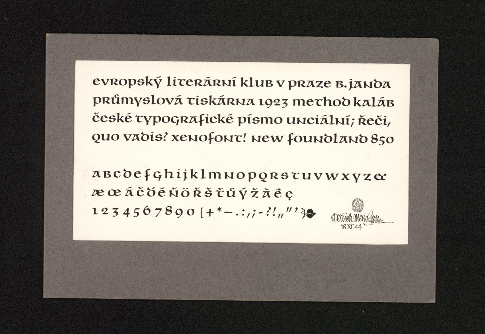
![Česká unciála v soudobém typografickém písmařství [Czech Uncial in Period Typographic Design]. Oldřich Menhart, type specimen book, State Printing Office, Prague 1950. Source: National Museum Library. [2]](https://oldrichmenhart.com/wp-content/uploads/2022/11/Unciala_03_01.png)
![Česká unciála v soudobém typografickém písmařství [Czech Uncial in Period Typographic Design]. Oldřich Menhart, type specimen book, State Printing Office, Prague 1950. Source: National Museum Library. [2]](https://oldrichmenhart.com/wp-content/uploads/2022/11/Unciala_03_02.png)
![Česká unciála v soudobém typografickém písmařství [Czech Uncial in Period Typographic Design]. Oldřich Menhart, type specimen book, State Printing Office, Prague 1950. Source: National Museum Library. [2]](https://oldrichmenhart.com/wp-content/uploads/2022/11/Unciala_03_03.png)
Česká unciála v soudobém typografickém písmařství [Czech Uncial in Period Typographic Design]. Oldřich Menhart, type specimen book, State Printing Office, Prague 1950. Source: National Museum Library. [2]
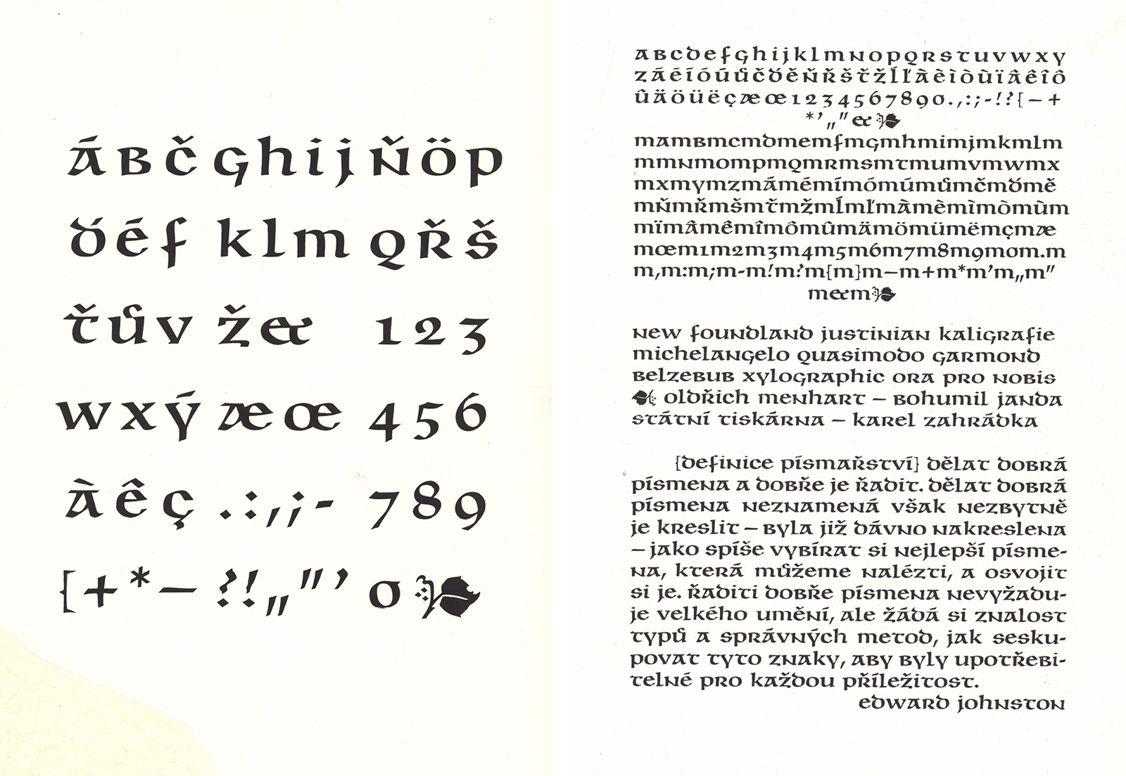
![Promotional page from the magazine Typografia (no. 5/1962, vol. 65) and a sample from the specimen book by Grafotechnca n.p.. Source: National Museum Library. [3]](https://oldrichmenhart.com/wp-content/uploads/2022/11/Unciala_04_04.png)
1. Materials for font digitization: The first test prints of hand typesetting in the State Printing Office.
2. Proof prints and adjustment versions of the type by Grafotechna n.p.
3. Offer card
4. Promotional page from the magazine Typografia (no. 5/1962, vol. 65) and a sample from the specimen book by Grafotechna n.p.. Source: National Museum Library. [3]
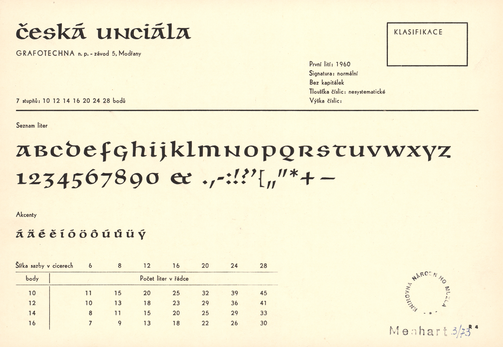
The design for Česká Unciála was completed in 1944. The typeface was produced in one size (10 points) in the type foundry of the State Printing Office in Prague’s Malá Strana neighborhood in 1948 and 1949. In 1953, the Grafotechna type foundry expanded its range with 12, 14, 16, 20, 24 and 28 point sizes. There is no doubt about the beauty, exceptionality and timelessness of Menhart’s design. With his Unciála, Oldřich Menhart even managed to create a unique phenomenon. In the environment of Czechoslovakia, it has become so integrated into local culture that it is inextricably linked not only with the era of its use, but also with numerous iconic places and businesses. Because it was used as a part of visual identity by dozens of mountain hotels, castles and chateaux, breweries and small wineries, it could be said that Menhart’s Unciála literally became part of the Czech vernacular.

Promotional beer coasters, restaurants and hotels using Menhart’s Unciála and shapes derived from it, 1950s-1990s.
Unciála was the third typeface we started work on in September 2021. We could not find the cards with the drawings in the National Museum or other archives, so it is likely that they did not survive at all. Following the example of Figural, we wanted the most accurate and sharpest drawing possible. The reproduction of Česká Unciála on the back page of the magazine Typografia (no. 5/1962, vol. 65), was the one we used. At the same time, we got our hands on a very high-quality proof from test prints. We also had a sample of the first type specimen book of the original type from the State Printing Office from 1950, and a type specimen book of all of the Grafotechna print typefaces. We set the height of the letters by comparing the same print size (24 points) of the produced typeface in the Grafotechna type specimen book – by comparing Unciála with Figural. After setting the horizontal metrics, we traced the authentic version including all errors in the reproduction. We were pleasantly surprised at how well the digitized version looks at first glance.
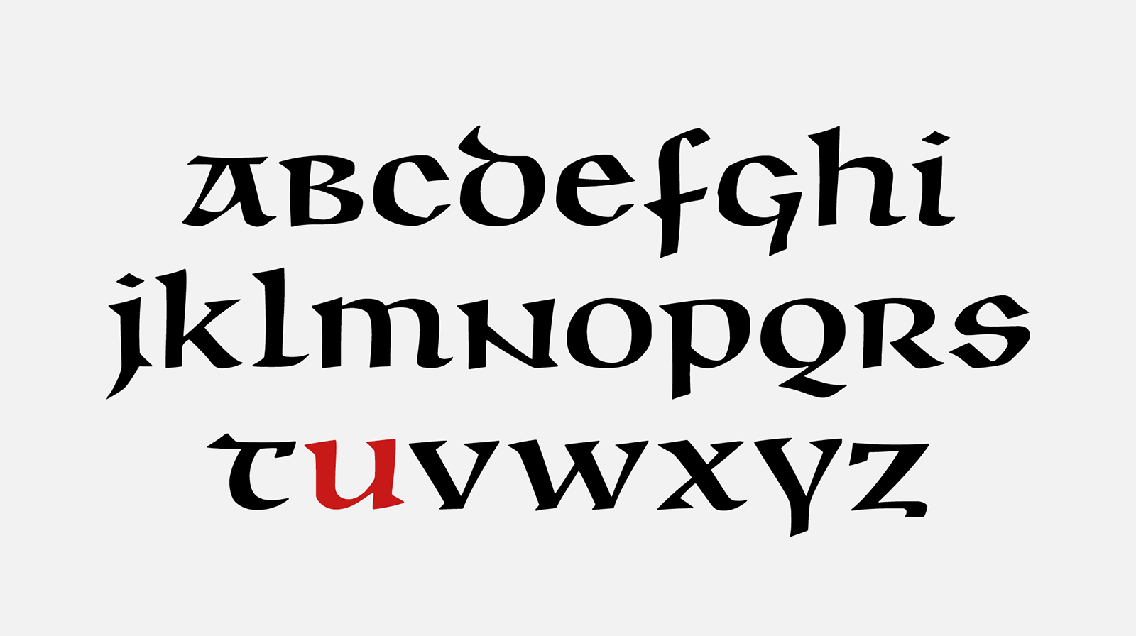
The first digital redrawing of the character set according to its original proof. We will call this version “authentic,” without any intervention from us.
We immediately started fixing this first version by removing flaws (as an incorrectly engraved g), solved the bouncing of characters on the base line, compensated for missing overshoots and unified the terminal strokes and fluctuating strength of the stems. We have significantly reduced the letter s, the height of which varies in the Graphotechna type specimen book. We have added a full set of accents and punctuation marks to Menhart’s original design. It is important to mention here that Menhart’s solution to accents in Unciála is particularly remarkable because there is no single historical model to follow when creating them; his design was completely genuine. We placed the accents closer to the body of the letters and darkened them. We also enlarged the dotaccent above the i and j. In addition, we designed several ampersand symbols in the belief that they will most probably be useful for display typesetting and wordmark design.
A series of corrections to the Unciála typeface carried out on the authentic version.
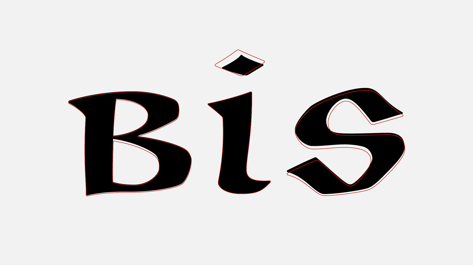
Comparison of the characters in the authentic version (black) and the outlines of the final font.
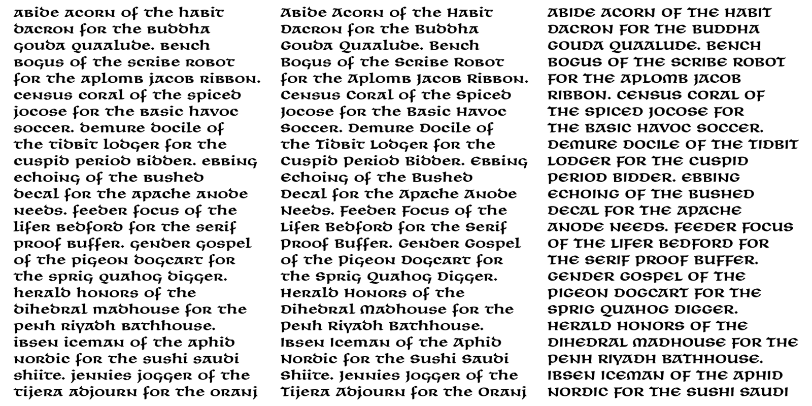
We compared Unciála’s display size with the prints of type set in the smallest sizes. Because the high-contrast drawing of the headline version was noticeably harder to read at small point sizes, we decided to create a second optical master for the text sizes. This version has reduced contrast and a more rounded, somewhat thicker outline curve. The radius of the serifs and sharp corners is significantly blunter. During the redrawing, we discussed whether to unify or leave the differences in terminals of the lower descenders, which end differently in both produced versions, and the shapes of the wedge serifs for v, w, r and b, which were smaller, so the characters seemed rounder and optically more suffused. (1) However, we tried to resolve the differences in drawing and minor nuances as we did when creating the small point sizes for Figural, and taking them into account for this text point size. For better rhythm, we also reduced the pronounced width of certain characters (n, z and t), and created a whole series of ligatures and contextual characters that make it possible to compensate for the excessively wide proportions of specific pairs of letters (such as aa, tt, zy, etc.). Lastly, we slightly expanded the metrics for the text master, and conversely reduced it slightly for the display master.
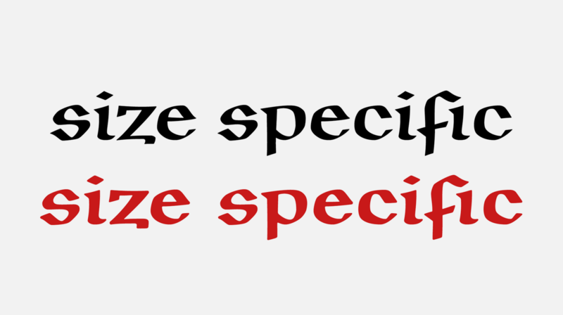
Grand and Petit masters for different sizes of use. The Petit style has an even looser metric.
Typographer Otakar Karlas chose Menhart’s Unciála for the design of the edition of the postage stamp edition of “Rotunda sv. Václava v Praze [Rotunda of St. Wenceslas in Prague].” However, the first use of the digitized Unciála immediately showed the limits given by the character of the uncial letterforms themselves. The inscription “Česká republika” cannot be written grammatically correctly with an initial capital letter. Ota solved this limitation by slightly enlarging the č character and modifying its ductus. In retrospect, we realized that we encountered such interventions fairly often in the Unciála typeface in various period implementations. Artists used their own imagination in modifying the missing majuscules in names or at the beginning of sentences, which often did not correspond at all to this kind of typeface.
![Detail of the postage stamp “Rotunda sv. Václava v Praze [St. Wenceslas’ Rotunda in Prague] with a depiction of the original tile with a gryphon and the new Unciála font.](https://oldrichmenhart.com/wp-content/uploads/2022/11/Unciala_10_new.png)
Detail of the postage stamp “Rotunda sv. Václava v Praze [St. Wenceslas’ Rotunda in Prague] with a depiction of the original tile with a gryphon, lion and the new Unciála font.
Out of professional curiosity, we decided to try adding a set of initial majuscules to the uncial typeface. We do so aware of the fact that we are proceeding in absolute opposition to Menhart’s idea of designing a perfect uncial type, but with regard to user comfort and mainly with the aim of limiting possible “designer modifications” of the typeface.
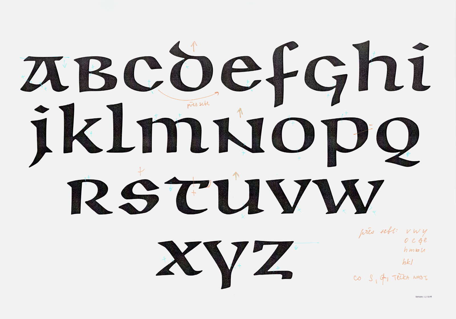
Majuscule characters of the BC Unciála typeface in three optical weights.
We drew the first shapes of the majuscules, which were based on Menhart’s various inscriptions and letterings created for wordmarks and monograms. Our intention was that the majuscules should not only quote the minuscule shapes, but that they should have their own character as much as possible. In addition to a few characters, the minuscules and majuscules now represent two different shape sets. It is visible most clearly in the majuscules E, F, F, D, M and T, and in the completely simple I, which is designed in this way for easier recognition among similar characters. I, L, i and l, and both variants of the figure 1.
Originally we wanted to hide the new majuscules in the character set and enable access to them only to experienced users. But in the end we decided to admit them and put them in the standard uppercase positions.
Three different examples of Unciála in text. On the left, the “true” uncial minuscule typesetting, then the use of the majuscules in the position of initials, and the last, purely “false” majuscules typesetting.
The last question was how many styles should be created, and how Unciála should be correctly named. After consultations with the typographer Filip Blažek, we tried to divide the typeface into several separate families – majuscules, uncials and bicamerals (these variants even encouraged us to use non-standard names such as Modern, Pseudo, Bizarre, Fake, Matured, Aged, etc.). Nevertheless, the multitude of weights and the unclear orientation in their naming and use led us to leave the entire Unciála glyph set in three optical styles – Grand, Regular and Petit. If someone wants to set a text in a true uncial, all they have to do is convert the entire text into minuscules.
We dropped Menhart’s original attribute “Česká” [Czech] from the name for reasons of pronunciation and the impossibility of using all accented characters in font names.
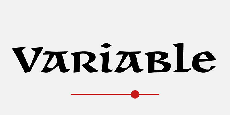
BC Unciála is also available as a variable font, using the opsz axis, so that the optical font size of the typeface changes according to the size it is set in.
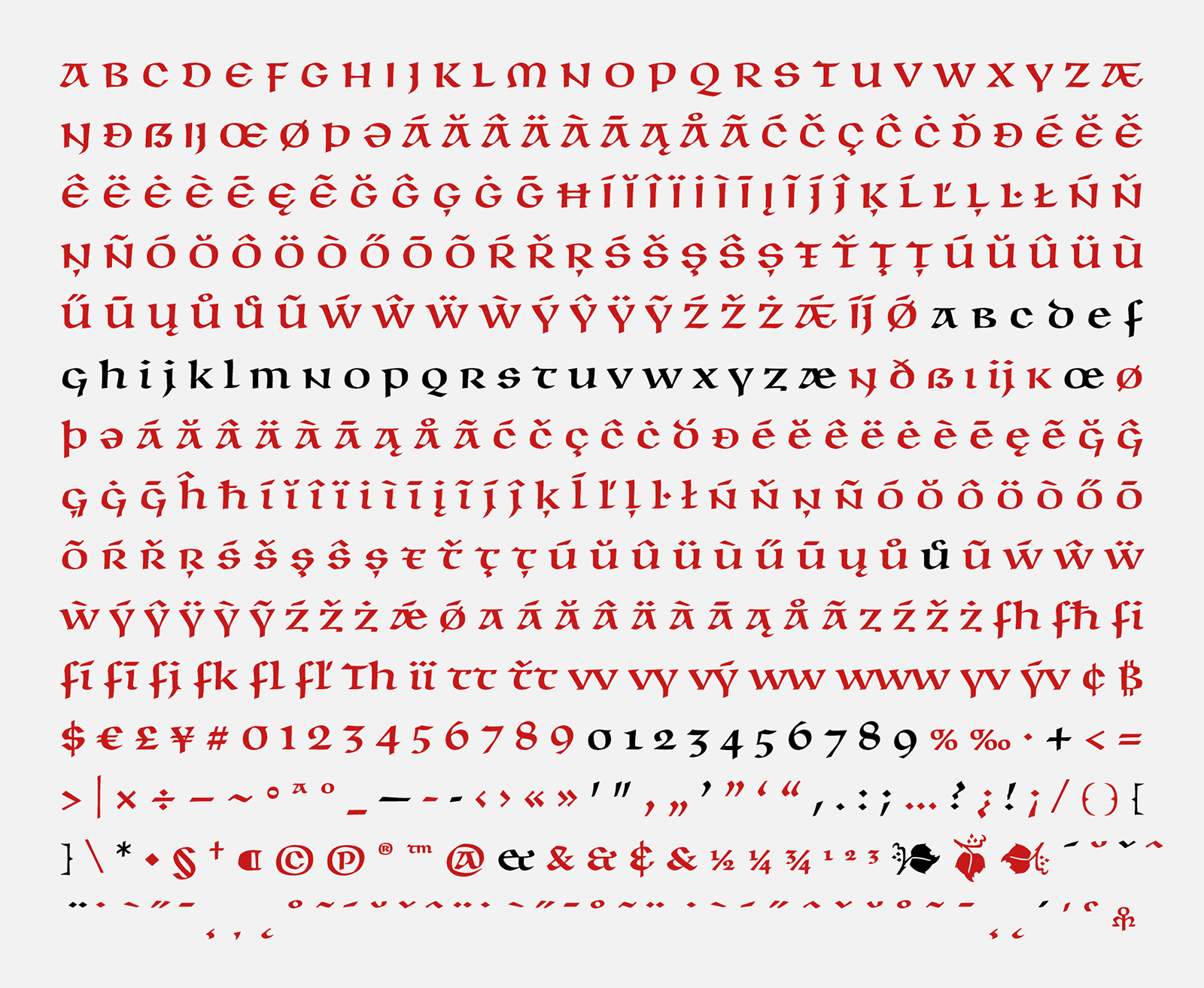
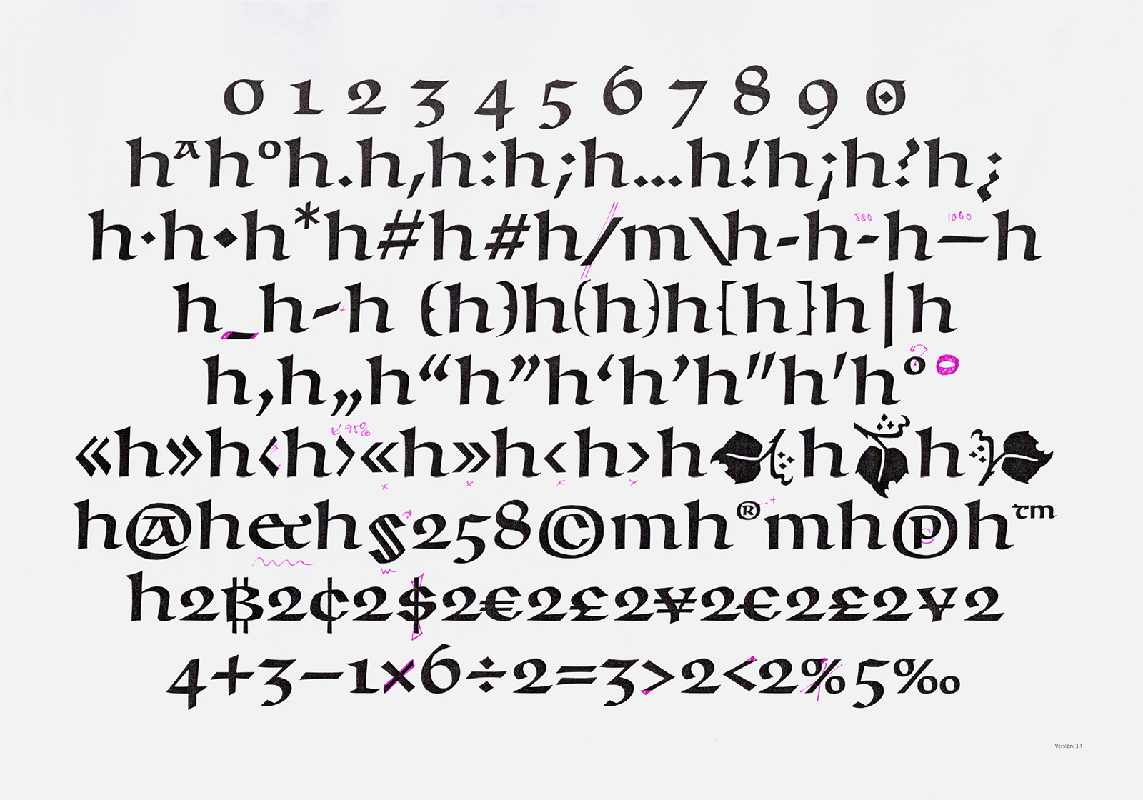
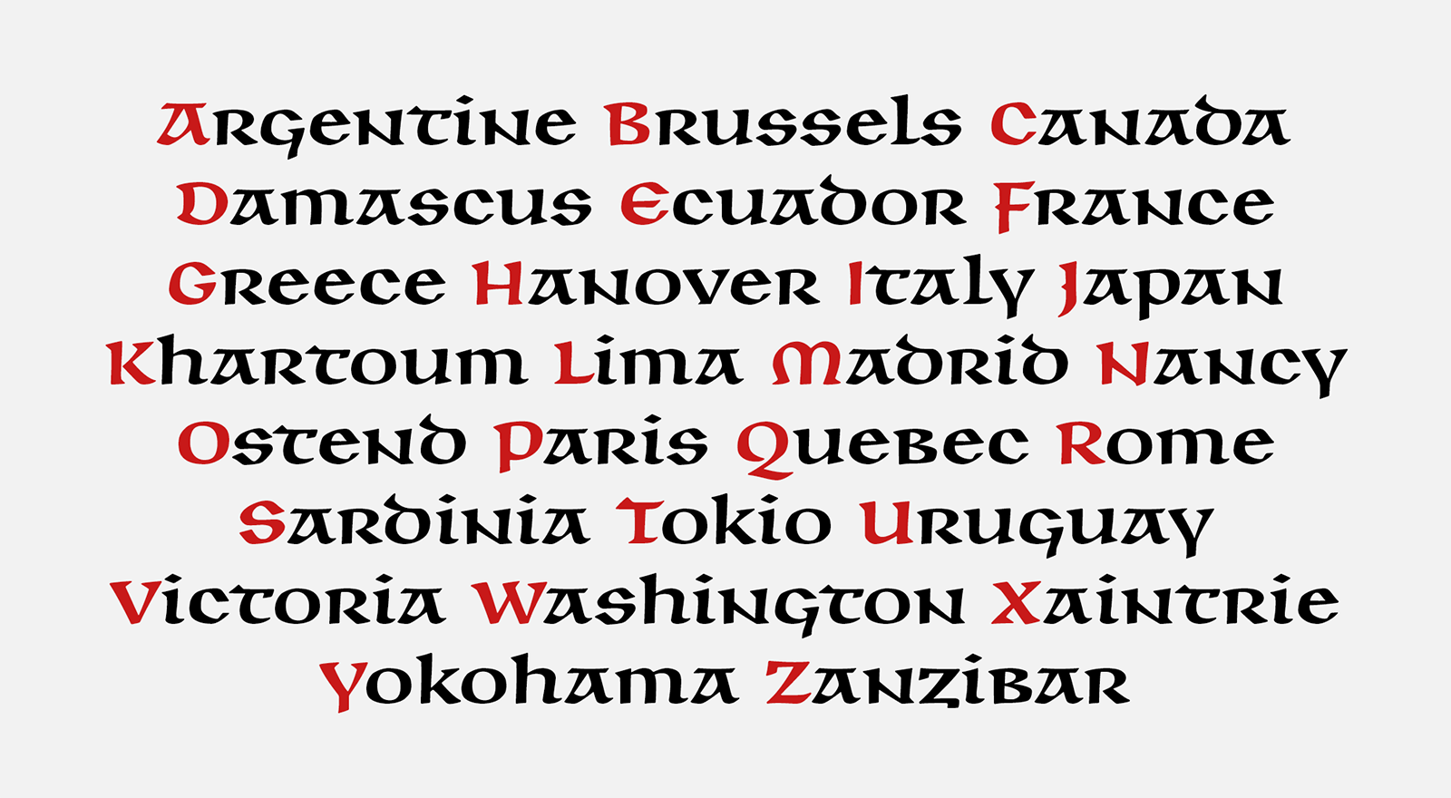
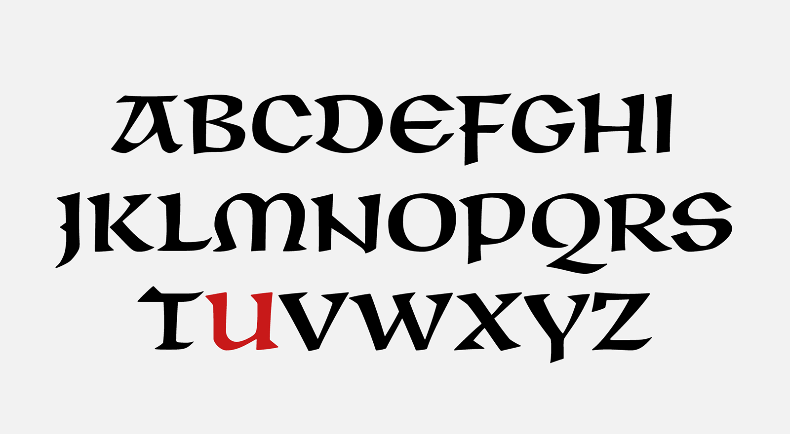
The complete character set of the BC Unciála typeface. The ones marked in black are the original characters designed by Oldřich Menhart. The red characters are the ones that have been newly created.
1) By comparing the 10-point version of the typeface originally published in 1948 by the State Printing Office and the same size by Grafotechna n.p., we found that the two versions differ in small details. In addition to the aforementioned terminations of the lower descenders, the most significant difference is in the shape of the f character.
[1] National Museum Library, book culture department, Typografika collection, inv. no. TYPO Menhart 68-1_1, TYPO Menhart 68-2_1, TYPO Menhart 68-3_1, typography: Česká unciála, 1948.
[2] National Museum Library, book culture department, Typografika collection, inv. no. TYPO Menhart 69-1_1; TYPO Menhart 69-1_3; TYPO Menhart 69-1_5; typography: Česká unciála, 1948.
[3] National Museum Library, book culture department, Typographika collection, inv. no. TYPO Menhart 65_1; TYPO Menhart 64_1; TYPO Menhart 66-1_1; TYPO Menhart 73_1; TYPO Menhart 70_006; typography: Česká unciála, 1940s and 50s.