About
The typographer Oldřich Menhart was gifted with extraordinary calligraphic talent, and a refined sense for typography and beautiful books. His typographic work was, and still is, wholly exceptional and has a genuine Czech character.
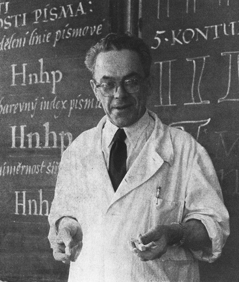
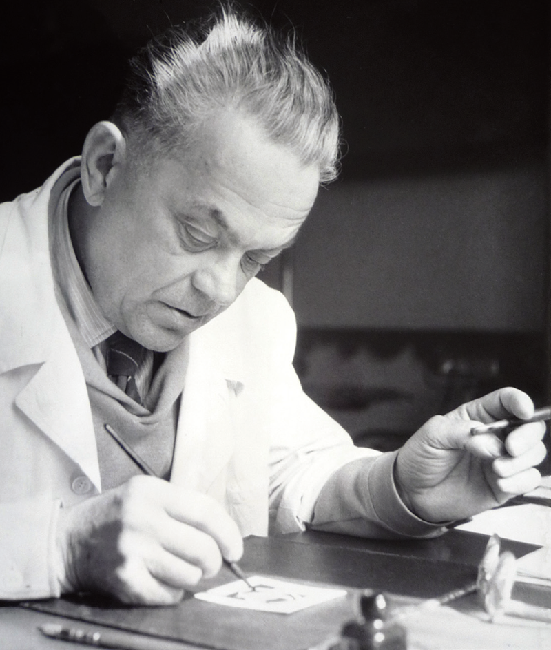
1. Oldřich Menhart on his typographic course
2. Oldřich Menhart working in his apartment at Nerudová Street No. 44 in Prague, Malá Strana.
On June 25, 1897, Oldřich Menhart was born into the family of master goldsmith Hubert Menhart, who lived in Prague in a building called U Kalicha. From 1911 to 1914 he learned typesetting in Prague’s Politika printing house. Following his discharge from the army and return from World War I, he published the two-volume “První česká škola ornamentálního písma [First Czech School of Ornamental Letterforms]” with Karel Mrázek. In 1922, he joined the type department of the Czech Graphic Union’s typesetting workshop as a supervisor. During his time there, he designed a poster typeface for the Czech Graphic Union that was never published. From 1923 to 1925, he worked as a specialist teacher at the typographic school in Prague. In 1924 he received a scholarship from the National Economic Institute of the Czech Academy and traveled to Antwerp, Paris and Cronberg where he studied typography and type design. In October 1924, he was hired as a supervisor at the State Printing Office in Prague, where he worked with Karel Dyrynk. In 1929, he left the State Printing Office of his own accord, in order to fully develop his creative abilities. In the following years, he worked as an independent freelance calligrapher, type designer, and book designer, and wrote expert articles. In 1930 he received a scholarship from the Supervisors’ Association, and completed his practice at the Bauer and Stempel type foundries in Frankfurt, the Klingspor brothers in Offenbach, in Paris at the Peignot type foundry and at the Imprimerie Nationale.
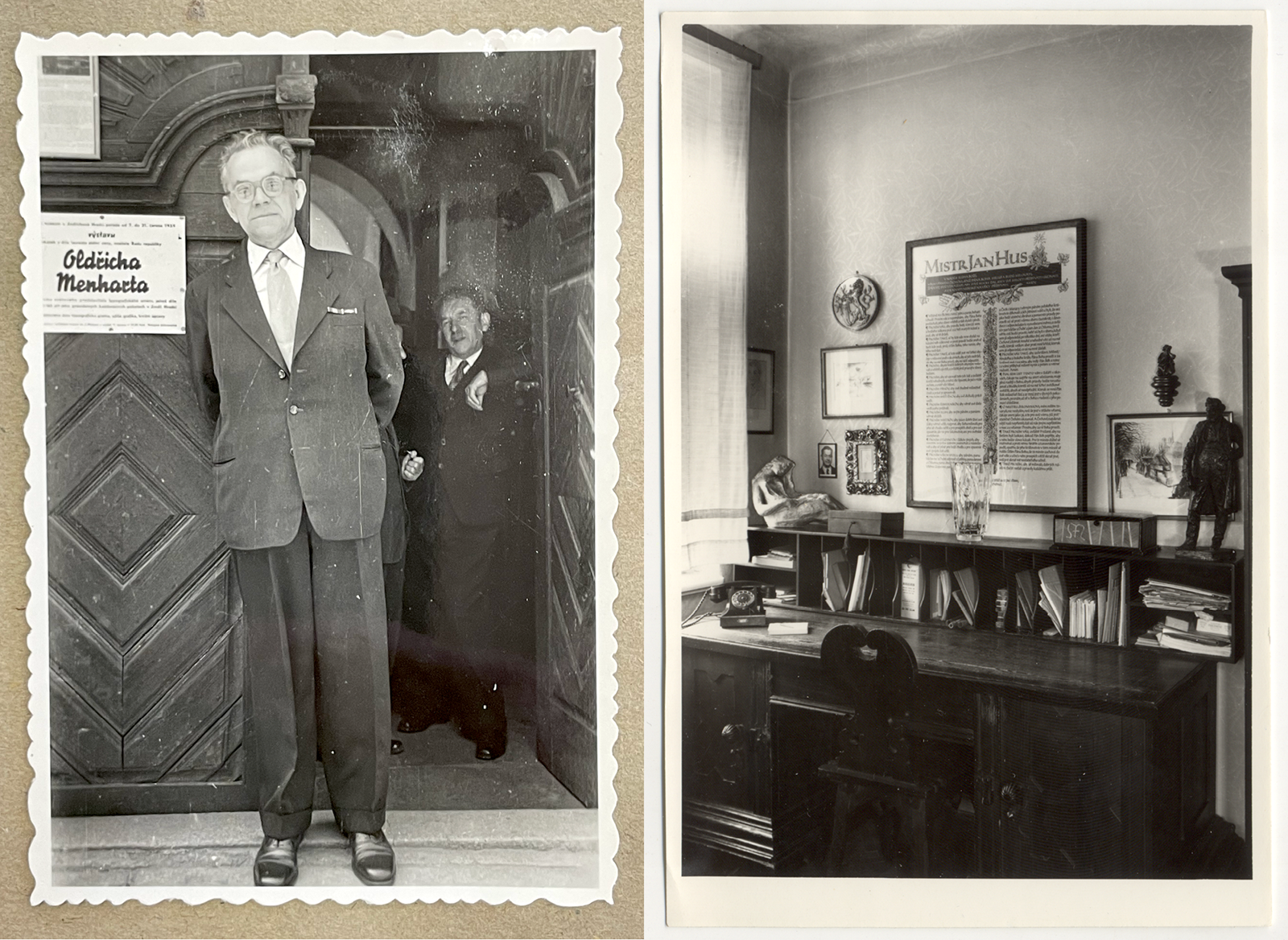
1. Oldřich Menhart at the opening of his exhibition in Jindřichov Hradec, 1959.
2. Oldřich Menhart’s desk in the apartment at Nerudová Street No. 44 in Prague, Malá Strana.
In the first period of his independent creative activity, he mainly worked in calligraphy and type design. He later also focused on book typography. Menhart was the first Czech type designer whose type was sold internationally. He designed several dozen original typefaces between 1929 and 1961. Most of the typefaces were successfully produced, first by foreign, and then by domestic type foundries. On the basis of his deep convictions, he strove to revive the art of calligraphy as a starting point for the design of typographic letterforms. In his work, he sought perfection and refinement in the name of the supremacy of spiritual culture over a civilization based on technology. He had his own exhibitions in Prague at Prague’s Hollar gallery in 1948, in 1957 in Olomouc, in 1958 in Brno and Bratislava, and in 1959 in Jindřichův Hradec. His opinions and the results of many years of studying the development and design of typefaces were published in a number of expert magazines and books. He wrote the unique textbooks Nauka o písmu [Teachings On Type] (1954) and Tvorba typografického písma [Designing Typographic Letterforms] (1957). He was awarded a gold medal for lifetime achievement at the international exhibition of book art IBA (Internationale Buchkunst Ausstelung) in Leipzig in Leipzig in 1959, as well as a number of other honors. Oldřich Menhart died on February 11, 1962, in his apartment at 44 Nerudova Street in Prague’s Malá Strana neighborhood.
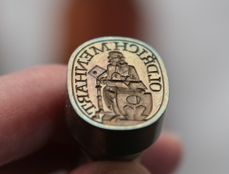
Oldřich Menhart’s seal with personal monogram.
A number of leading experts were interested in Oldřich Menhart’s work—writers as well as typographers—who often knew him personally and admired him. There are several texts that bear witness convincingly to Menhart’s life and work. The authors of such texts included Method Kaláb, Rudolf Hála, Emanuel Frynta Jr., František Hrubín, Otto F. Babler, René Murat, Oldřich Hlavsa, František Muzika, Miroslav Bohatec, Karel Fabel and many others. Menhart’s typographic work was also appreciated by a number of personalities abroad. According to Paul Standard, one of the most persistent admirers of Oldřich Menhart’s work was Jan Tschichold, the world-renowned type designer and typographer and harsh critic of 20th century book design. Even Paul Standard himself commented only in superlatives about the level of Menhart’s work in type design, calligraphy and book design, and he did not hesitate to rank him among the foremost type designers of the 20th century. The beauty of Menhart’s romans and italics was appreciated by type experts Stanley Morrison, Emil Rudolf Weiss and A. A. M. Stols. In 1962, when Oldřich Menhart forever left his desk, his work was also highly praised by Hermann Zapf, Otto Hurm, Albert Kapr and many others (in the specialist magazine Typografia 5/62, which was dedicated to Menhart’s memory).
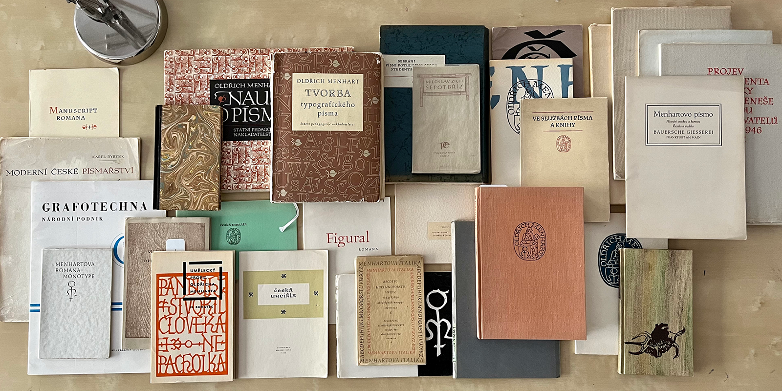
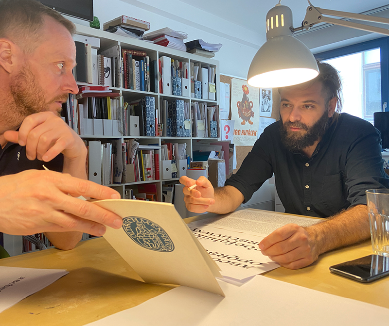
Collecting specimens, rare prints and bibliophilia is not only our passion, but also a prerequisite for the quality digitization of Oldřich Menhart‘s typefaces.
Menhart’s typefaces were present in the type cases of many printing houses in the former Czechoslovakia. They were among the few typefaces that were produced from the 1940s to the 1960s by domestic type foundries, including Slévárna Písem in Prague, the State Printing Office in Prague, and later by the state-owned Grafotechna company. Menhart’s typefaces were commonly used until the era of the technological breakthrough in the 1970s that gradually replaced classic metal typesetting with phototypesetting. After the advent of digital technologies in the 1990s, Oldřich Menhart’s work was sparsely remembered domestically, and his typefaces practically ceased to be used.
Nauka o písmu [Teachings On Type], State Pedagogical Publishing House, Prague 1954
There are several reasons why Menhart did not receive adequate attention in his home country since the 1990s. Menhart’s textbook, Nauka o písmu [Teachings On Type], which was written for the needs of secondary art schools, caused several generations of graphic artists and type designers to hate him; many of them still do not hold him in high esteem to this day. What’s more, when Menhart had come to an end of his career, his work became closely tied to the treacherous era. In Czechoslovakia in the 1950s, the shapes of Menhart’s typefaces, inspired by medieval scripts and much more suitable for monasterial scriptoriums and theological literature, unfortunately echoed the political regime’s emphasis on Hussite tradition. This is why his calligraphic typefaces resonated with the products of socialist realism. Last but not least, due to the unavailability and lack of foreign typefaces, Menhart’s typefaces were overused, which etched them into many people’s memories. Looking at Menhart’s work from today’s perspective was therefore quite a challenge.
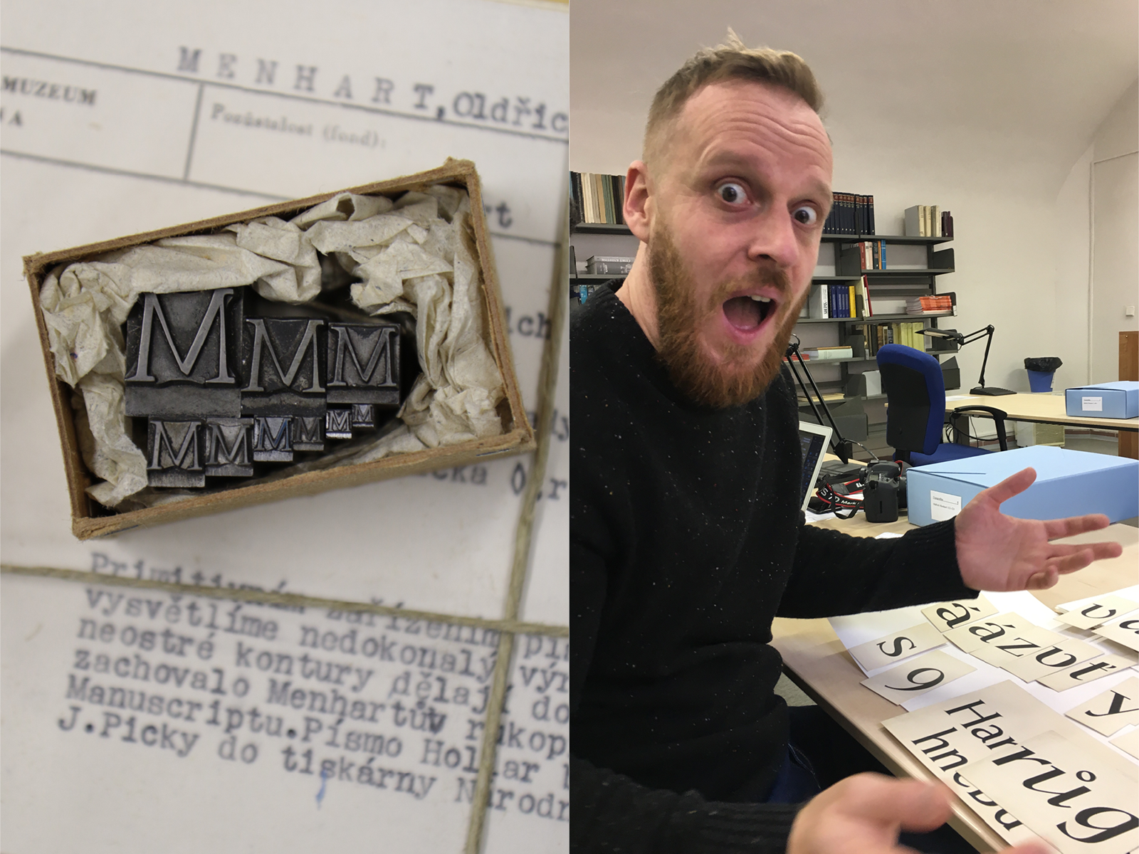
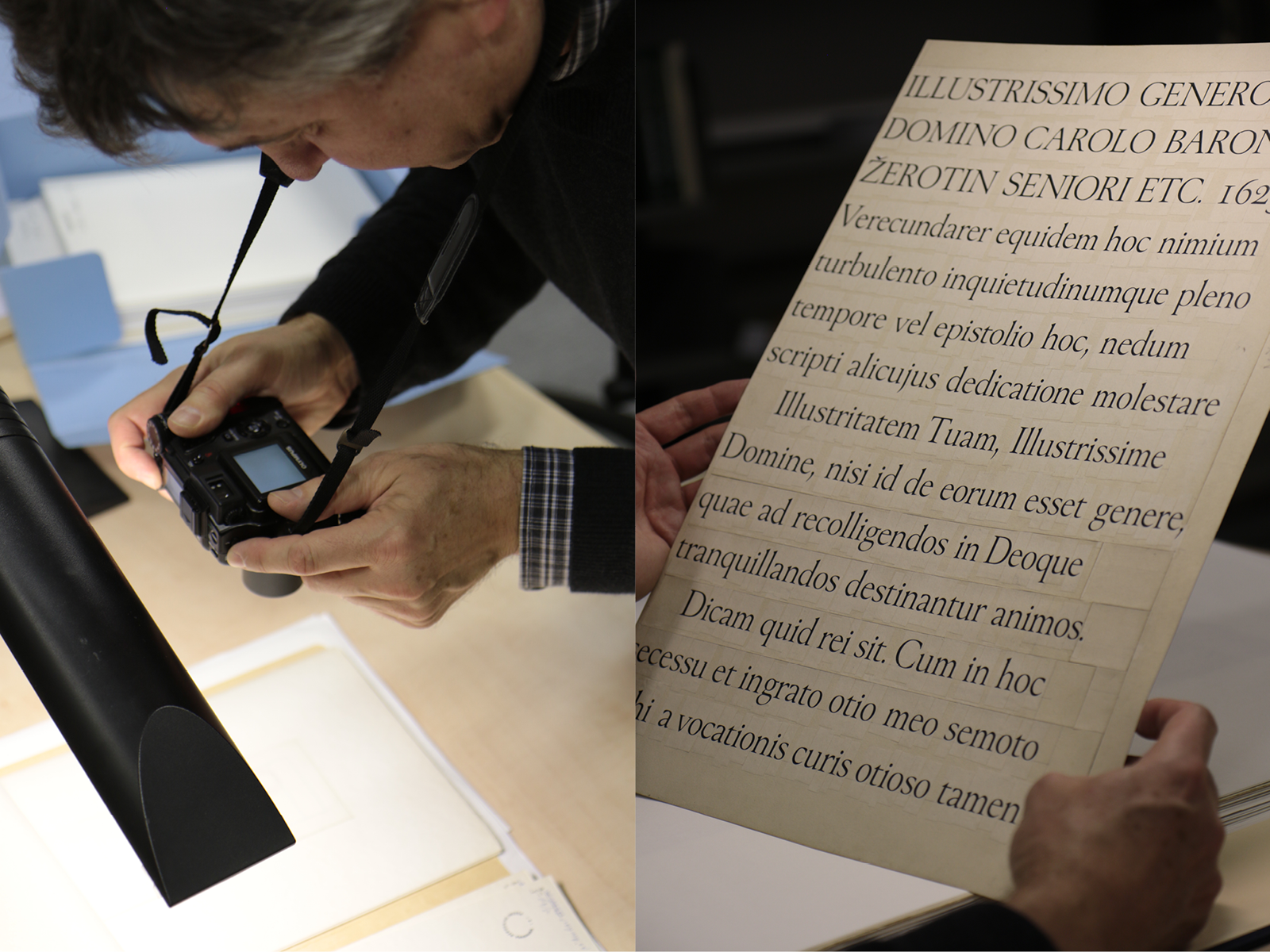
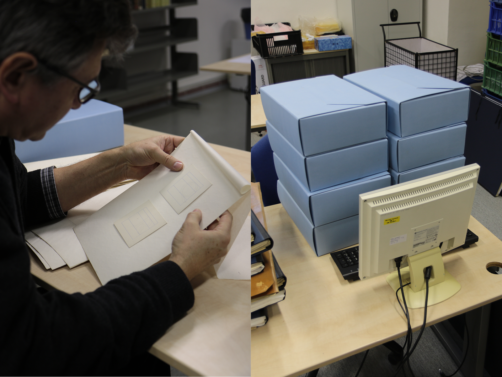
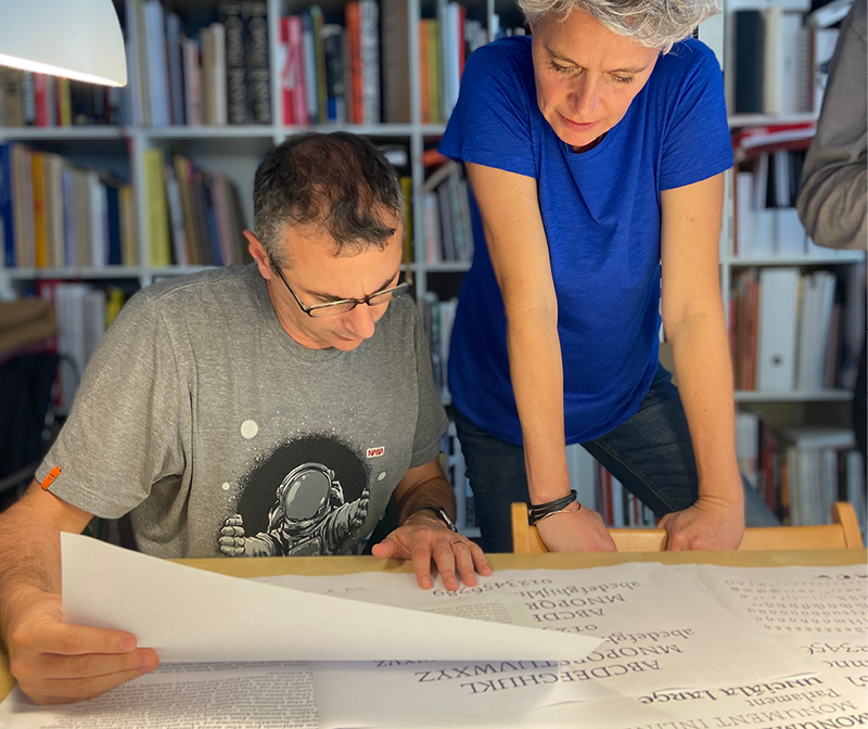
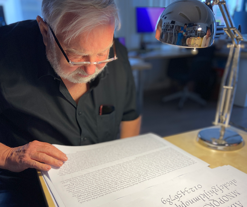
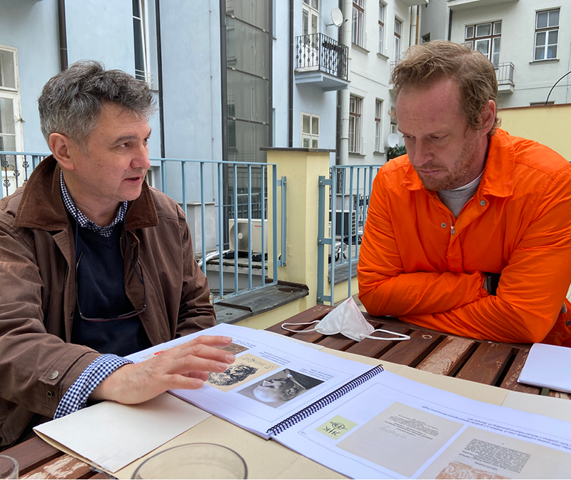
Searches and findings from the archive and estate of Oldřich Menhart.
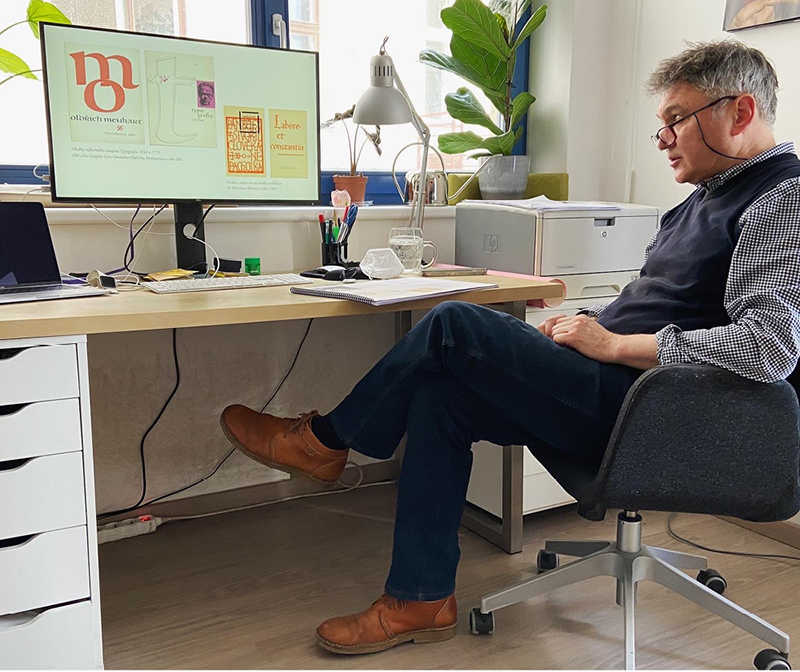
In 2017, when we looked at the unprocessed materials on Oldřich Menhart’s work in the National Museum Library archive in Prague, it occurred to us that Czech typography has been owed a high-quality digitization of his typefaces for many decades. In hopes of further developing the full potential of his type designs, we decided to gradually digitize all of his typefaces. We are launching our Oldřich Menhart typography collection with the first five type families: Figural, Monument, Parlament, Unciála and Vajgar.
Oldřich Menhart knew how to calligraph most of his typefaces exactly as they had been typographically produced. His typefaces do not contain a single straight line, but do contain a whole range of inventive shapes and specific details. Looking at the precise execution of the typographic cards (none of the older type sketches have been preserved), it is amazing how accurately and quickly, only on the basis of his calligraphic skill and typographic sensibility Menhart managed to design typefaces for printing that are utterly natural and organic on the page, even after complicated engraving. Menhart did not have the possibility to test and endlessly tweak his typefaces, as we do today, and yet his “first attempt” was often enough and perfect. For this reason, we did not try to improve upon Menhart’s fonts other than technically. This made their digitization that much more complicated. Although our approach remained reverent, it brought opportunities to get into Menhart’s mind and understand, if only metaphorically, the complexity of his typographic considerations. This extraordinary privilege was our primary motivation.
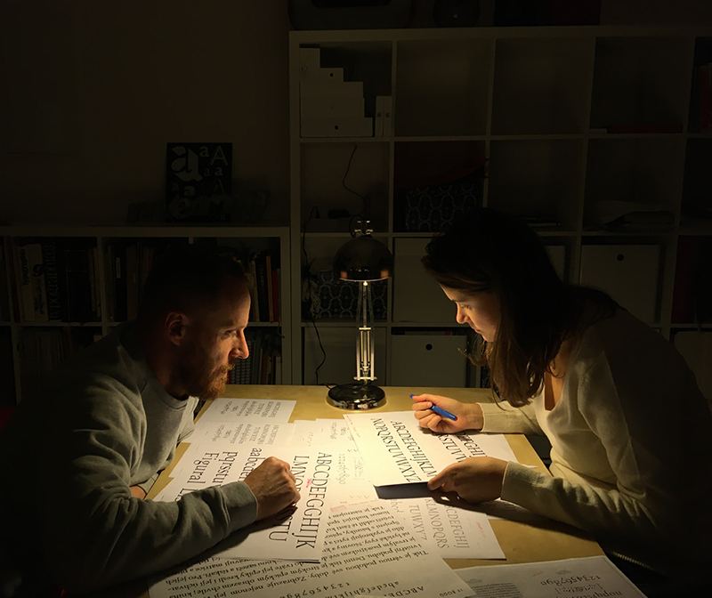
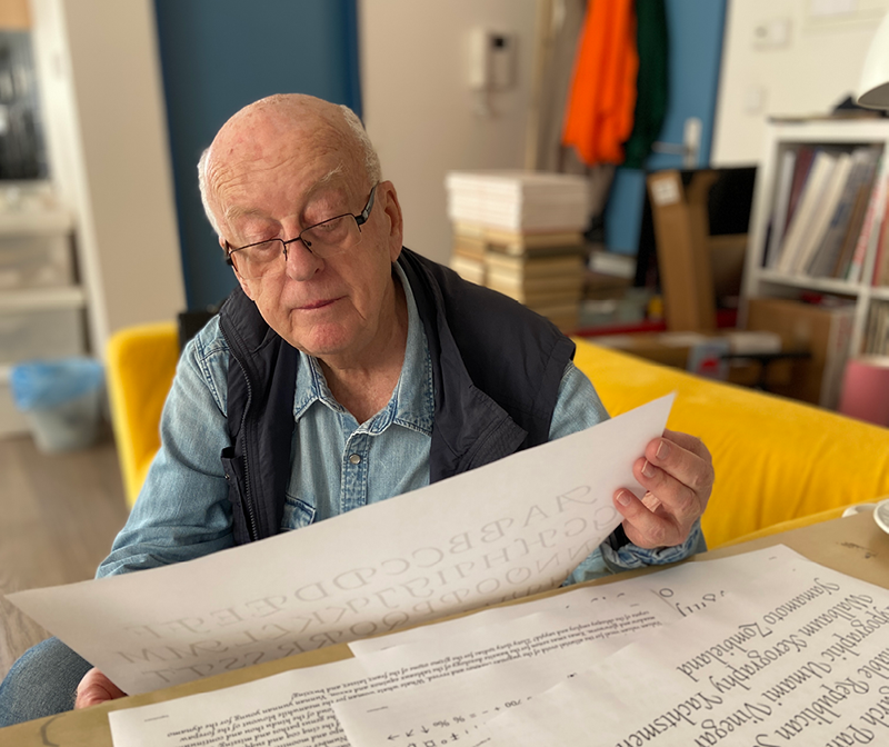
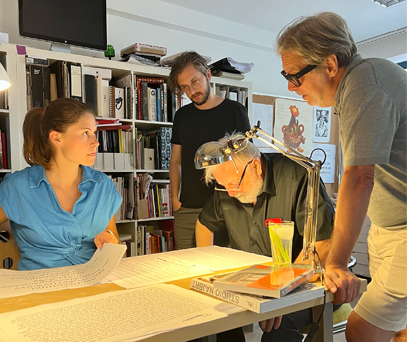
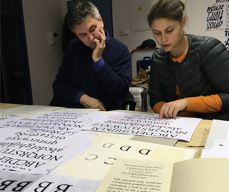
Numerous corrections during 2017–2022.
We would like to especially thank Pavel Menhart, without whom we would not have been able to start our project. Many thanks also go to Veronika Karfusová, Pavel Muchka and Petr Mašek of the National Museum, without whom we would not have had access to key materials for digitization. We would also like to thank Petr Dvořáček of the Chamber of Deputies Parliament of the Czech Republic Archive, and Pavel Pohlreich of the National Technical Museum, for discoveries that expanded our findings thus far. Many thanks to typographer Jan Solpera for his multiple comments and notes on editing the typefaces, Filip Blažek for the technical supervision of our fonts as well as Radek Sidun, Karel Haloun, Rostislav Vaněk, Veronika Burian and José Scaglione for their valuable suggestions. Many thanks go to Jaromír Štoural for the letterpress print-proofs of typefaces by Oldřich Menhart, Douglas Arellanes for the translation of all texts to English, Petra Rabová for editing the original Czech texts, and Jan Borecký for programming of the microsite.


![Nauka o písmu [Teachings On Type], State Pedagogical Publishing House, Prague 1954. Nauka o písmu [Teachings On Type], State Pedagogical Publishing House, Prague 1954.](https://oldrichmenhart.com/wp-content/uploads/2022/12/About_05-01.png)
![Nauka o písmu [Teachings On Type], State Pedagogical Publishing House, Prague 1954. Nauka o písmu [Teachings On Type], State Pedagogical Publishing House, Prague 1954.](https://oldrichmenhart.com/wp-content/uploads/2022/12/About_05-02.png)
![Nauka o písmu [Teachings On Type], State Pedagogical Publishing House, Prague 1954. Nauka o písmu [Teachings On Type], State Pedagogical Publishing House, Prague 1954.](https://oldrichmenhart.com/wp-content/uploads/2022/12/About_05-03.png)
![Nauka o písmu [Teachings On Type], State Pedagogical Publishing House, Prague 1954. Nauka o písmu [Teachings On Type], State Pedagogical Publishing House, Prague 1954.](https://oldrichmenhart.com/wp-content/uploads/2022/12/About_05-04.png)
