BC Parlament
The Parlament typeface pays homage to medieval ceremonial manuscripts. It represents the pinnacle of Menhart’s calligraphic skills and his virtuosity in converting handwritten morphology into type.
Parlament is Oldřich Menhart’s ceremonial typeface, based on models from early Renaissance humanist manuscripts. It feels calligraphed, with a soft, flexible pen with a straight nib. The distinctive breaking of rounded strokes and the bending of straight stems is particularly eye-catching in the details. In text sizes it stands out for its picturesqueness, good readability and its delicate, semi-cursive temperament. Parlament represents the pinnacle of Menhart’s calligraphic skills, and his virtuosity in converting handwritten morphology into type.
![Poster for the Parlament typeface, Grafotechna n.p., sample no. 14, from the estate of Oldřich Menhart. Source: National Museum Library. [1] Poster for the Parlament typeface, Grafotechna n.p., sample no. 14, from the estate of Oldřich Menhart. Source: National Museum Library. [1]](https://oldrichmenhart.com/wp-content/uploads/2022/11/Parlament_01-571x800.png)
Poster for the Parlament typeface, Grafotechna n.p., sample no. 14, from the estate of Oldřich Menhart. Source: National Museum Library. [1]
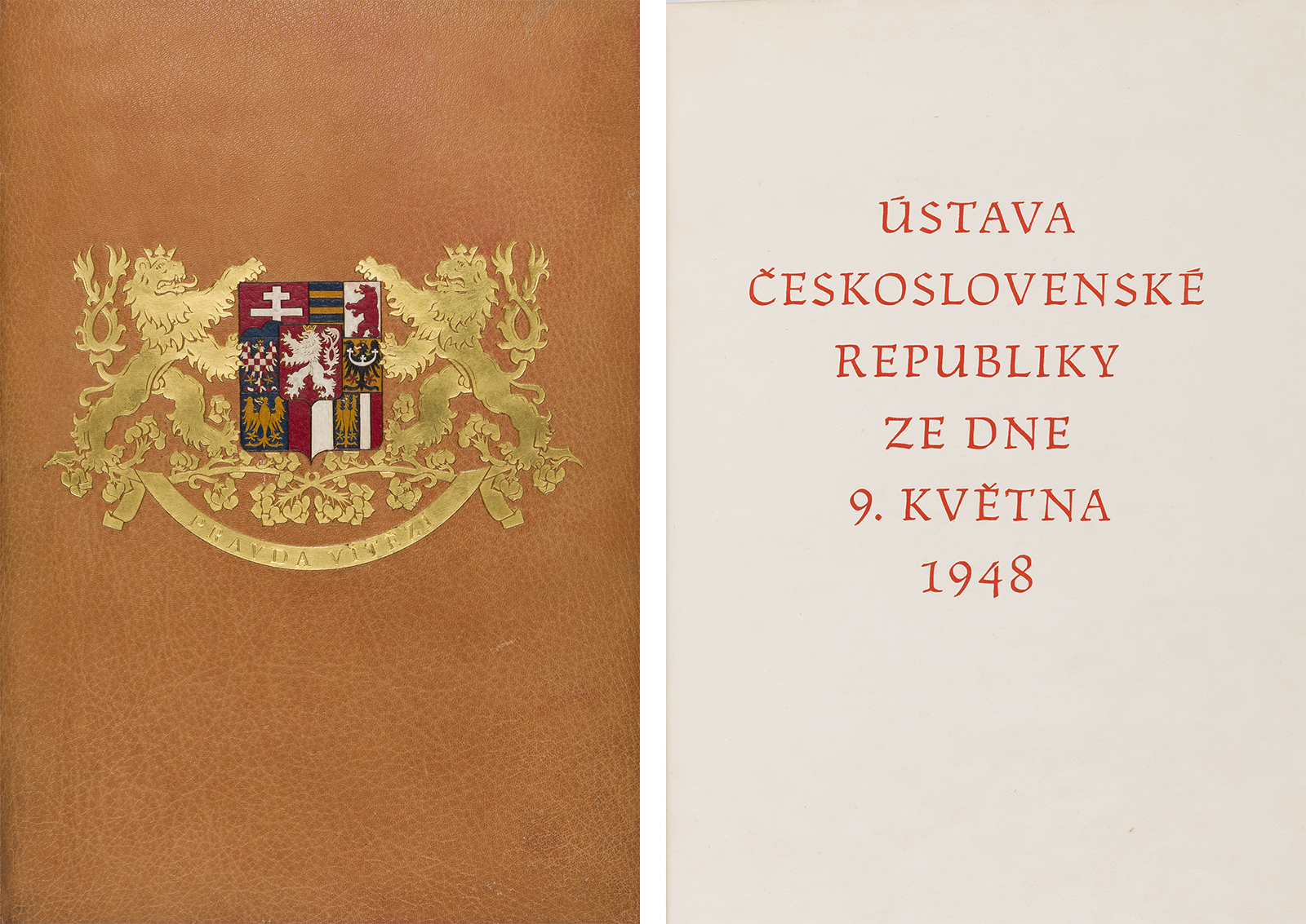
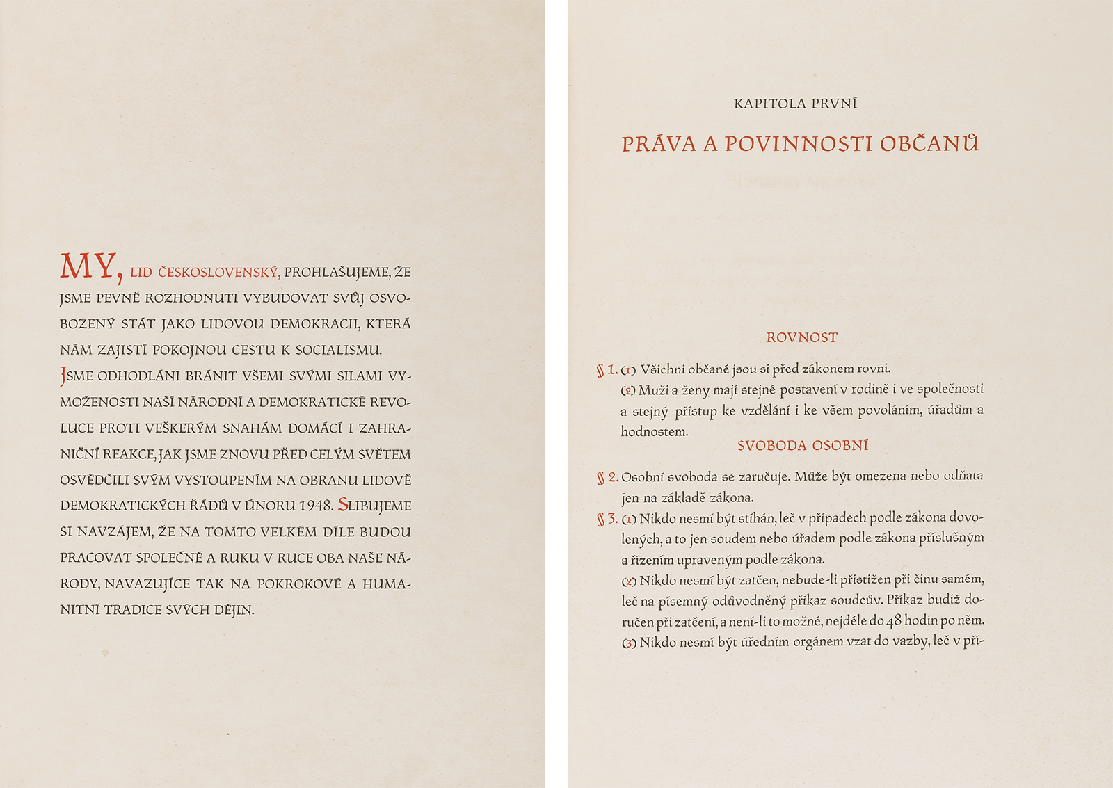
The original Constitution of May 9, stored in the Archive of the Chamber of Deputies of the Czech Republic. [2]
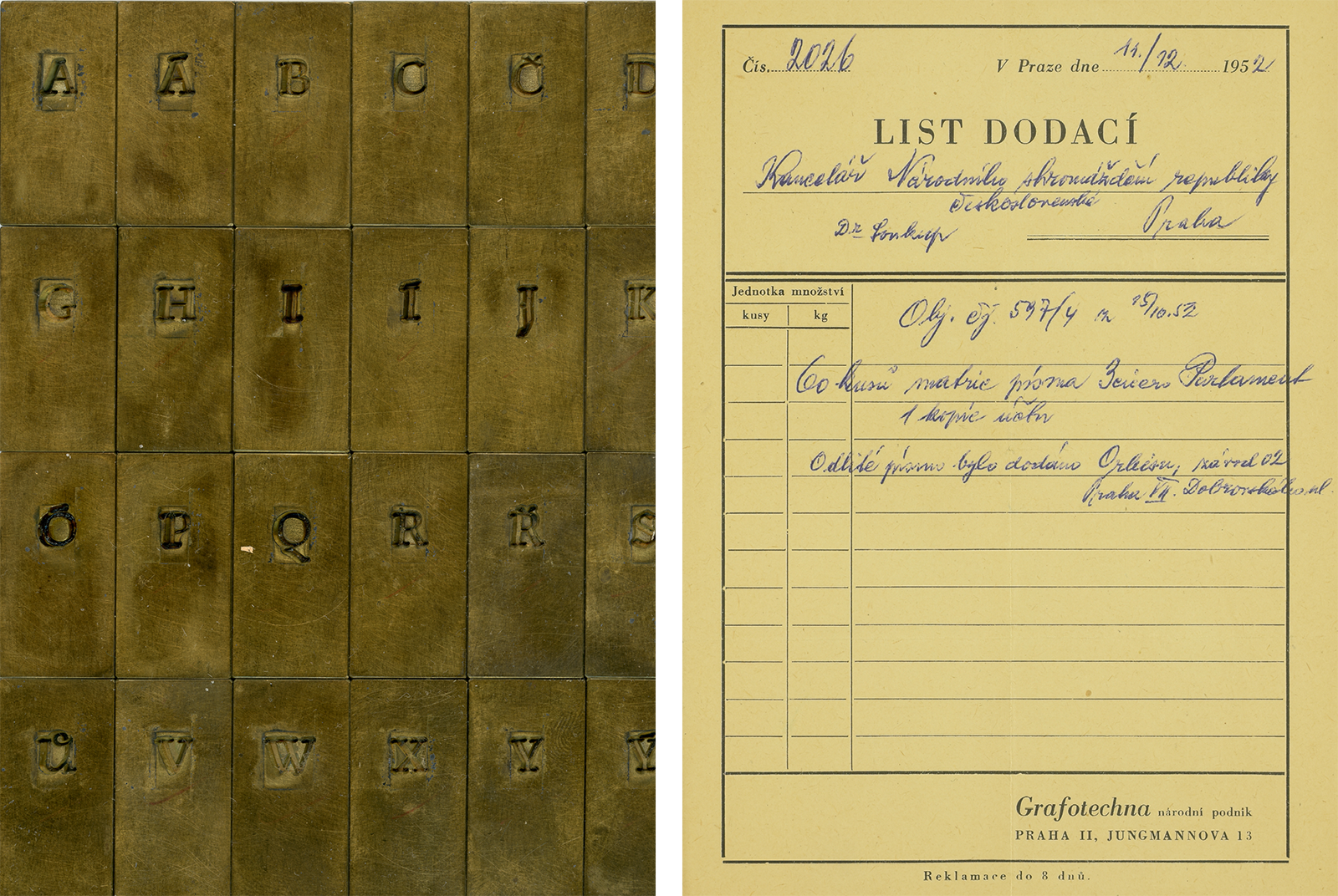
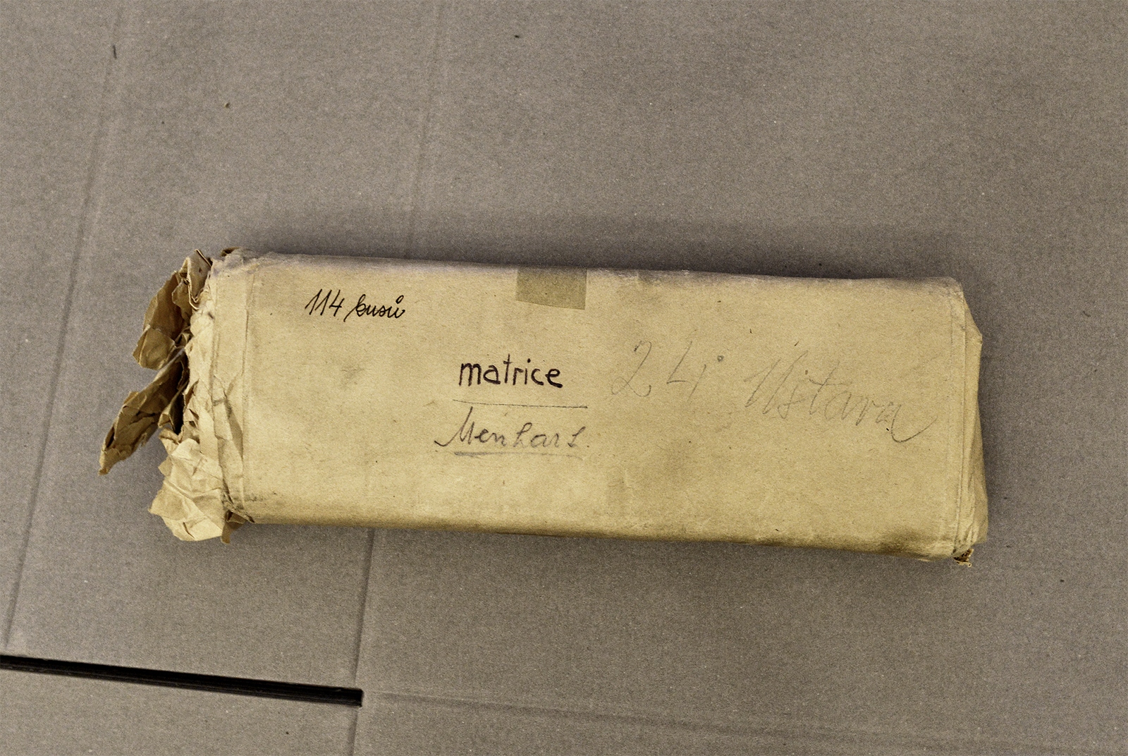
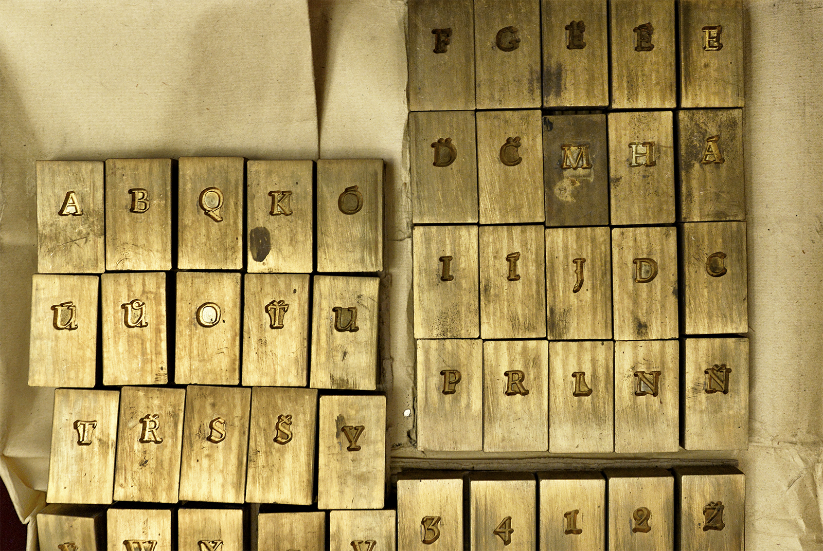
The National Assembly commissioned Menhart to design a ceremonial typeface for the Czechoslovak constitution in mid-1950. Menhart delivered the first designs with the working title of Republika as early as July 12, 1950, and on September 28, 1950 he submitted all 95 drawings of individual characters under the official name of Parlament. In the years 1950—1951, the typeface was cut and cast by the type foundry of the State Printing Office in Prague in a single 16-point size. Two additional sizes of figures and plate initials in the form of enlarged majuscules are the only decoration of the Constitution of the Czechoslovak Republic (1), which is probably also the only print where this typeface was used; the metal letters were probably melted down right after the print. The original brass matrices remained as the property of the National Assembly (Archive of the Chamber of Deputies).
![A medieval ceremonial manuscript that was the model for the Parlament typeface. A table from Menhart’s publication: Nauka o písmu [Teachings On Type], Státní pedagogické nakladatelství [State Pedagogical Publishing House], Prague 1954. A medieval ceremonial manuscript that was the model for the Parlament typeface. A table from Menhart’s publication: Nauka o písmu [Teachings On Type], Státní pedagogické nakladatelství [State Pedagogical Publishing House], Prague 1954.](https://oldrichmenhart.com/wp-content/uploads/2022/11/Parlament_03.png)
A medieval ceremonial manuscript that was the model for the Parlament typeface. A table from Menhart’s publication: Nauka o písmu [Teachings On Type], Státní pedagogické nakladatelství [State Pedagogical Publishing House], Prague 1954.
We originally balked at the Parlament typeface and did not want to digitize it at all. It seemed fussy and histrionic to us at first glance, with its overly affected character, minuscules with impractically long ascenders, and especially the burden of its historical connotations. It wasn’t until we took a closer look at the precise draftsmanship of the characters that we were enchanted, enough so that we decided to set out on this virtuoso calligraphic variation without hesitation.
![Original pencil typeface designs for Parlament from the preserved estate of Oldřich Menhart, 1950. Source: National Museum Library. [3] Original pencil typeface designs for Parlament from the preserved estate of Oldřich Menhart, 1950. Source: National Museum Library. [3]](https://oldrichmenhart.com/wp-content/uploads/2022/11/Parlament_04.png)
Original pencil typeface designs for Parlament from the preserved estate of Oldřich Menhart, 1950. Source: National Museum Library. [3]
We had cards of 80 × 80 mm with Menhart’s designs from the archives of the National Museum Library at our disposal for the digitization. These showed a precise, sharp outline drawing with a very hard pencil (2). But we were understandably interested in the original print produced with the metal letters, which is why we visited the Archive of the Chamber of Deputies. At the time, the Constitution of the Czechoslovak Republic was unfortunately in the restoration department, so only loose, unbound folios were available for study. In March 2022, in the archives of the National Museum in Terezín, we photographed individual characters using a microscope from the same proofs of the Constitution, and we found a proof of the adjustment (3) of the minuscules and figures. In all of the prints, the Parlament typeface differs considerably from Menhart’s pencil designs. During a detailed study of the prints and proofs of the typeface, we noticed pronounced differences in the drawing of the characters (see the figures – especially 3, 4, 5, and 7; some majuscules – A, B, D, R and S, and especially the minuscules – including a, b, c, d, f, m, n, and z) as well as in the quality and degree of detail when engraving the letters. Compared to Menhart’s pencil designs, it seems to be a completely different typeface. The text point size printed in the Constitution has a pleasantly rounded and delicate character, which is in fact the direct opposite of the very sharply cut designs of Parlament in the original pencil drawings (this can be seen well in the shape of the straight serifs, for example). On the basis of this comparison, we were convinced that we would have to create two masters of Parlament (as with Figural) – a title (Grand) master for use from 48 points and up, and a text master (Regular) for 16 points and under.
Brass matrices from the archive of the Archive of the Chamber of Deputies are probably the only preserved specimens of Menhart’s Parlament typeface. In addition to the matrices, the documentation of the production and handover of the typeface is stored in the archive. [4]
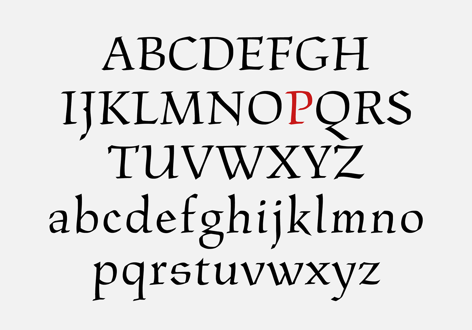
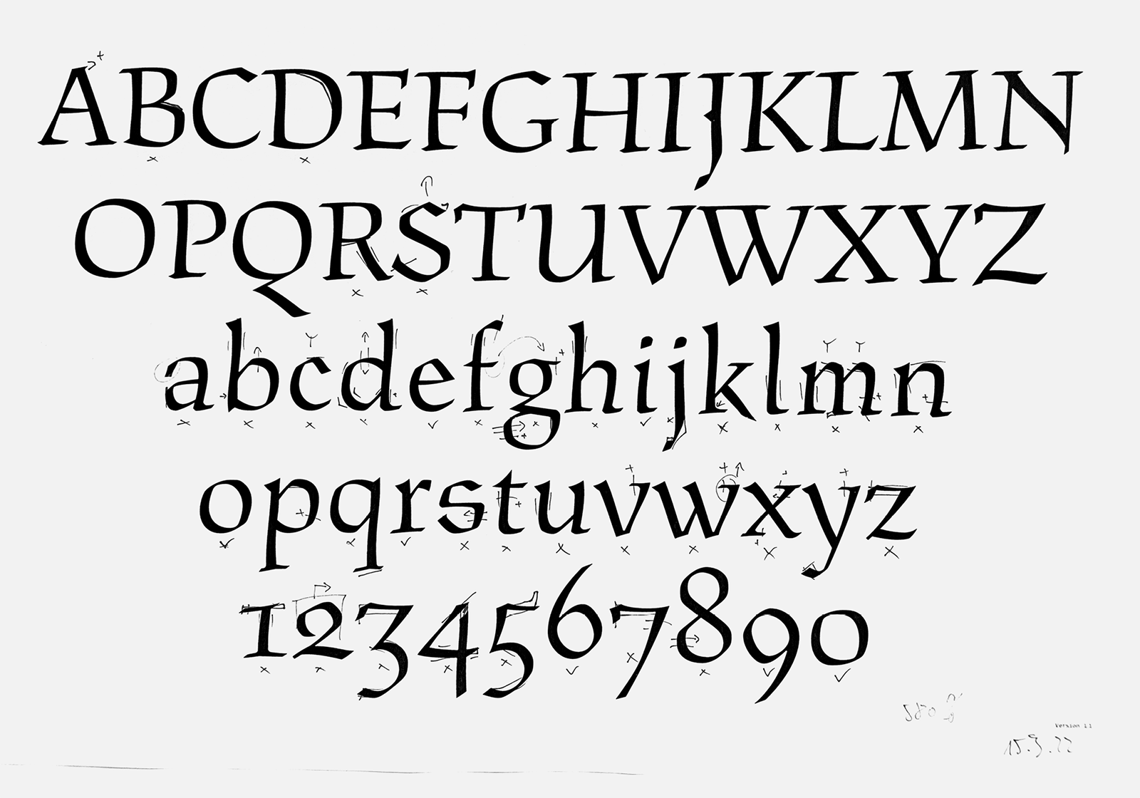
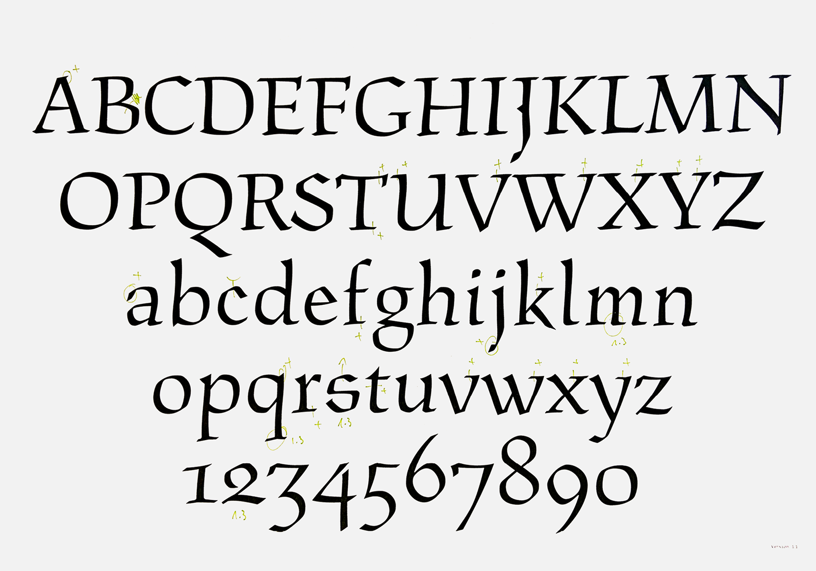
The first digital redrawing of the Parlament typeface’s character set based on pencil drawings. We call this version ‘authentic,’ without any intervention from us.
We created the basis of the “Grand” master by precisely redrawing the curves from the original pencil drawings on the cards from the National Museum. We derived the horizontal metrics from the already digitized Figural so that the majuscules of both typefaces sit at the same cap-height. However, the resulting digital redrawing was uncomfortably sharp (as opposed to Menhart’s parlament, where the sharp contours suit it), which is why we decided to soften the sharp terminals slightly. The radius of the rounding is almost imperceptible and identical to Figural.
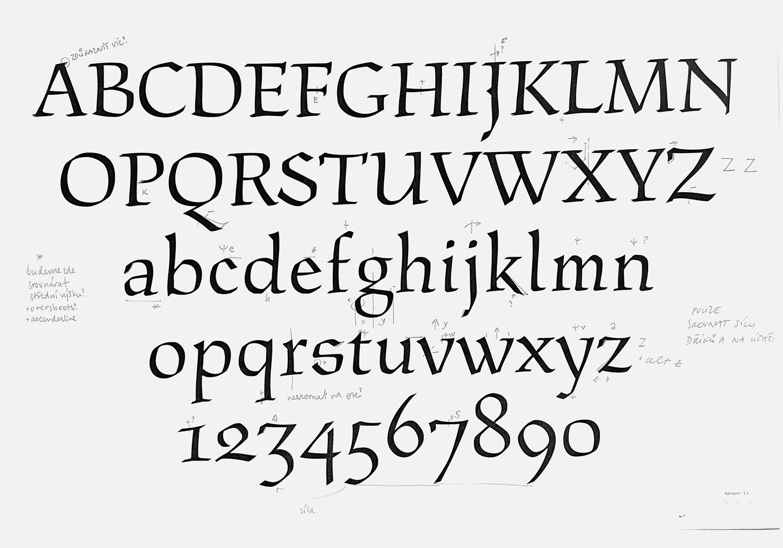
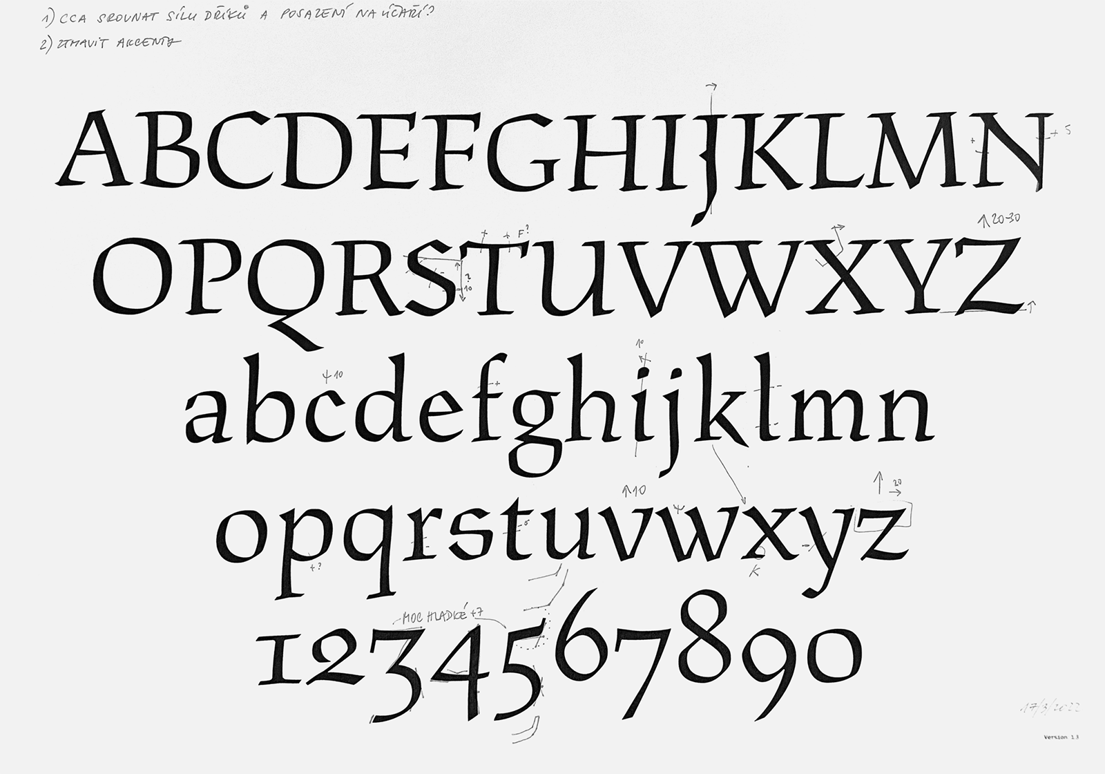
A series of corrections to the Parlament typeface carried out on the authentic version.
From this first authentic version, it was immediately clear that Parlament had to be modified significantly. The digitization based on the cards was so different from the printed letterforms that it was almost a different typeface. This is why we looked at the ceremonial manuscript from Menhart’s publication Nauka o písmu [Teachings On Type] (pgs. 50-51), but above all we tried to modify the typeface according to the proof and the adjustments from the Constitution. In the editing process, we changed the proportions of the characters and the shape of the strokes, but we kept the high contrast and sharpness of the terminals.
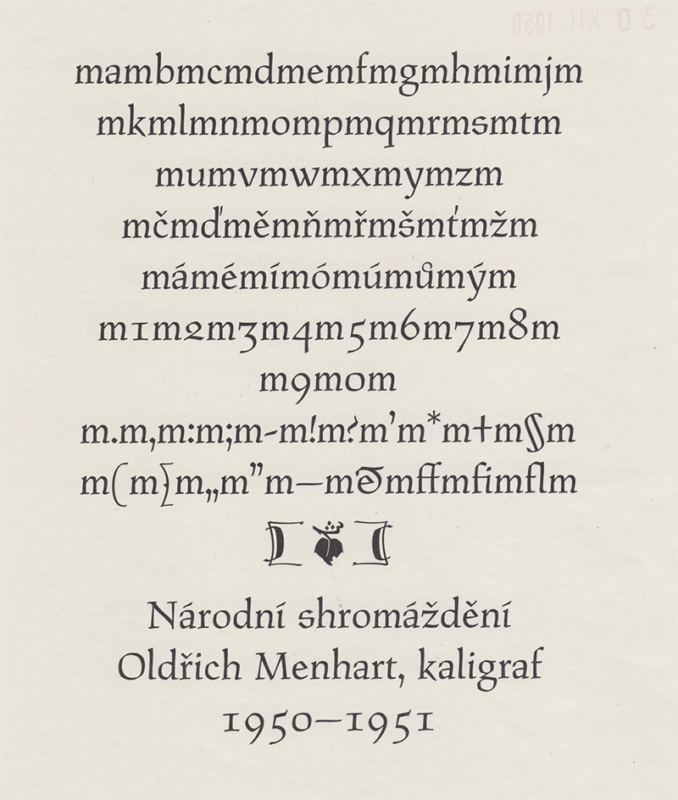
A high-quality proof of the typeface for hand typesetting – an adjustment test. (3) From the preserved estate of Oldřich Menhart. Source: National Museum Library. [5]
![A very rough proof from the typeface’s production process for hand typesetting. Pouring printer’s ink on the typeface “created” a bolder weight with softer curves and rounder serifs. From the preserved estate of Oldřich Menhart. Source: National Museum Library. [6] A very rough proof from the typeface’s production process for hand typesetting. Pouring printer’s ink on the typeface “created” a bolder weight with softer curves and rounder serifs. From the preserved estate of Oldřich Menhart. Source: National Museum Library. [6]](https://oldrichmenhart.com/wp-content/uploads/2022/11/Parlament_09.png)
A very rough proof from the typeface’s production process for hand typesetting. Pouring printer’s ink on the typeface “created” a bolder weight with softer curves and rounder serifs. From the preserved estate of Oldřich Menhart. Source: National Museum Library. [6]
The new drawings based on the adjustments showed that the shape changes carried out in the printed typeface did not work at all with this digitization. The changes affected nearly every character to their detriment; the strength of the stems (in the f and l, for example), the shape of the bowls (in the R and B, for example). We decided to go back and keep the original version according to the pencil drawings, only making minor, necessary and logical alterations (broadening the proportions of the m, rotating the g and r, modifying the bulbous terminals of the a and z, etc.). There was some discussion over the characters of Z and z and the figures 3, 4, 5 and 7, which were completely different from the printed typeface. But we kept the original variants and thus ended the debate. We then drew all the necessary glyphs of the character set, while even finding the model of the missing character §, which was filed by mistake under the Hollar typeface in the National Museum Archives.
![We have found alternative shapes of Parlament glyphs on photocopy from the Polygraphic collection from National Technical Museum in Prague. [7] We have found alternative shapes of Parlament glyphs on photocopy from the Polygraphic collection from National Technical Museum in Prague. [7]](https://oldrichmenhart.com/wp-content/uploads/2022/11/Parlament_10.png)
Alternative versions of characters are depicted on photo negatives from preparatory materials for the exhibition in the National Technical Museum. [7]
In parallel with work on the kerning, we tried to create another master for text point sizes by reducing the contrast, adding more massive serifs and creating an overall darker ductus. It didn’t work. The method of mechanical strengthening and darkening which worked for Figural didn’t work for Parlament at all, and completely mutilated it. We tried to redraw the typeface one more time on the basis of the text prints, but again we were not satisfied with the results. The typeface didn’t look good at all. Simulating on a computer the qualities conditioned by printing technology and real materials for this type of ceremonial typeface seemed to us unnecessary, tedious and false. This is why we abandoned the idea of creating a text point size of Parlament.
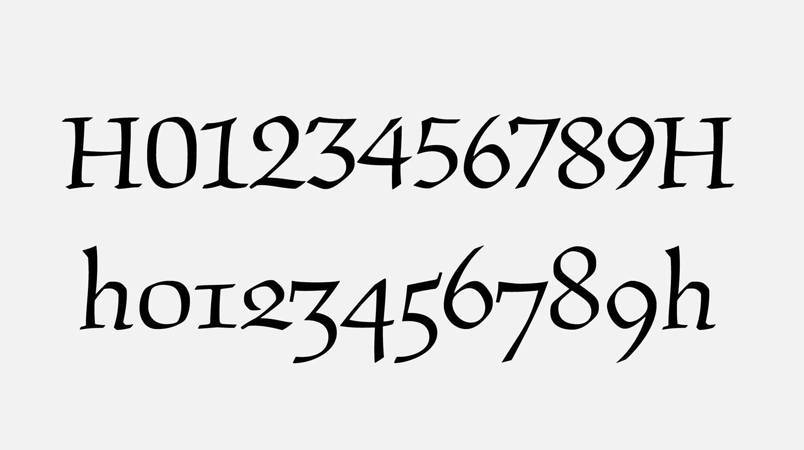
To create a new set of majuscule figures, we used alternative oldstyle figures – especially 3, 5, 7.
Among the last interesting changes compared to the original Parlament were the different designs for diacritics and accented characters. The majuscules’ original carons (only the accents for Czech typesetting were produced – the acute, caron and ring) were designed by Menhart so as to directly connect to individual letters. However, for the sake of expanding the character set, we separated the accents from the character bodies (as with the other digitizations, of course we kept Menhart’s connected version of the Ů and ů as an alternative). We also added majuscule figures whose morphology is based on the cast version of the typeface, and we increased the punctuation (dotaccent, question marks and quote marks, etc.), which were too bland and small in the text. After consultation with Veronika Burian and José Scaglione from TypeTogether, we decided to revise the shapes of the lower accents (especially the cedilla) and used a more traditional and readable morphology.
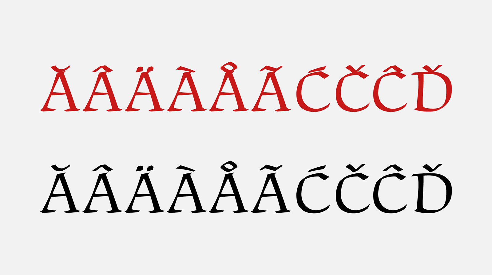
Menhart’s original low placement of the Czech accents (red) merged with the body of the characters. However, we faced significant problems when completing the remaining diacritics. Accents placed higher have more space, are more readable and are more distinct.
We finished the Parlament typeface as the first of Menhart’s fonts. That’s not to say we won’t return to creating a text point size sometime in the future. At the moment, however, we enjoy its flamboyance and directness, its absolute precision and at the same time fragile line based on exact guidance of the writing instrument, as well as its liveliness, which is perfectly complemented by the set of the other Menhart typefaces we decided to digitize.
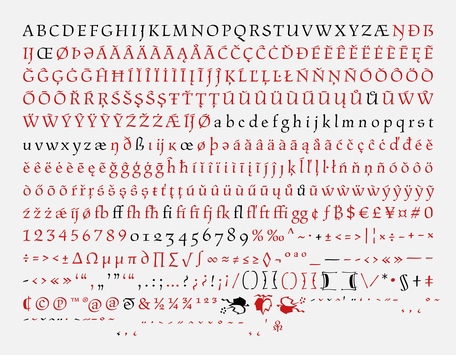
The BC Parlament typeface’s complete character set. The ones marked in black are the original characters designed by Oldřich Menhart. The red characters are the ones that have been newly created.
1) The Constitution was originally supposed to be illustrated with elaborate woodcut scenes by the artist Bohdan Lacina. He had worked with Menhart in the past as an illustrator (on Sebrání písní potulného cechu studentského [Collected Songs of the Guild of Traveling Students], ELK, Prague, 1948). His dense illustrations counter Menhart’s letterforms wonderfully. But due to a convergence of circumstances, Lacina never completed the planned color woodcuts for the constitution.
2) “An experienced typographer will prepare a type design in two ways. The first is with a hard pencil for personal use only in the outlines of the letters, and only then with a pen and ink for the needs of the type foundries.” Oldřich Menhart, Tvorba typografického písma [Designing Typographic Letterforms], Státní pedagogické nakladatelství [State Pedagogical Printing House], Prague, 1957
3) Adjustment is the modification of the optical appearance of a typeface, especially the setting of optimal spaces between individual letters for the harmonious appearance of the text.
[1] National Museum Library, book culture department, Typografika collection, inv. no. TYPO Menhart 95-1, typography: Parlament, 1950s.
[2] Archive of the Chamber of Deputies, Parliament of the Czech Republic
[3] National Museum Library, book culture department, Typografika collection, inv. no. TYPO Menhart 92-5,6_1; TYPO Menhart 93-21,22_1; TYPO Menhart 93-5,6_1; TYPO Menhart 92-13,14_1; TYPO Menhart 93-23,24_1, typography: Parlament, 1950.
[4] Archive of the Chamber of Deputies, Parliament of the Czech Republic
[5] National Museum Library, book culture department, Typografika collection, inv. no. TYPO Menhart n01, typography: Parlament, 1950s.
[6] National Museum Library, book culture department, Typografika collection, inv. no. TYPO Menhart n02, typography: Parlament, 1950s.
[7] Scan of photography with a design of Parlament typeface by Oldřich Menhart, National Technical Museum, Prague, 1969.


