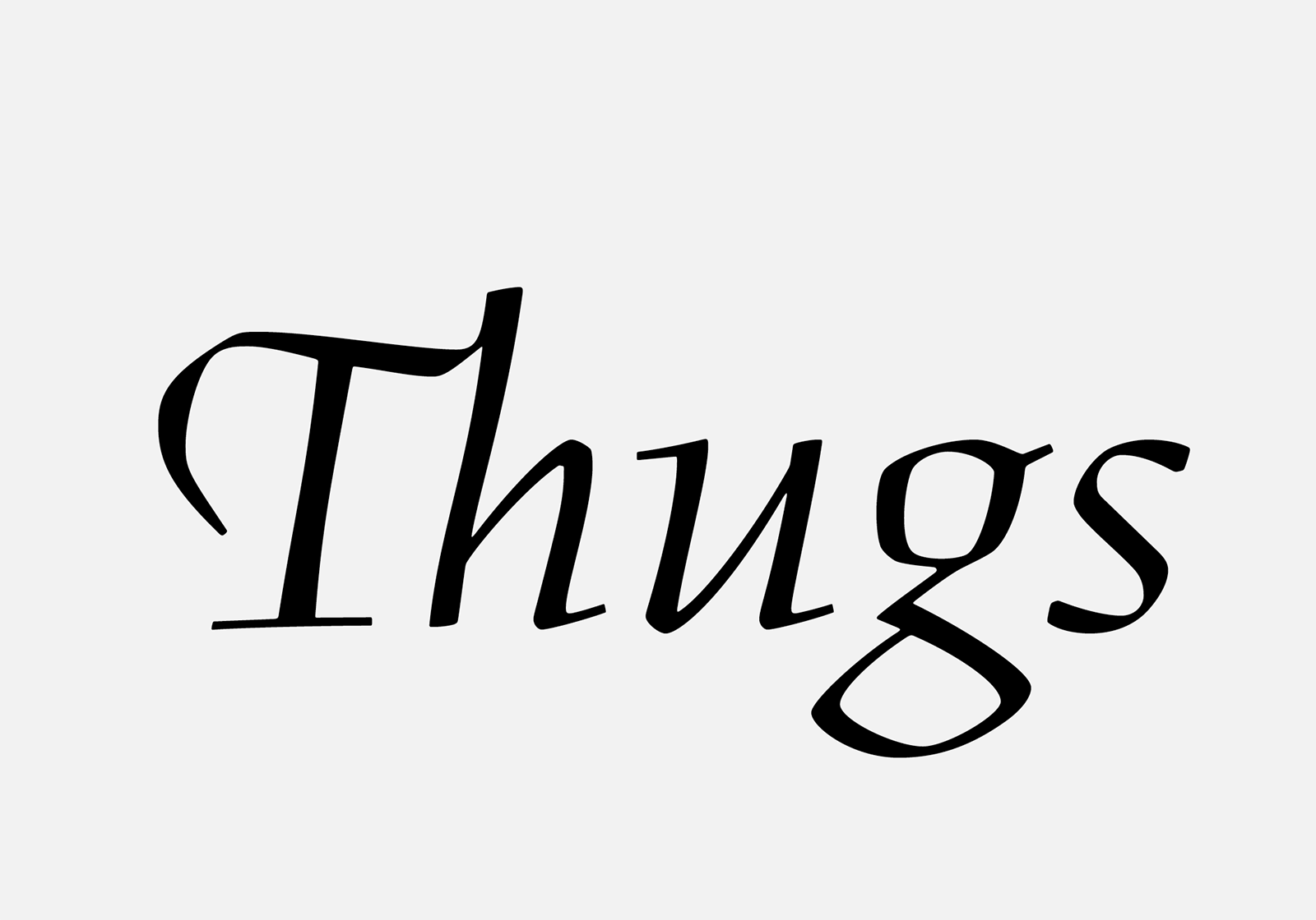
BC Figural
Figural is one of the most beautiful book typefaces of the 20th century. In its design, Menhart masterfully succeeded in applying refined calligraphic principles to a functional set of characters.
Figural Romana is a dynamic antiqua loosely based on historical Renaissance antiquas. Flat serifs without instrokes, often set in a slightly angled direction, are specific to Figural. Its calligraphic approach determines not only the way the main and secondary strokes alternate on a left-inclined letter axis, as well as the differentiated width proportions of individual letterforms. What’s remarkable is the carefully balanced bent shape of the stems, thinned in the middle parts and modeled by an energetic pen stroke. These barely visible irregularities lend life and strength to its letterform drawings. With their help, the letterforms’ outlines are stretched, and the drawing of the type gets a gentle rhythm and cadence, one which can never be achieved with a ruler or compass. The long ascenders and descenders and the relatively low x-height are also distinctive. Figural achieves an unusual dynamism and shape flexibility by idiosyncratically breaking the letterforms’ curved strokes. Also worth noting is the typical trailing placement of the dot above the i and j, hearkening back to Renaissance morphology.
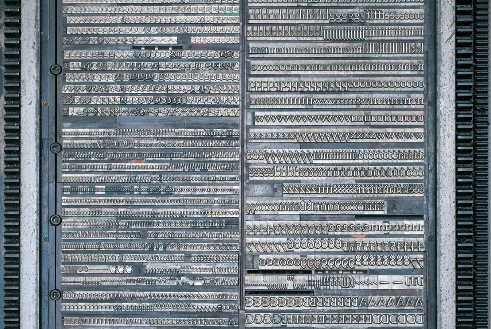
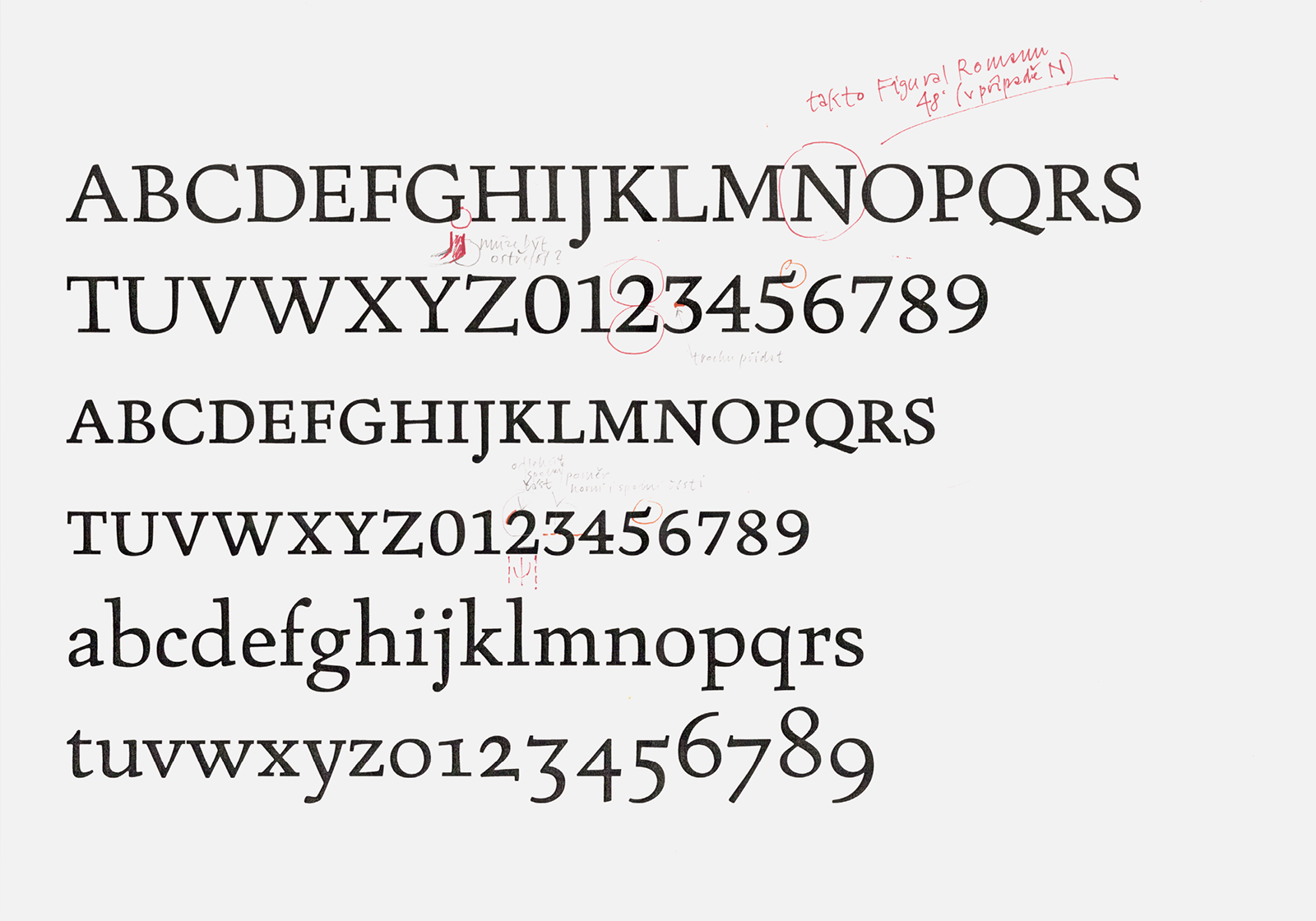
Hand typesetting from metal letters at 24 point size (Romana) and 12 point (Kursiva) from the letterpress workshop of the Academy of Arts Architecture and Design in Prague for print-proofs of the Figural typeface. Print by Jaromír Štoural.
Oldřich Menhart drew his version of Romana in 1940 (1), but did not present it publicly until March 1948, at his first artist’s exhibition, Písmařství a typografie [Letterforms and Typography], at Prague’s Hollar gallery. There he presented it as an untitled book type. In the following year, the type foundry of the State Printing Office in Prague released it as a typeface for manual typesetting in 8, 10, 12, 14, 16, 20, 24, 28, 36 and 48 point sizes. At the same time, they asked Menhart to supplement the roman with an appropriate marking italic. He promptly developed a draft of an italic that was released in 1949 in sizes from 8 to 28 point. Despite both designs being almost a decade apart, Menhart managed to create an absolutely harmonious type family imbued with a passion for handwritten expression.
![Photo of Oldřich Menhart handing over cards of Figural to the State Printing Office (its director Jan Noha is in the picture on the right), in his apartment at Nerudová street 44 in Prague, and pictures of Oldřich Menhart with the original drawings of Figural Kursiva, 1949. Photos from the preserved estate of Oldřich Menhart. Source: National Museum Library. [1] Photo of Oldřich Menhart handing over cards of Figural to the State Printing Office (its director Jan Noha is in the picture on the right), in his apartment at Nerudová street 44 in Prague, and pictures of Oldřich Menhart with the original drawings of Figural Kursiva, 1949. Photos from the preserved estate of Oldřich Menhart. Source: National Museum Library. [1]](https://oldrichmenhart.com/wp-content/uploads/2022/11/Figural_02-2-1-1.png)
Photo of Oldřich Menhart handing over cards of Figural to the State Printing Office (its director Jan Noha is in the picture on the right), in his apartment at Nerudová street 44 in Prague, and pictures of Oldřich Menhart with the original drawings of Figural Kursiva, 1949. Photos from the preserved estate of Oldřich Menhart. Source: National Museum Library. [1]
The Kursiva repeats the same drawing principles as the roman; it is understandably not just an inclined roman, but a completely separate design, one whose drawing refers to the character of Renaissance manuscripts, especially cancellaresca. Figural’s italic design is based on a lively drawing with a flexible flat pen. Curve-breaking and stem-bending are even more obvious here. The Kursiva has relatively narrow proportions, a pronounced tilt and an emphasized fixed upper base line in the minuscules, as can be seen in the shapes of c and s, and in the positioning of the unilateral serifs.
![Figural Obyčejný [Regular] and Figural Kursiva Ozdobná [Decorative] from the Vzorník Ručních písem [Typefaces for Manual Typesetting specimen book], including the scale of sizes they were produced in. Grafotechna n. p., 1950s. Figural Obyčejný [Regular] and Figural Kursiva Ozdobná [Decorative] from the Vzorník Ručních písem [Typefaces for Manual Typesetting specimen book], including the scale of sizes they were produced in. Grafotechna n. p., 1950s.](https://oldrichmenhart.com/wp-content/uploads/2022/11/Figural_03.png)
Figural Obyčejný [Regular] and Figural Kursiva Ozdobná [Decorative] from the Vzorník Ručních písem [Typefaces for Manual Typesetting specimen book], including the scale of sizes they were produced in. Grafotechna n. p., 1950s.
In 1960, Menhart supplemented the italic with decorative majuscules and ornaments for typesetting in bibliophilia. This set was commissioned by Grafotechna (2) and was released in 1962. The decorative shapes have a slightly darker drawing than the italic’s majuscules, which is more complicated and sometimes even gothic in character (as can be seen in the doubling of some letterforms’ strokes, spurs, and tails). But we’ll get to that later.
1. The first proofs of Figural Romana from the State Printing Office. Dated 12 March 1949. From the preserved estate of Oldřich Menhart. Source: National Museum Library. [2]
2. Typeface proof, printed by Jaromír Štoural of the letterpress workshop of the Academy of Arts Architecture and Design in Prague
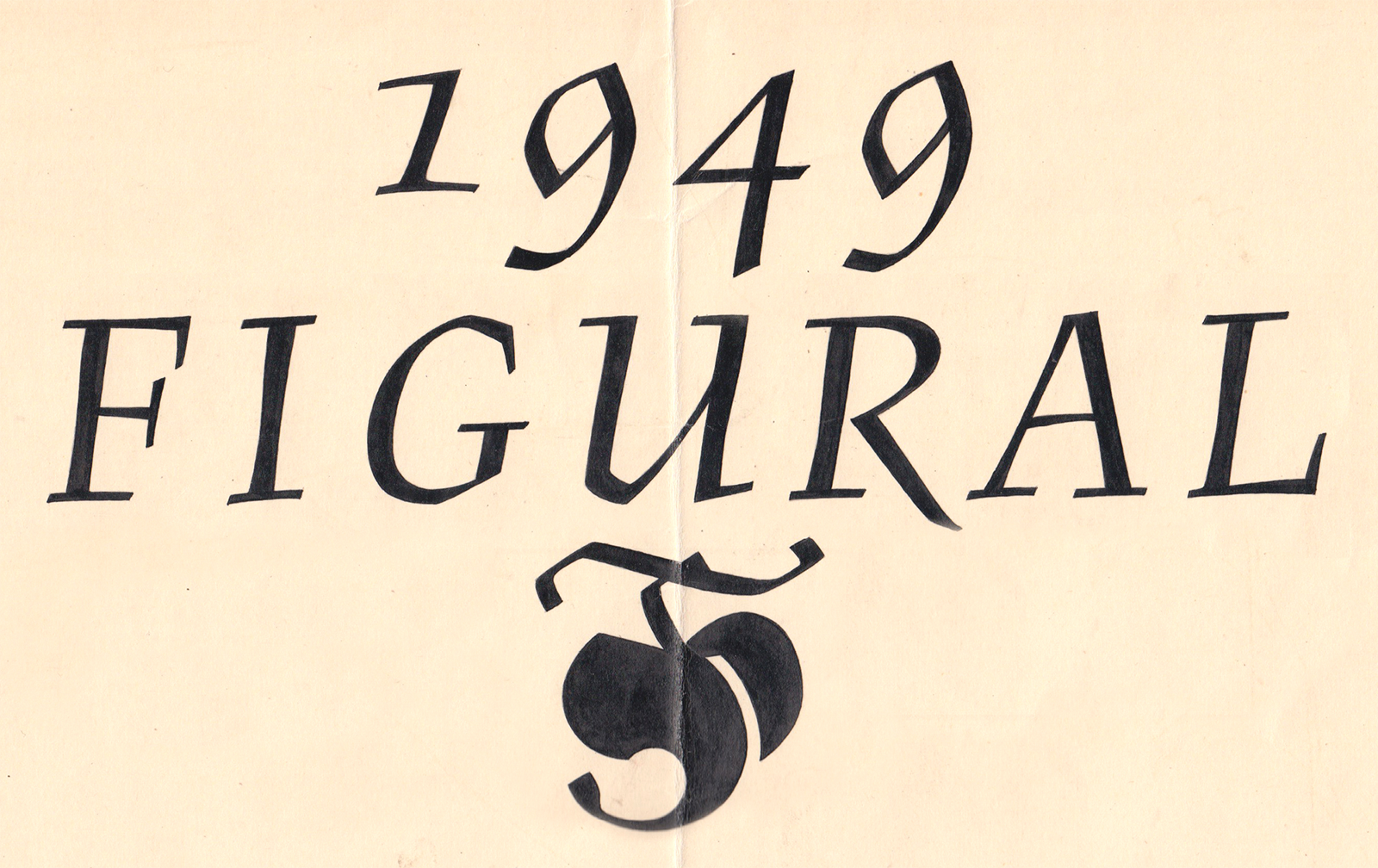
3. Ink drawing typeface design of Figural Kursiva, 1949, from the archive of Stanislav Maršo Jr.
Typographer Otakar Karlas prompted us to digitize Figural in 2017. The existing digital interpretation (3) is more of an approximation of Menhart’s original design, but we decided to try for a more responsible reconstruction of the original version based on the best available sources.
As part of the research, we compared all of the materials available to us: Menhart’s original cards with the pencil drawings of Figural Romana from the National Museum Archives; examples of his book Roman and Italic (Figural’s form) printed in the publication Nauka o písmu [Teachings On Type] from 1954; a type specimen and offer cards released by Grafotechna in 1973; a current print-proof of the typeface from the collection of the Academy of Arts Architecture and Design’s letterpress workshop; several examples of contemporary use of the typeface; and, for those who are interested, a sample of the digitized version of ITC Figural.
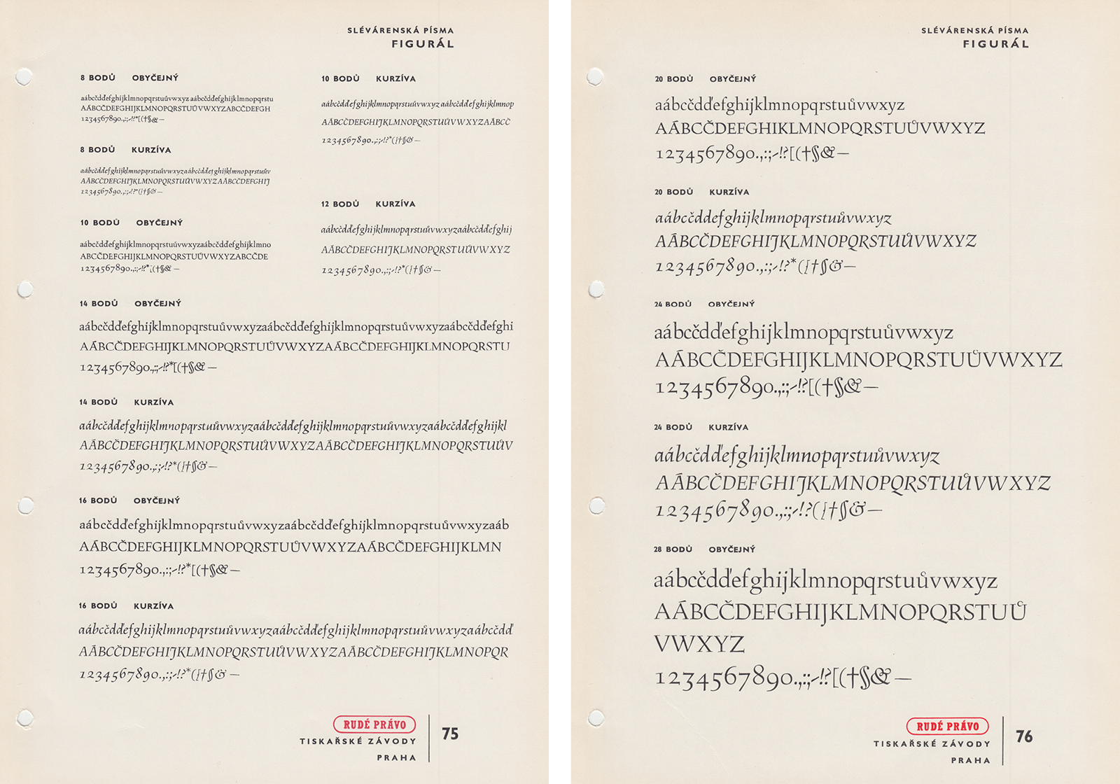
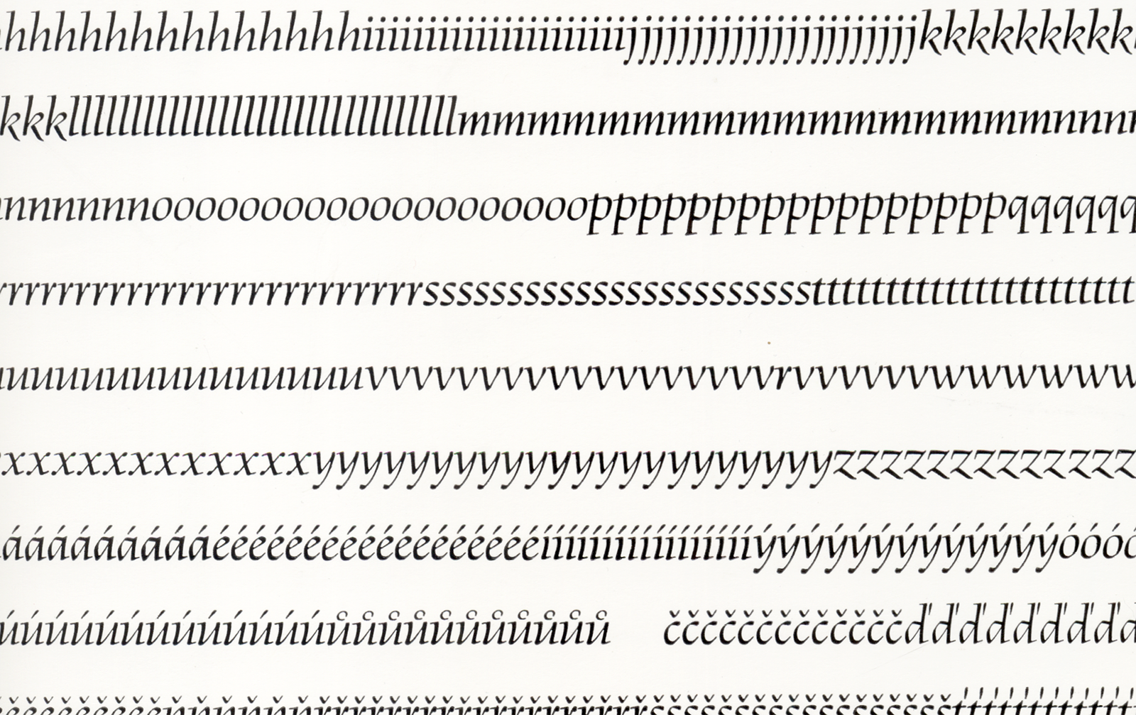
1. The original specimen of the Figural typeface shows the type in all sizes produced. Published by Grafotechna n. p., 1950s. Source: National Museum Library. [3]
2. Figural foundry typeface, specimen in Rudé Právo newspaper, 1950s.
The printed version of the typeface reveals the technological limits of converting drawings into metal. Despite the fact that the engravers did the best work possible, the wear on the typeface is noticeable. The serifs trap ink, occasionally break off, are insufficiently engraved, and the alignment of the letterforms is problematic. In manual typesetting, the letters were not ideally set on the base line. These distracting moments are more obvious at larger point sizes. In smaller sizes, the details are not as pronounced, and they do not hinder the flow of the text as much. Various characters’ tilt in different angles is especially disturbing in the case of the italic’s point sizes.
![Original pencil typeface designs of Figural Romana from the preserved estate of Oldřich Menhart. Source: National Museum Library. [4] Original pencil typeface designs of Figural Romana from the preserved estate of Oldřich Menhart. Source: National Museum Library. [4]](https://oldrichmenhart.com/wp-content/uploads/2022/11/Figural_06-1.png)
Original pencil typeface designs of Figural Romana from the preserved estate of Oldřich Menhart. Source: National Museum Library. [4]
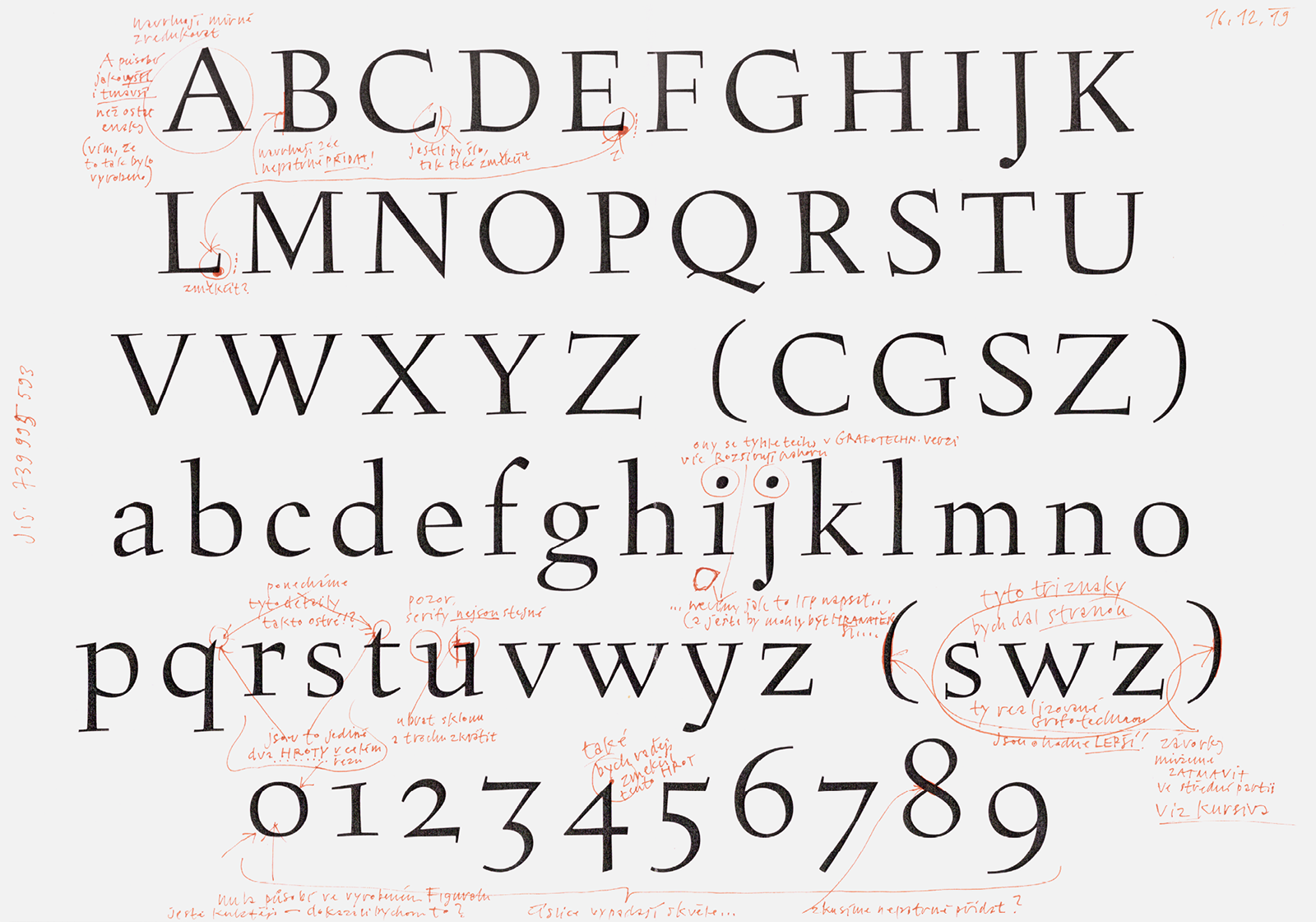
In order to reveal the true ambitions of Menhart’s drawings for Figural, we began by digitizing the Romana’s original drawings from cards intended for engraving in 1940 in the National Museum Archives. These cards contained precisely drawn outlines of the characters without a single distortion; they were placed clearly on the base line. The cards have drawings of majuscules, minuscules, figures, basic diacritics and punctuation. Unfortunately, we could not find the cards for the Kursiva. The pencil outline is highly accurate. Every letter was drawn entirely differently. There is not a single straight line in the typeface; ascenders and descenders end on a different line each time. The tilt of the serifs as well as their length are modeled individually, with no repeating regularity. The characters b, d, p, q, which are normally handled similarly in book type are drawn absolutely differently.
But transferring these original drawings into digital curves regrettably overemphasized Figural’s characteristic elements. The pleasing softness, elegance and calligraphic finesse as we knew it from the reproductions disappeared from the typeface. It seemed that we would have to bring some necessary softening to the font so that it could work naturally in text.
![The printed Romana book type and Kursiva are one of the source materials used for the digitization of the typeface. A table from Menhart’s publication: Nauka o písmu [Teachings on Type], State Pedagogical Publishing House, Prague 1954, pgs. 83–85. The printed Romana book type and Kursiva are one of the source materials used for the digitization of the typeface. A table from Menhart’s publication: Nauka o písmu [Teachings on Type], State Pedagogical Publishing House, Prague 1954, pgs. 83–85.](https://oldrichmenhart.com/wp-content/uploads/2022/11/Figural_07-1.png)
The printed Romana book type and Kursiva are one of the source materials used for the digitization of the typeface. A table from Menhart’s publication: Nauka o písmu [Teachings on Type], State Pedagogical Publishing House, Prague 1954, pgs. 83–85.
This is why in the second version we redrew Figural’s form from Nauka o písmu [Teachings On Type], which appears much rounder but also darker. Together with the italic, it is reproduced in the publication at roughly four cicero size (48 point), so we redrew both versions at the same time. The most visible changes from the roman print typeface are borne by the characters C, G and S without an upper serif, the w without a serif in the middle, and certain figures. All of the characters’ serifs are inclined at a greater angle and more relaxed, with a more pronounced rounding as well as fine instrokes. In the case of the italic, the characters without extended feets and swash tails (K, R, k, and z) are especially different than the printed version.
In our opinion, the figures digitized from the drawn materials in Menhart’s original designs and according to the table in Nauka o písmu [Teachings On Type] were not yet entirely ideal. This is why we tried to redraw the figures from the printed version from Grafotechna at the largest size. This is when an important moment occurred. It was only when we got to the figures that we saw that they have the right ductus, but it is especially their modeling that accurately captures Figural’s character. This was the ideal Figural we sought to digitize. Our attempts to redraw the “original” logically relied on the produced materials, and merely showed us what process the type must have gone through during production before it reached the optimal form produced by the State Printing Office.
![Corrections to the old style figures for the Figural Romana typeface. Top row: the dark figures are digitized from Nauka o písmu [Teachings On Type]. Middle row: Digitized according to Grafotechna’s specimen book. Bottom row: It has an ideal ductus and morphology, which we used to derive the shape of the characters. Corrections to the old style figures for the Figural Romana typeface. Top row: the dark figures are digitized from Nauka o písmu [Teachings On Type]. Middle row: Digitized according to Grafotechna’s specimen book. Bottom row: It has an ideal ductus and morphology, which we used to derive the shape of the characters.](https://oldrichmenhart.com/wp-content/uploads/2022/11/Figural_08.png)
Corrections to the old style figures for the Figural Romana typeface. Top row: the dark figures are digitized from Nauka o písmu [Teachings On Type]. Middle row: Digitized according to Grafotechna’s specimen book. Bottom row: It has an ideal ductus and morphology, which we used to derive the shape of the characters.
In this way, prints of the type from Grafotechna’s specimen book became the template for the third redrawing. For the roman, we used 48 point, the largest size that was cut. For the italic, unfortunately, the largest size available was 28 point. During the digitization of both styles, we concentrated on the basic architecture of the characters. We reworked the shape and thickness of the serifs several times, as well as their alignment on the base line, for all characters at the same time. The stems’ varying thickness has been slightly unified, as have the lengths of the ascenders and descenders.
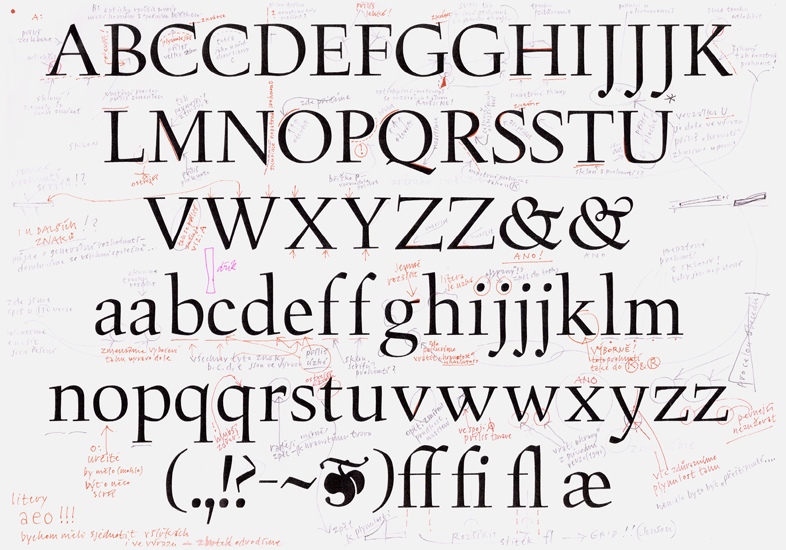
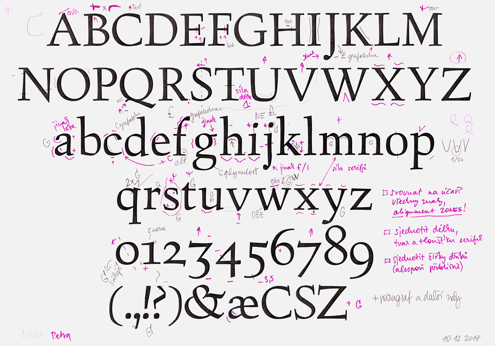
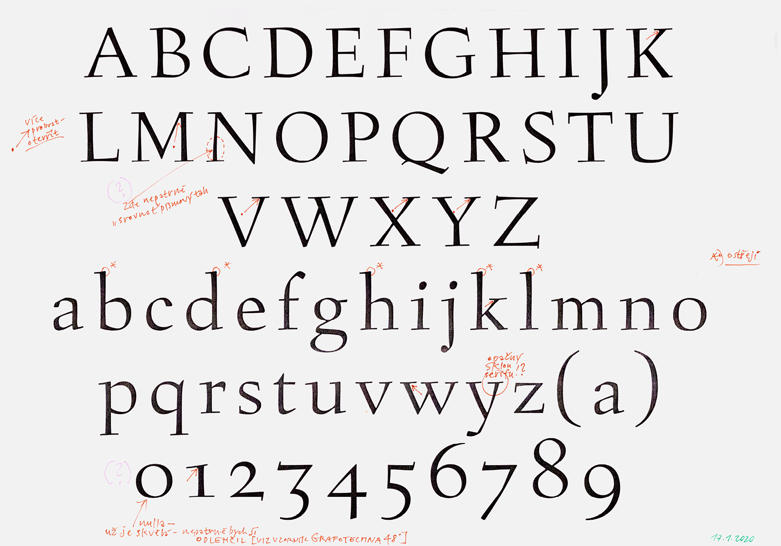
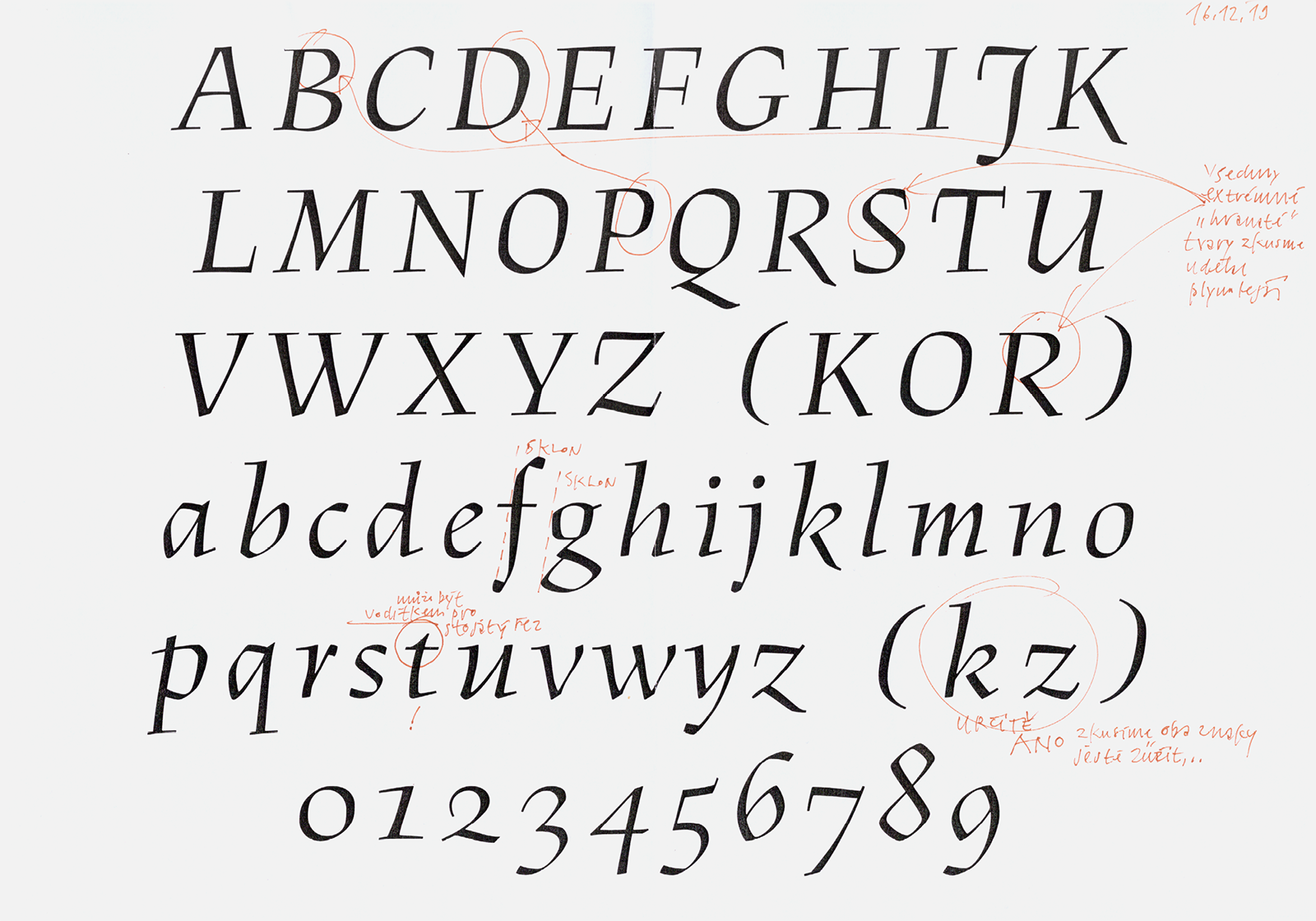
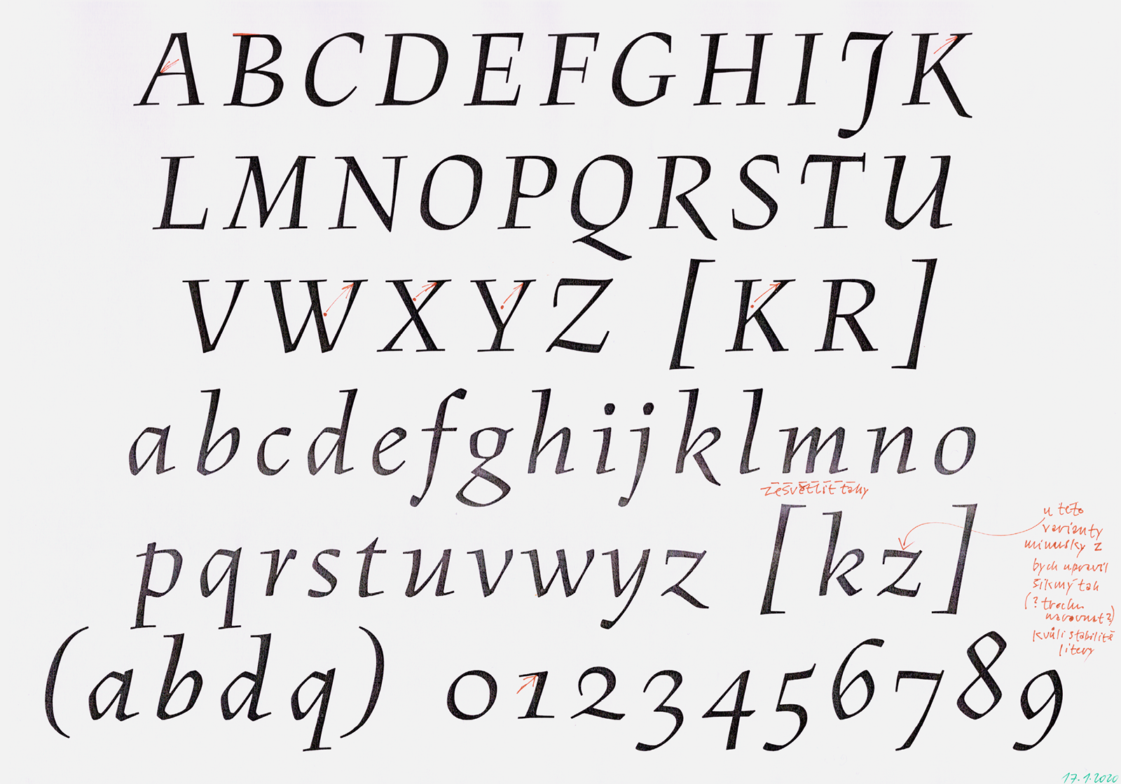
A series of corrections to the Figural typeface which led to researching and creating the so-called “authentic version.” The oldest revisions are dated December 10, 2018.
We also redrew the basic ligatures, punctuation marks and diacritics so that we could set a paragraph of longer text, and because of this we were finally able to try out a combined typesetting. We had to compare pronounced and surprising differences in height, boldness and drawing so that both weights appeared compatible. Due to the fact that the italic was redrawn from a 28 point original, it naturally belonged to the 28 point roman weight. For the 48 point roman equivalent which we had already created, the ductus of the italic gave a darker impression, which is why we had to significantly lighten the entire character set.
![The gradual development of the digital curves of the Figural Romana typeface. 1) Digitization of drawings from the cards, 2) Digitization according to Nauka o písmu [Teachings On Type], 3) Digitization from the Grafotechna type specimen, 4) Version 4.0, 5) Version 5.2, 6) Version 9.0. The gradual development of the digital curves of the Figural Romana typeface. 1) Digitization of drawings from the cards, 2) Digitization according to Nauka o písmu [Teachings On Type], 3) Digitization from the Grafotechna type specimen, 4) Version 4.0, 5) Version 5.2, 6) Version 9.0.](https://oldrichmenhart.com/wp-content/uploads/2022/11/Figural_10.png)
The gradual development of the digital curves of the Figural Romana typeface. 1) Digitization of drawings from the cards, 2) Digitization according to Nauka o písmu [Teachings On Type], 3) Digitization from the Grafotechna type specimen, 4) Version 4.0, 5) Version 5.2, 6) Version 9.0.
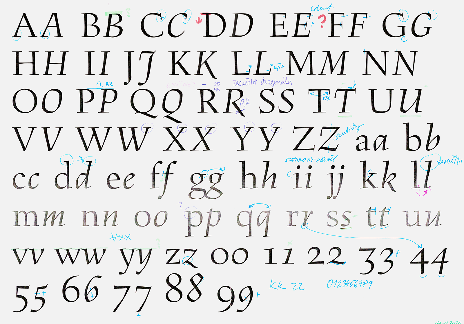
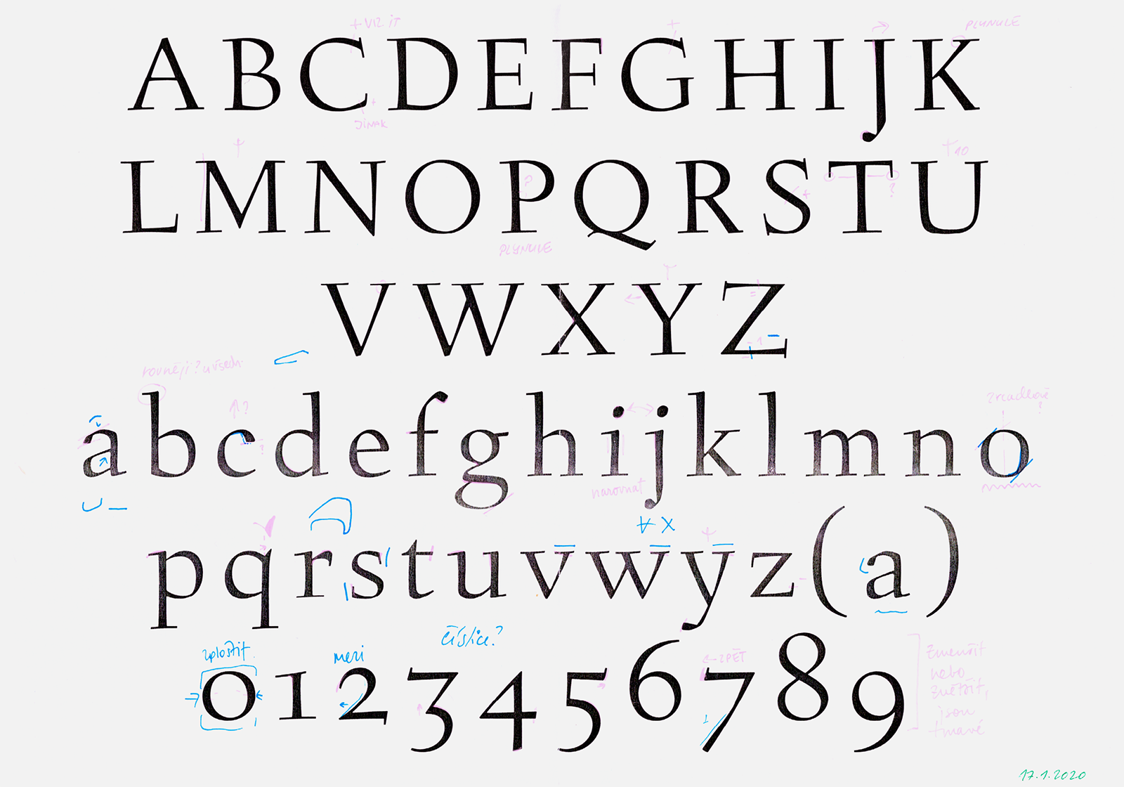
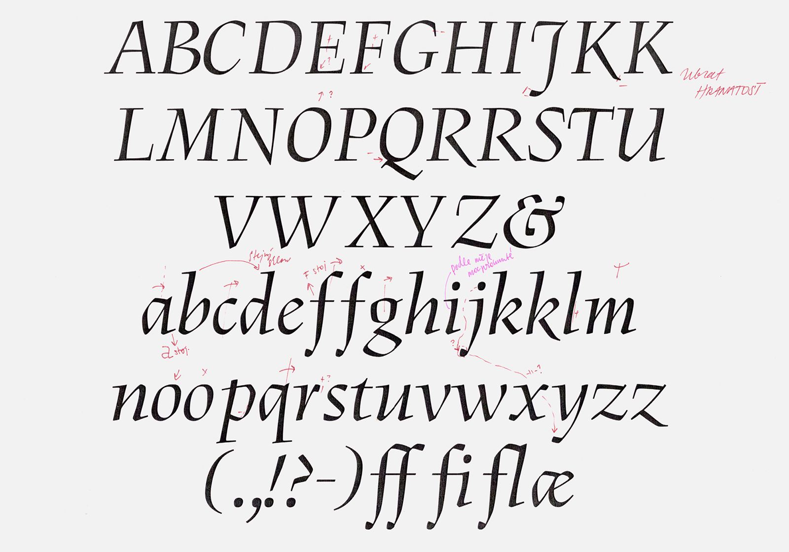
A series of corrections between Romana and Kursiva masters, in which differences in the heights of the characters, thickness of the stroke, proportions and incline angle can all be seen.
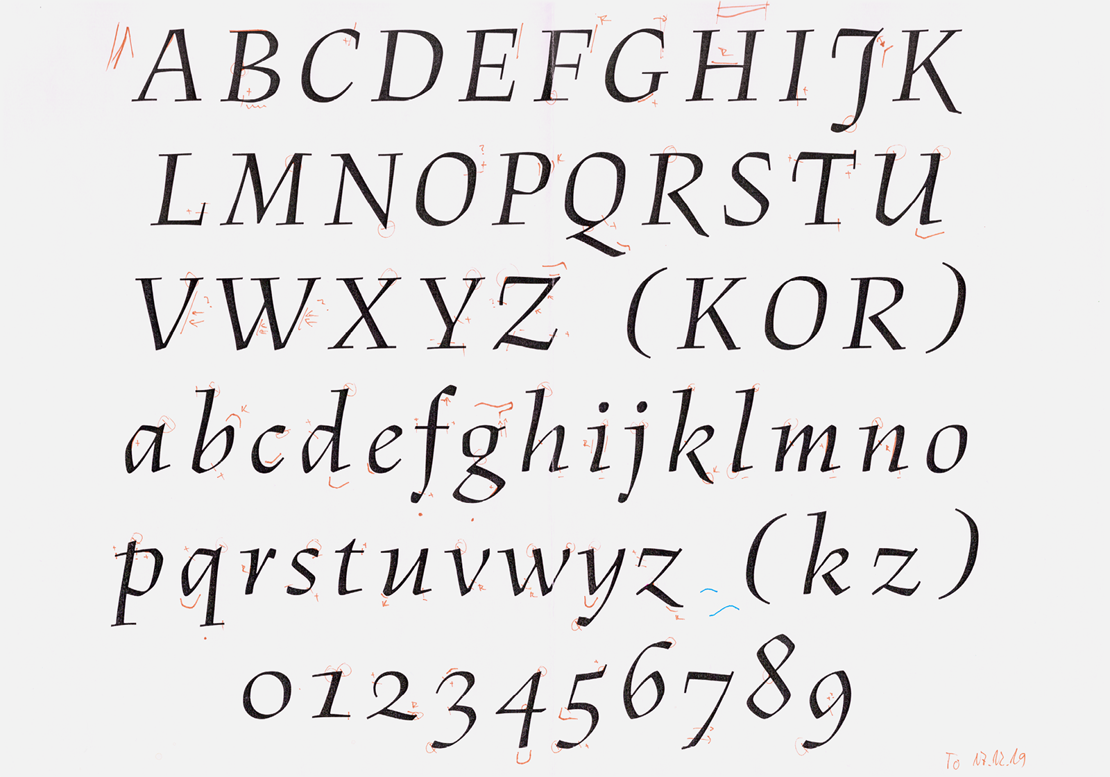
All of the italic’s problematic places showed themselves in text typesetting – uneven proportions of characters, too large an amount of stem angles and thicknesses of the strokes, and a non-uniform placement on the base line, and uneven overshoots. The goal of the modifications was to make the italic appear as harmonious as possible, although we still sought to intentionally leave slight irregularities, so as to preserve the lively and distinctive character of the typeface. This is why there were a huge number of changes in the drawing. At this stage, we had already decided that for both typefaces we would, in the words of Otakar Karlas, “make the Figural better.” The definitive drawing of Figural is a synthesis of the best of all available originals and redrawn variants. This was followed by the setting and adjustment of metrics which we determined according to typeset print-proofs from equipment in the workshop of the Academy of Arts Architecture and Design in Prague. With this, we completed work on Figural in headline master corresponding to 48 point size in both roman and italic.
A series of corrections to Figural Kursiva.
As we mentioned in the introduction, the creation of a digitized version of Figural was initiated by typographer Otakar Karlas. His intention was to publish a reprint of Jan Tschichold’s Prague lecture ‘The Importance of Tradition in Typography,’ which was originally published by Střední průmyslová škola grafická [Industrial School of Graphic Arts] in 1965. For this purpose, however, it was necessary to start thinking about a text size because it was obvious that our digitized version is too contrasty, detailed, fragile and sharp for setting at smaller point sizes. That’s why we decided to create a variable font which would correspond to the true appearance of the original prints engraved in metal at the given size. For compatibility reasons, we used the drawing of the headline master as the basis for the second master for the smallest text size, corresponding to 8 point.
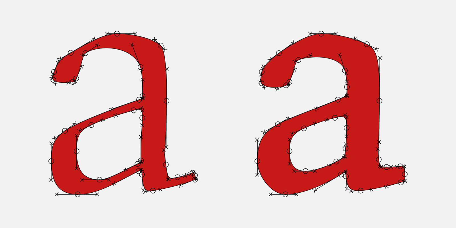
Differences in the drawing of Figural’s optical point sizes. The strengthening of strokes and rounding of the corners of the Petit weight is so pronounced that the typeface appears soft and harmonious at 8 point, as opposed to the Grand display weight.
We strengthened the mass of the stems, calmed down and suppressed their calligraphic modeling by straightening them. We made all of the horizontal serifs stronger and placed them on the base line, emphasized their instrokes and made all the curves more rounded. The minuscules have undergone a more significant change. A completely new character modeling is typical of the 8 point size; the a, for example, has a completely differently shaped bowl, bulbous terminal, upper instroke and serif. For the greatest possible accuracy in this sensitive process, we used a magnifying glass, a microscope and macro images of individual letters printed in various quality on different papers and compared how the individual sizes differed from each other. Our interpretation of the text size therefore represents an intersection of sorts of the shape designs that came the closest to the authenticity of the original Figural, while at the same time fulfilling our aesthetic and technical requirements for a typeface for setting small text.
A series of corrections to the text and small sizes of Petit, including small caps and adequate figures.
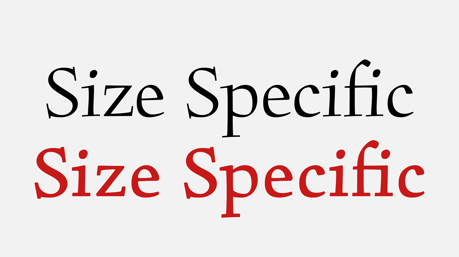
Grand and Petit weights for use at different sizes. The Petit weight even has a looser metric.
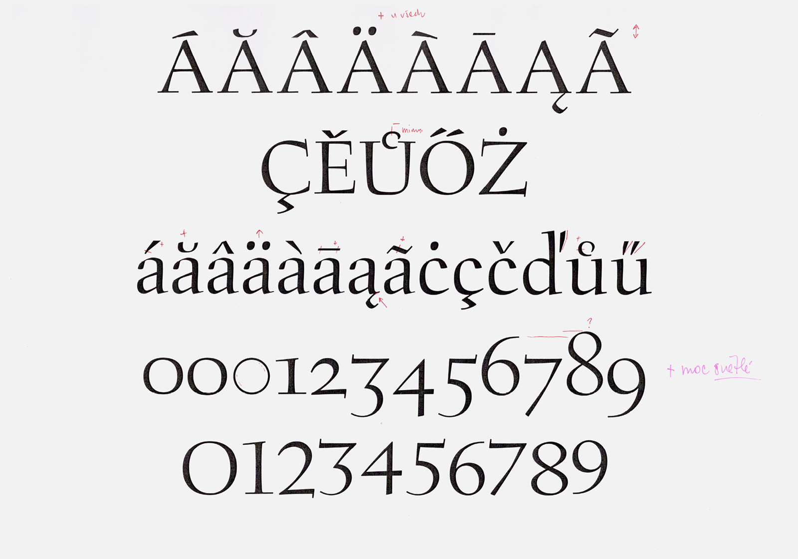
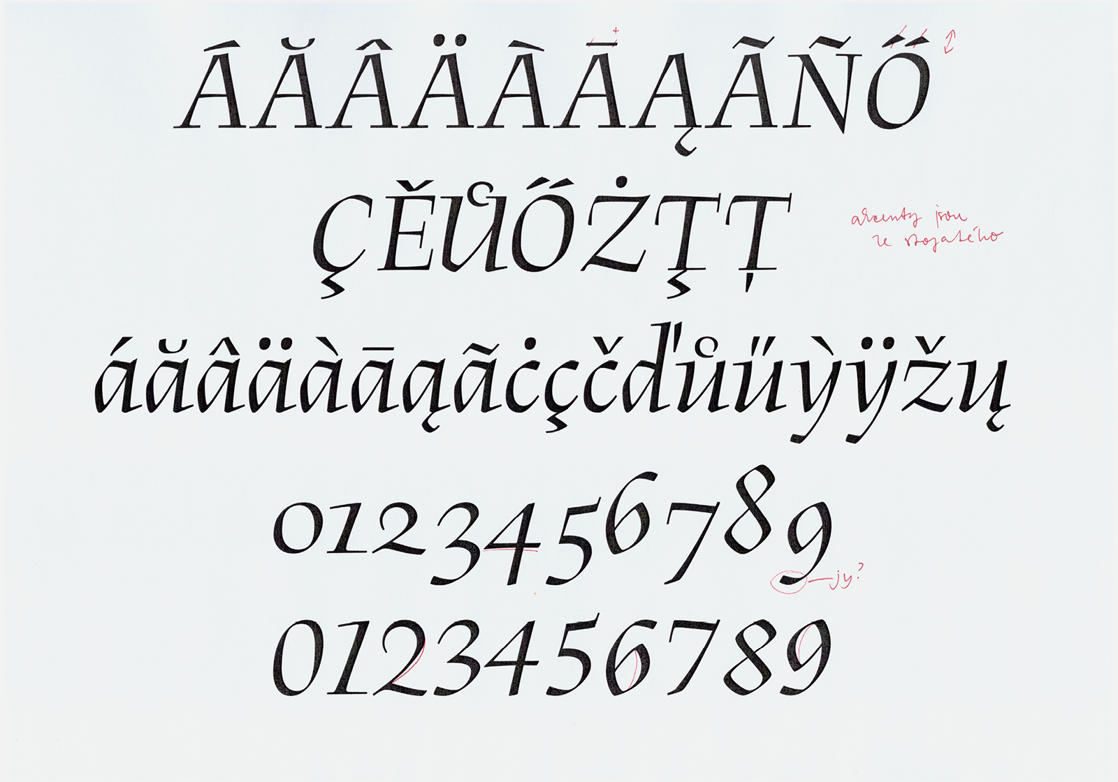
As soon as the drawing of the second optical master was stabilized, we were able to start completing the character set. We had to create a set of majuscule figures, from which we could derive the index forms and fractions. We drew a whole range of accompanying characters, from mathematical and currency symbols to paragraph symbols and parentheses that maintain Menhart’s signature thin strokes. Logically, we added small caps to all masters. For the accents, which respected Menhart’s original design, we had to make many changes to their shapes, sizes, and placement. In the end we drew the remaining ligatures and their accented variants.
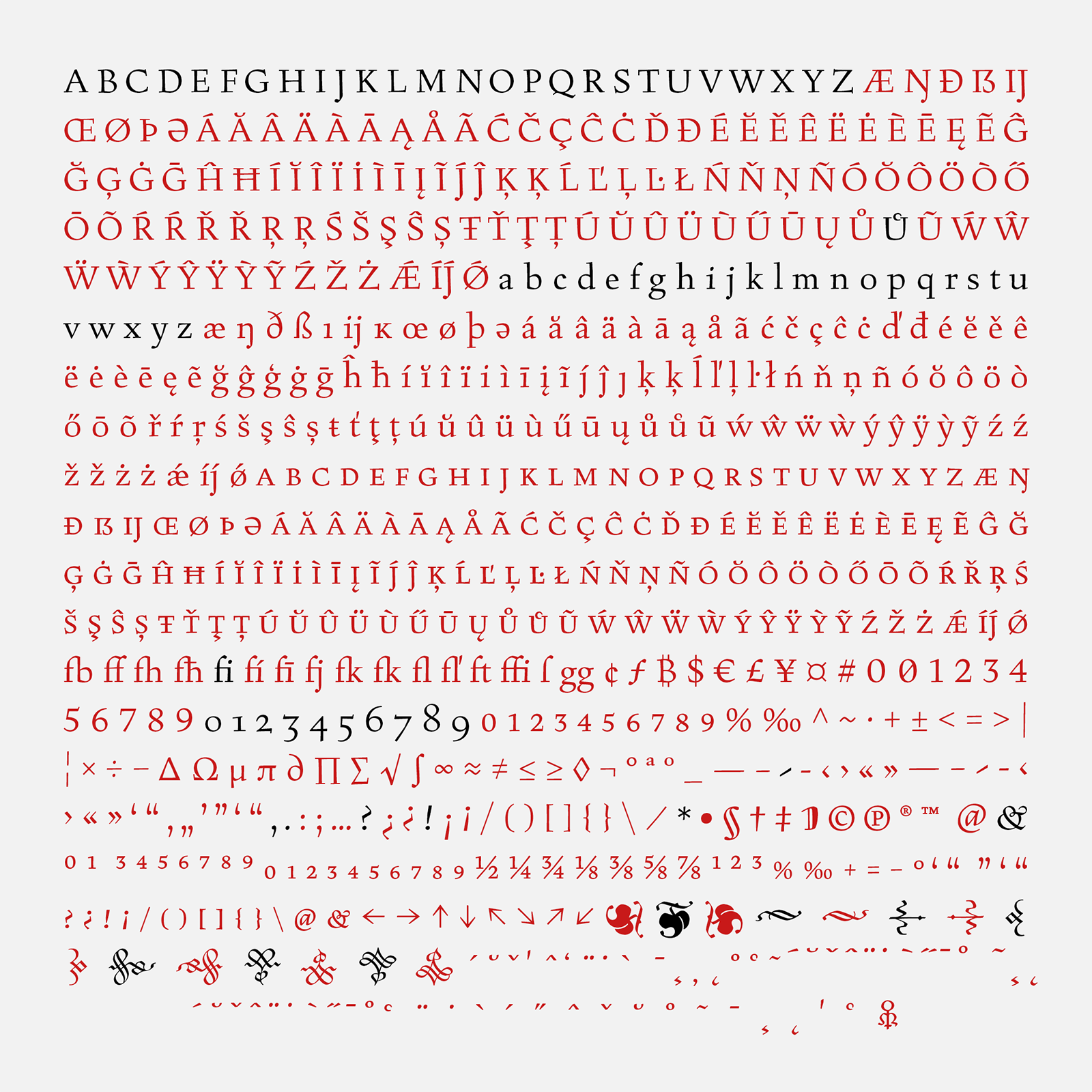
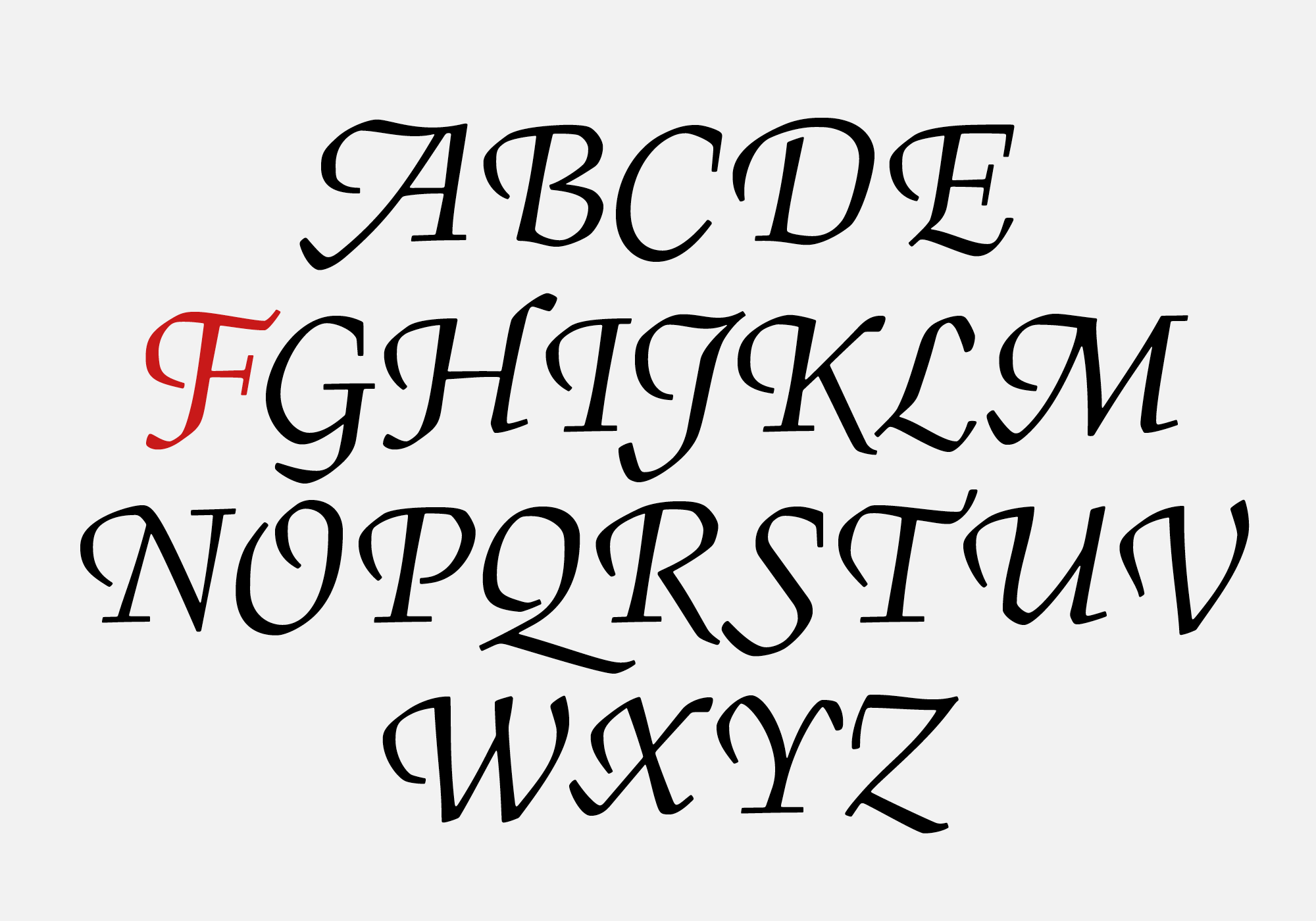
The complete character set of BC Figural Romana. Menhart’s original design contained 88 drawings (marked in black); we added 250 newly created characters (the red ones) to the set and created around 360 additional glyphs. For the Figural Kursiva typeface, decorative swash majuscules and their accented components complete the character set.
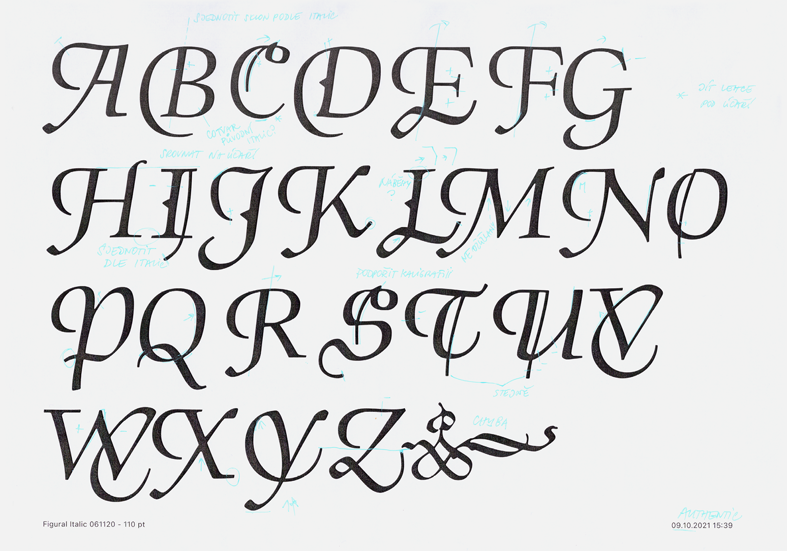
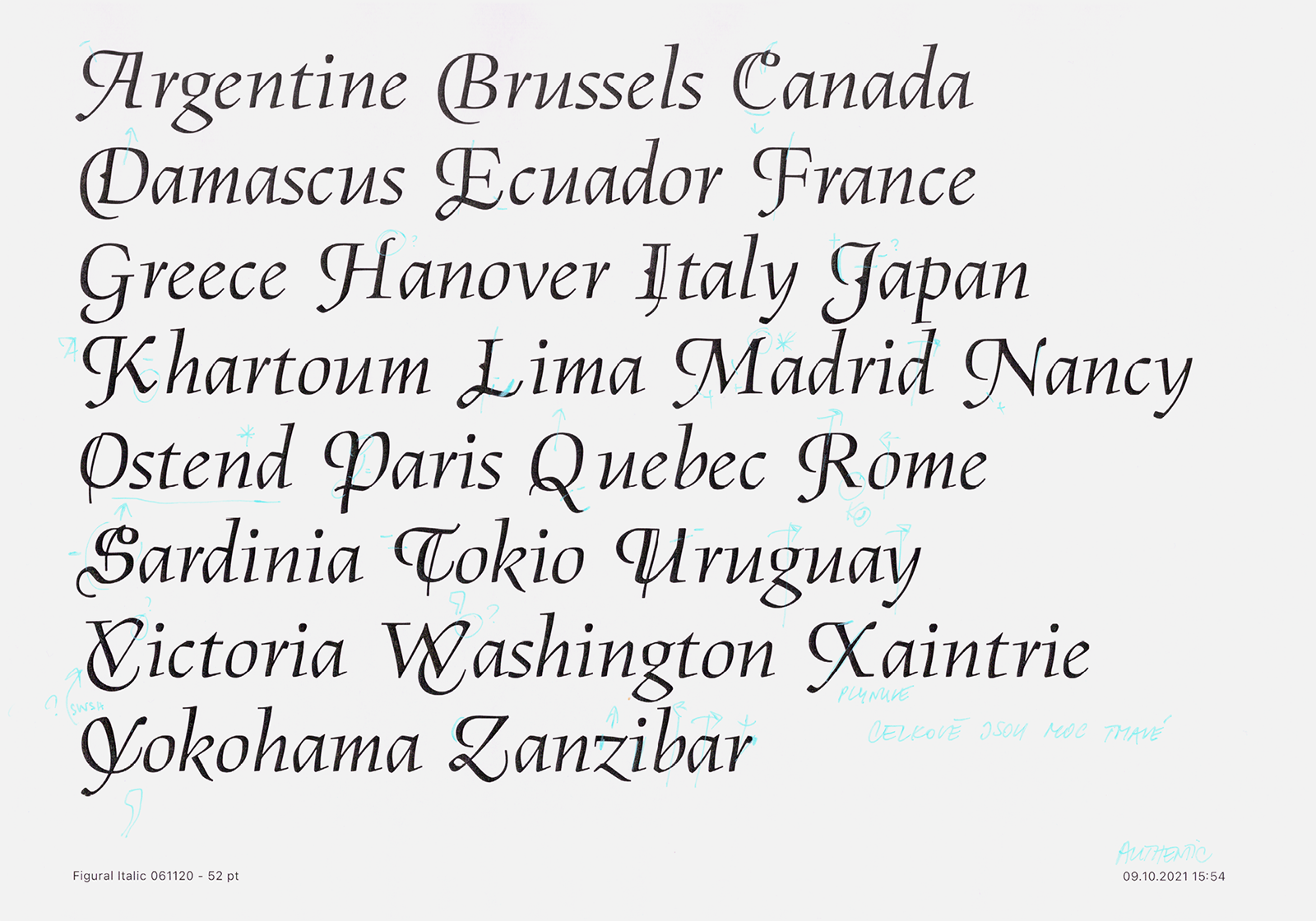
At the very end, we somewhat reluctantly returned to the design of decorative majuscules in the Kursiva, which until that point we had managed to ignore. Nevertheless, we carefully digitized all of the cards from the National Museum Archives, and tried to add them to the italic. Unfortunately, they could not have been further from the nature of the italic’s chiseled, elegant design. They contain inconsistent instrokes, rough tilts, strange loops and archaisms in the form of spurs and lines. We therefore decided to design our own, more up-to-date version of the decorative swash letters that develop and expand the calligraphic potential of the entire Figural, in a contemporary and fresh spirit. Our decorative initials are based on the drawing of the majuscules; their tails and loops quote Menhart’s breaking strokes and their tilt fits better to the characters that connect to them. They represent our own ode and tribute to Menhart’s legacy.
A series of corrections to the original decorative majuscules designed by Oldřich Menhart, which we rejected, as well as new forms we continued to develop.
The new decorative majuscules are based on the original calligraphic principles of Kursiva, and do not contain any historicisms except a newly-formed swashes.
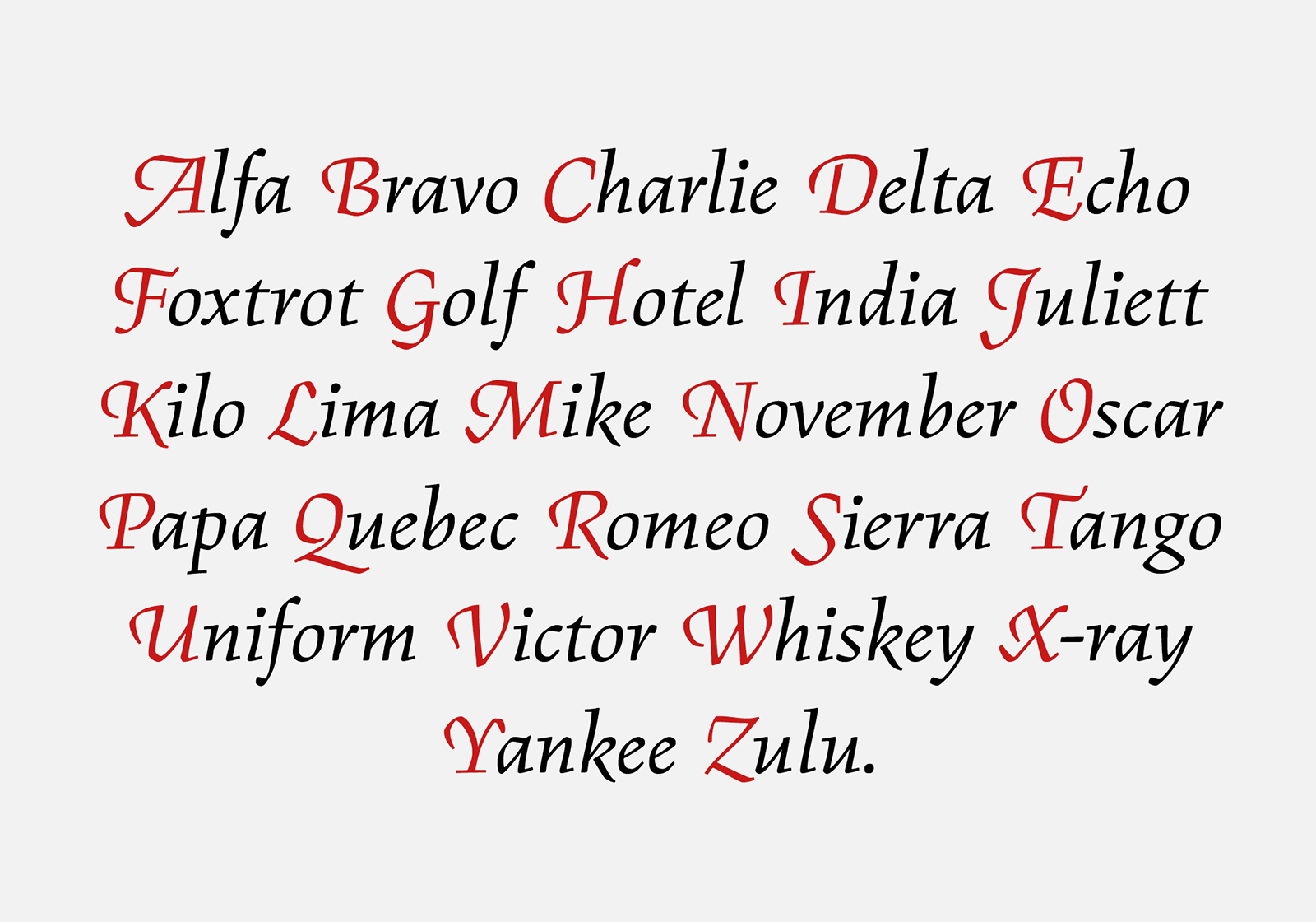
The decorative shapes of the majuscules are part of the italic in both optical masters. In addition to the variable font family, we have created a conventional set of optical sizes, including the corresponding italics – Grand for setting headlines, Regular and Italic for regular text typesetting, and Petit for use at the smallest sizes.
1) According to his findings, Otakar Karlas believes the typeface was commissioned by the Břevnov Monastery in Prague in 1940. Although Menhart was the designer of two typefaces produced by foreign type foundries, he had not received any significant typeface commissions at the time.
2) In February 1948, a communist coup d’etat took place in Czechoslovakia—the transition from democracy to totalitarianism that led to the country joining the Soviet bloc. As a result of this, one of the things that began was the transition of private property to common ownership by the totalitarian state. At the request of employee committees, all local type foundries—Slévárny písem, a.s., Slévárny Státní tiskárny and the state-owned company Mír were merged into a single company and type foundry. Thus in 1951 the state-owned Grafotechna was established.
3) ITC Figural was created by the Letraset Type Studio in 1992. It was digitized by Michael Gills under the direction of Colin Brignall. The font includes the weights Book, Book Italic, Medium and Bold. The typeface’s calligraphic character was deliberately suppressed.
[1] National Museum Library, book culture department, Typografika collection, inv. no. TYPO Menhart 63_1; TYPO Menhart 63_3, typography: Figural, 1949.
[2] National Museum Library, book culture department, Typografika collection, inv. no. TYPO Menhart 50-1, typography: Figural, 12 March 1949.
[3] National Museum Library, book culture department, Typografika collection, inv. no. TYPO Menhart 53-1_1–8, typography: Figural, 1950s.
[4] National Museum Library, book culture department, Typografika collection, inv. no. TYPO Menhart 47-1,2_1; TYPO Menhart 48-27,28_1; TYPO Menhart 48-31,32_1; TYPO Menhart 49-3,4_1; TYPO Menhart 49-11,12_1; TYPO Menhart 55-6_1; typography: Figural, 1940.


![The first proofs of Figural Romana from the State Printing Office. Dated 12 March 1949. From the preserved estate of Oldřich Menhart. Source: National Museum Library. [2] The first proofs of Figural Romana from the State Printing Office. Dated 12 March 1949. From the preserved estate of Oldřich Menhart. Source: National Museum Library. [2]](https://oldrichmenhart.com/wp-content/uploads/2022/11/Figural_04_01.png)
![The original specimen of the Figural typeface shows the type in all sizes produced. Published by Grafotechna n. p., 1950s. Source: National Museum Library. [3] The original specimen of the Figural typeface shows the type in all sizes produced. Published by Grafotechna n. p., 1950s. Source: National Museum Library. [3]](https://oldrichmenhart.com/wp-content/uploads/2022/11/Figural_05_01.png)
