BC Monument
Monument is Menhart’s extraordinary artistic interpretation of majestic capitals. The typeface bears all of the features of ancient Roman monumental inscriptions carved in stone.
In 1949, Oldřich Menhart was the graphic designer of publication “Satyr”, a set of lithographs by Max Švabinský accompanied by poems by Victor Hugo, for the Sfinx publishing house. He calligraphed the title page and several dividing pages in a majestic shadowed capital letters. This work was so warmly received by the expert community that even Jan Tschichold called on him to develop this study into its own typeface. So in 1950, Menhart completed the design of the Monument typeface, which was released in 1953 by the Grafotechna type foundry in four sizes: 24, 28, 36 and 48 point.
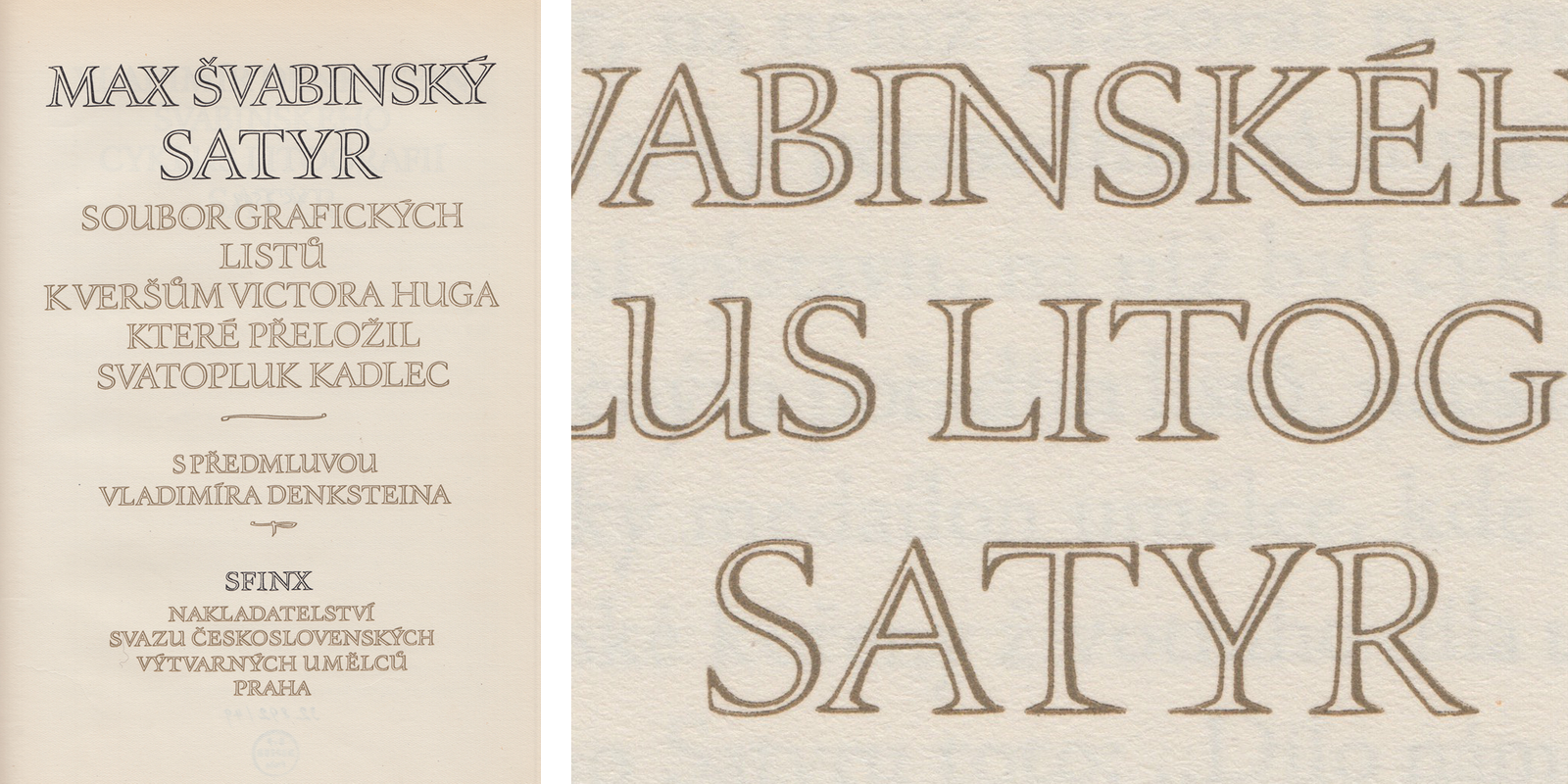
Title and divider pages of the Satyr publication including Menhart’s title inscription with unusual ligatures and his characteristic shadowing. Published by the Sfinx publishing house in Prague, 1949.
Monument’s letterforms were designed for extraordinary book titles and ceremonial diplomas. As the name suggests, Monument’s proportions are derived from monumental Roman inscription letters, first sketched with a flat brush and then chiseled into stone. Monument is Menhart’s artistic interpretation of highly calligraphic capitals. Monument’s double shadowed stroke gets its character from a writing instrument – a double nib pen – which Menhart knew how to write with brilliantly. The sculptural impression enabled by this shadowing also emphasizes the overall lightness of the typeface. Another of Monument’s characteristic details is its long, pronounced and flat serifs, mostly without instrokes.
![Monumental Roman capitals, the basis for Monument’s proportions. A table from Menhart’s publication: Nauka o písmu [Teachings on Type], State Pedagogical Publishing House, Prague 1954. Monumental Roman capitals, the basis for Monument’s proportions. A table from Menhart’s publication: Nauka o písmu [Teachings on Type], State Pedagogical Publishing House, Prague 1954.](https://oldrichmenhart.com/wp-content/uploads/2022/10/Monument_02.png)
Monumental Roman capitals, the basis for Monument’s proportions. A table from Menhart’s publication: Nauka o písmu [Teachings on Type], State Pedagogical Publishing House, Prague 1954.
Monument was the fourth typeface in our series of digitizations. On the surface, it seemed like an easy task – only a majuscule character set with semi-old-style figures and basic punctuation. For the digitization process, we used Grafotechna’s type specimen book and especially scans of cards mounted on boards from the archive of the National Museum Library. While studying the cards in greater detail, we discovered that Monument’s designs exist in two decidedly different versions: Pencil and ink. When compared to the largest 48 point size in the Grafotechna specimen book, the version with ink was the first to be produced, followed by interventions that toned down the drawing. The pencil version on the cards is the final one; it is identical to the version produced by Grafotechna.
![The original type specimen of the Monument typeface presents it in all sizes produced. Published by Grafotechna n. p., 1950s. Source: National Museum Library. [1] The original type specimen of the Monument typeface presents it in all sizes produced. Published by Grafotechna n. p., 1950s. Source: National Museum Library. [1]](https://oldrichmenhart.com/wp-content/uploads/2022/10/Monument_03_1-1.png)
The original type specimen of the Monument typeface presents it in all sizes produced. Published by Grafotechna n. p., 1950s. Source: National Museum Library. [1]
![The original pencil and ink typeface designs for Monument from the estate of Oldřich Menhart, 1950. Source: National Museum Library. [2] The original pencil and ink typeface designs for Monument from the estate of Oldřich Menhart, 1950. Source: National Museum Library. [2]](https://oldrichmenhart.com/wp-content/uploads/2022/10/Monument_04.png)
The original pencil and ink typeface designs for Monument from the estate of Oldřich Menhart, 1950. Source: National Museum Library. [2]
From the very start, we thought of Monument as a majuscule typeface, one without minuscules and with a limited character set. As a headline font, it will be especially suitable for use from 48 point and up, which is why we decided not to soften the way its fine, rounded corners are drawn at all; we left the edges completely sharp. We are of the opinion that Menhart would have wanted it that way, had the technical possibilities of the time permitted it for him.
With the authentic redrawing, it was obvious that there is a difference in the thickness of the outlines – some characters are optically lighter, some are darker (especially for the diagonal in the characters A, N, W, Z, the length of the shadow literally catches your eye). We therefore set the thickness of the monolinear outline mechanically, which we then modeled. Then we compared the axis and tilt of the characters, their height and width proportion.
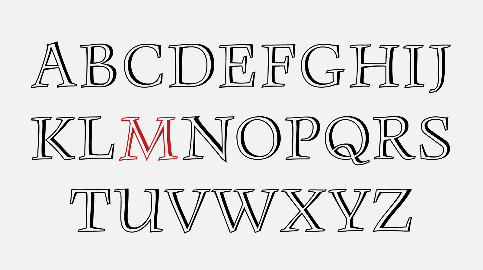
The first digital redrawing of the Monument typeface’s character set, based on pencil drawings. We call this version “authentic” because we did not intervene at all.
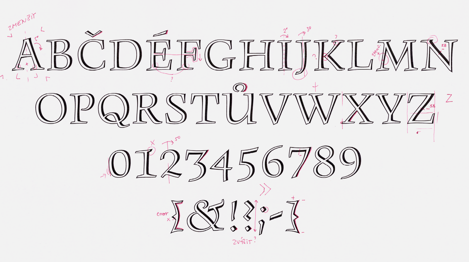
A few of the many corrections made to the authentic version.
We estimated the spacing and metrics according to Grafotechna’s type specimen book. It wasn’t until we looked at the case of cast type in the letterpress workshop of the Academy of Arts Architecture and Design in Prague that we realized that the Grafotechna type specimen book used a significant number of thins and space gaps when typesetting so that the typeface looked lighter and more ceremonial. In the cast typeface, the edge of the letter ends close to the edge of the bulb, so the type’s optical alignment is tighter.
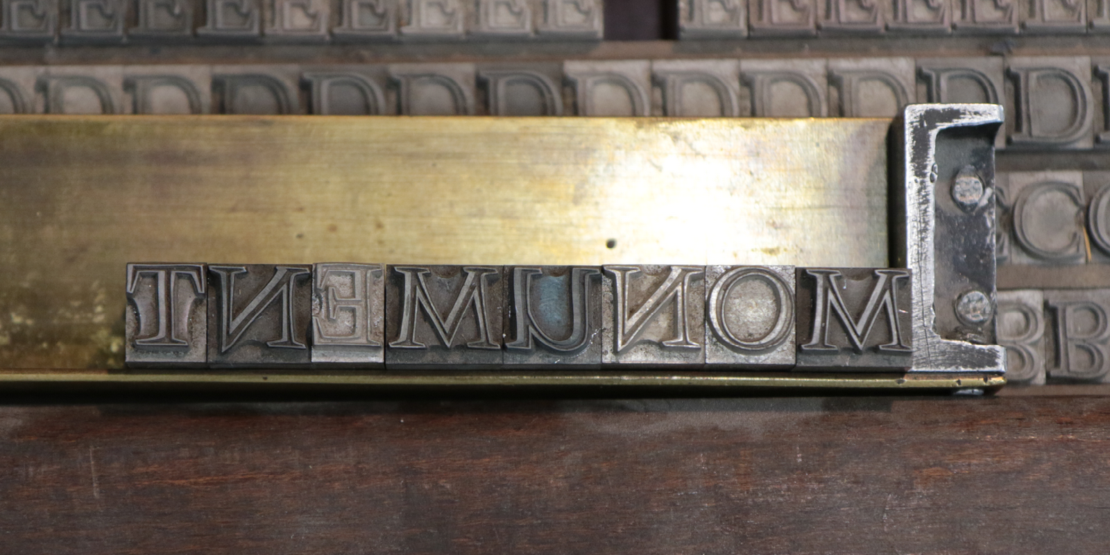
Metal letters for manual typesetting at 48 point from the letterpress workshop of the Academy of Arts Architecture and Design in Prague. The width of the bulb is determined by the width of the letter itself.
Menhart favored semi-oldstyle figures, and he created them for Monument as well. In this case, however, they were oddly perched on the base line, even though they were positioned exactly as we found them on the cards. But when we compared them to the metal type, we found that the figures were supposed to be set in a standard manner, so we adjusted their placement accordingly. These oldstyle figures look good especially on their own, for example when displaying years. However, for better inclusion in line typesetting, we have also prepared strictly majuscule figures.
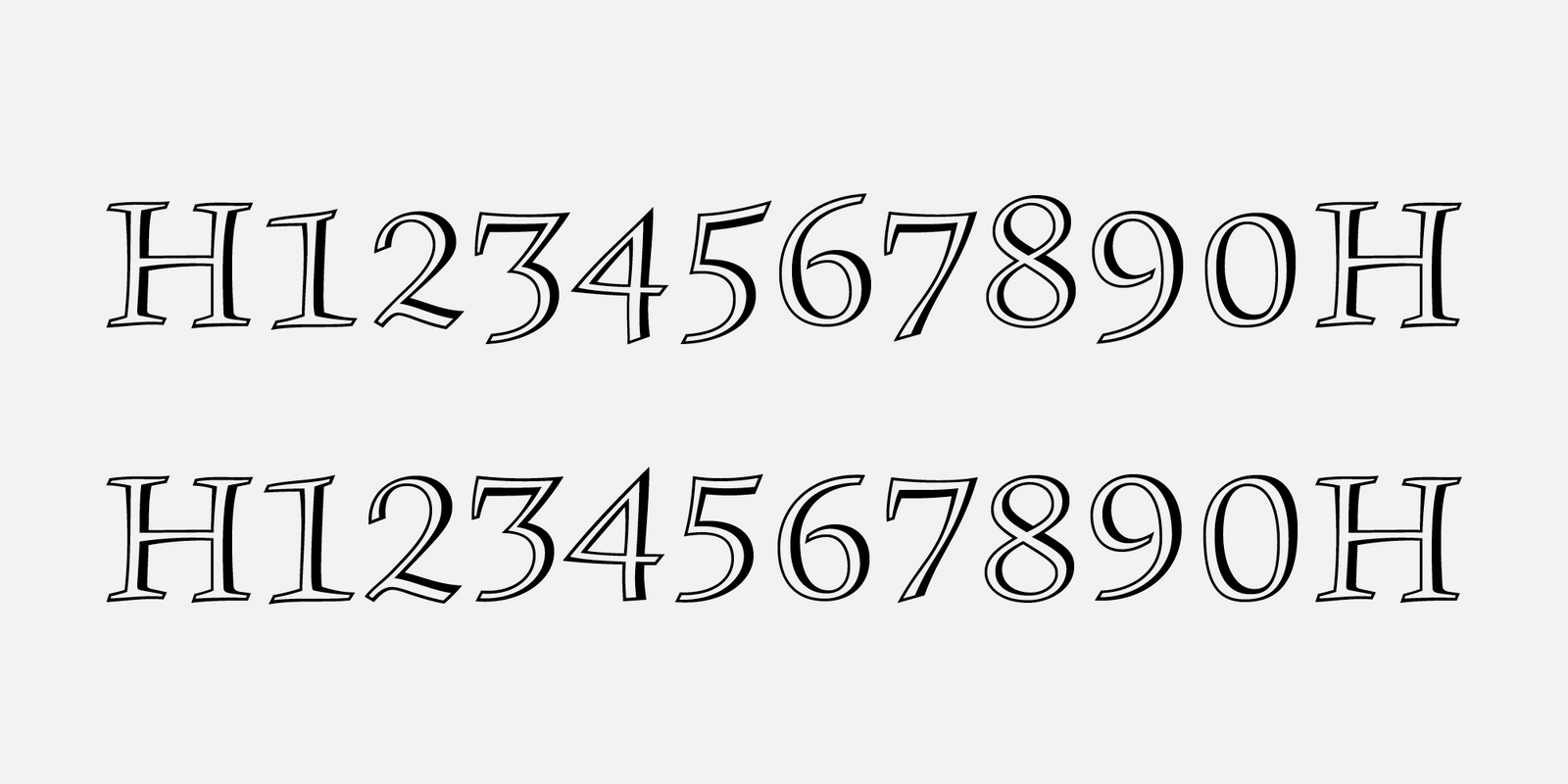
Comparison of modified oldstyle figures and newly-created proportional lining majuscules.
We thought long and hard about whether we should make more artistic interventions in Monument, as we had done in the other typefaces. For example, Vajgar needed significant modifications, but Monument is a much more delicate and lively typeface, and we were concerned that it would not withstand further interventions. Nevertheless, we designed a series of corrections. What would happen to Monument if we rotated the letters A, I, J by several degrees to the right; lowered the horizontal stem of the F, widened A, Y, U; made the figures taller; removed minor traps; and redraw the shadowing, which we found to be either too strong or too weak in illogical places? To our surprise, after all the numerous changes, nothing could be seen at first glance. Even if we changed Monument in a variety of ways, its calligraphic malleability can withstand anything. This filled us with optimism and gave us the courage to go even further.
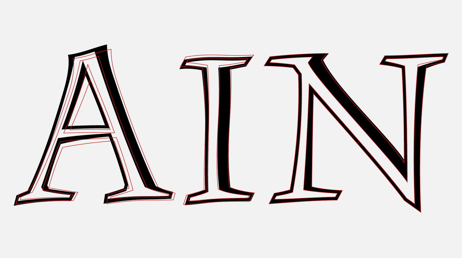
Comparison of the characters in the authentic version (black) and the outlines of the final font.
For proofreading with typographer Otakar Karlas, we prepared an experiment – we separated the outline of the letter from the light inner “bone skeleton,” so as to reveal how much the darkness differs for the diagonals (in A, K, M, for example) and emphasized unnatural details (such as small flats in the instroke on the serif, which we later removed). But this brought an unexpected result. Two new versions of the typeface were created using the inner and shadow outline. We were utterly fascinated at how terrific they looked, so we decided to produce Monument in three styles; in the original Regular and in two additional ones – Base and Inline, which enable the individual layers of the typeface to be colored and to have fun with effects of multiple layers that would have been hard to produce in metal. The coloring of the layers, the interplay of positive and negative, perfectly plays to Monument’s plasticity. What’s more, it looks really good.
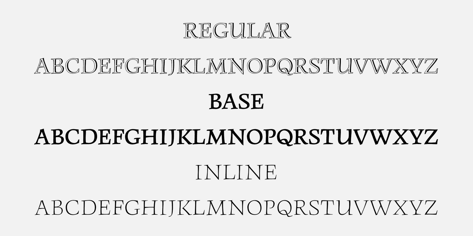
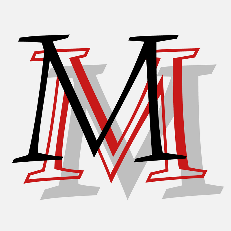
Monument’s three styles – Regular, Base and Inline – are interchangeable and can also be used as stand-alone fonts.
Finishing up a complete character set was the icing on the cake, but nevertheless we were quite worried about its complicated shadowed drawing. We created the characters in a dark Base style first in order to maintain the correct ductus and proportions. An Inline layer was then inserted into this drawing, which created a complete character that plays harmoniously with the rest of the set. Although it sounds very complicated, Monument was one of our fastest digitizations.
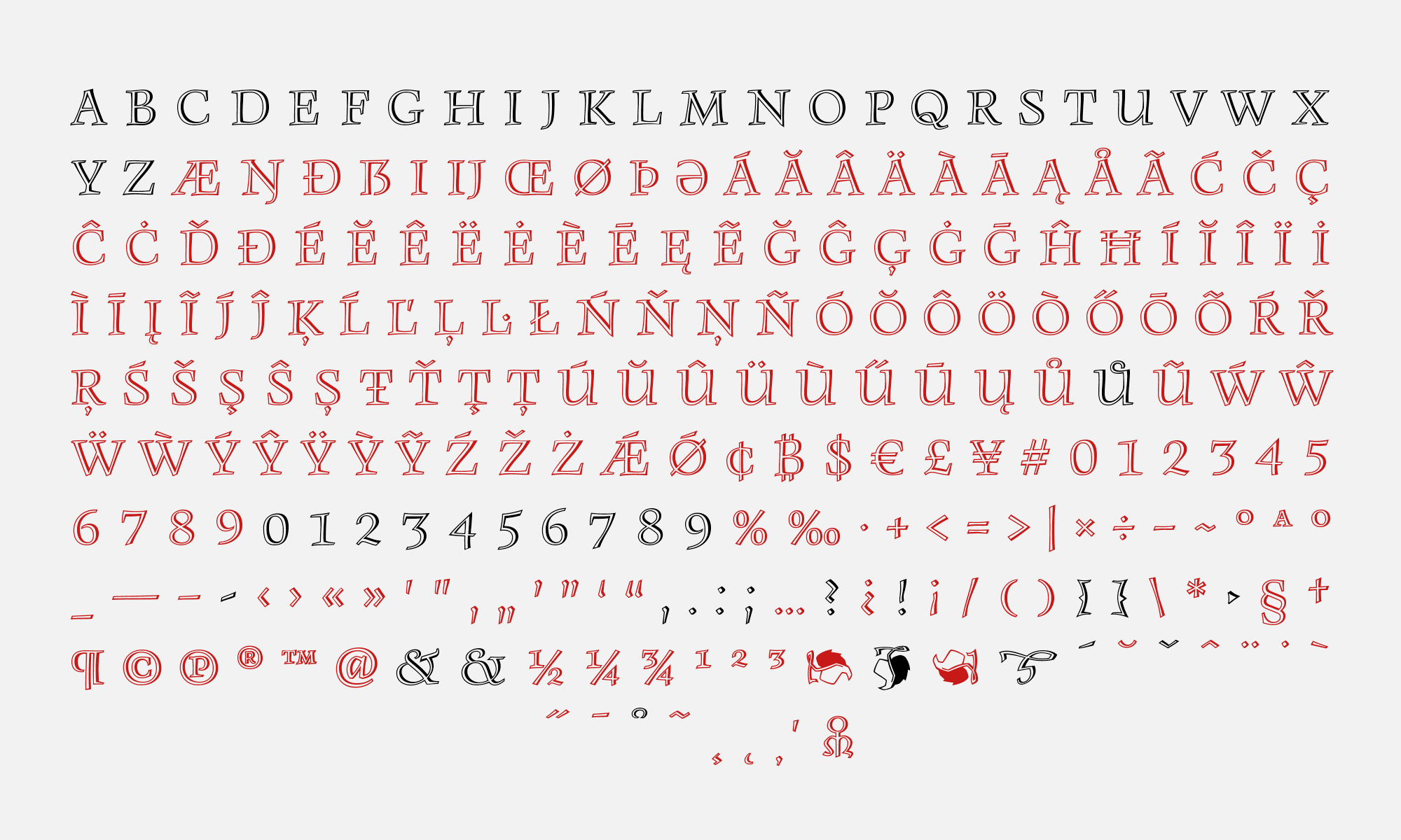
The complete character set of the BC Monument typeface. The ones marked in black are the original characters designed by Oldřich Menhart. The red characters are the ones that have been newly created.
[1] National Museum Library, book culture department, Typografika collection, inv. no. TYPO Menhart 87_1–6, typography: Monument, 1950s.
[2] National Museum Library, book culture department, Typografika collection, inv. no. TYPO Menhart 83-25,26_1; TYPO Menhart 83-27,28_1; TYPO Menhart 84-9,10_1; typography: Monument, 1950.

