BC Vajgar
The Vajgar typeface is Oldřich Menhart’s only poster typeface. Its fresh and lively draftsmanship is perfect for use in headlines—the characters fit together nicely. Vajgar’s addition to the Menhart’s font collection is well-deserved.
The Vajgar typeface was created in 1961, commissioned by the Stráž printing house in České Budějovice and is actually a model for subsequent engraving into linoleum. It could be characterized as a narrow gothic-antiqua, a historicizing typeface with one-sided wedge serifs whose form was derived from calligraphy carried out with an unyieldingly wide and flat writing instrument, either a pen made of reed or a cut piece of wood. The first Vajgar model contained a majuscule glyphs with a set of numbers and a few of the most essential characters.
![The well-known and only proof of Vajgar. 1960s, Stráž printing house, České Budějovice. Source: National Museum Library. [1] The well-known and only proof of Vajgar. 1960s, Stráž printing house, České Budějovice. Source: National Museum Library. [1]](https://oldrichmenhart.com/wp-content/uploads/2022/12/Vajgar_01.png)
The well-known and only proof of Vajgar. 1960s, Stráž printing house, České Budějovice. Source: National Museum Library. [1]
Vajgar is best characterized by the letter A, with its upper unilateral serif, the bent arc of the J, which has a small left-pointing triangular spur in the middle (we gave it the working title of ‘thorn’), and the shape of the U, derived from the minuscule. Also noticeable is the serif positioned high on the letter L, which ends in a short lower horizontal stroke. The slightly bent vertical spade-like main and secondary stems are completed with deeply set hints of wedge serifs. Rounded strokes are broken in certain places. The only precisely geometrically constructed shape in this typeface is an open circle embedded in the Ů. (1)
![Method of drawing wedge head serifs. Left: The unilateral use of the heads and serifs creates a violation of the balance of the perpendicular strokes. Right: Smoothing out the unsteadiness by slightly bending the basic curves. A sample of O. Menhart’s publication; Nauka o písmu [Teachings on Type], State Pedagogical Publishing House, Prague 1954. Method of drawing wedge head serifs. Left: The unilateral use of the heads and serifs creates a violation of the balance of the perpendicular strokes. Right: Smoothing out the unsteadiness by slightly bending the basic curves. A sample of O. Menhart’s publication; Nauka o písmu [Teachings on Type], State Pedagogical Publishing House, Prague 1954.](https://oldrichmenhart.com/wp-content/uploads/2022/12/Vajgar_02.png)
Method of drawing wedge head serifs. Left: The unilateral use of the heads and serifs creates a violation of the balance of the perpendicular strokes. Right: Smoothing out the unsteadiness by slightly bending the basic curves. A sample of O. Menhart’s publication; Nauka o písmu [Teachings on Type], State Pedagogical Publishing House, Prague 1954.
![Romans with wedge heads and serifs could have been a distant model for Menhart’s Vajgar. A table from O. Menhart’s publication. Nauka o písmu [Teachings on Type], State Pedagogical Publishing House, Prague 1954. Romans with wedge heads and serifs could have been a distant model for Menhart’s Vajgar. A table from O. Menhart’s publication. Nauka o písmu [Teachings on Type], State Pedagogical Publishing House, Prague 1954.](https://oldrichmenhart.com/wp-content/uploads/2022/12/Vajgar_03.png)
Romans with wedge heads and serifs could have been a distant model for Menhart’s Vajgar. A table from O. Menhart’s publication. Nauka o písmu [Teachings on Type], State Pedagogical Publishing House, Prague 1954.
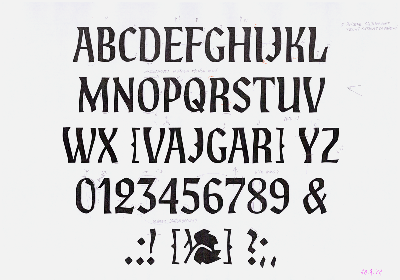
Vajgar is the second typeface we worked on in the series; we started at the end of August 2021. We were originally only familiar with it from several reproductions (such as Typographia 2, Oldřich Hlavsa, p. 528), but we did not find any examples in use. (2) An original proof—a small poster provided to us by Jan Solpera—proved to be an essential guide to how the exact contours of the typeface looked. We obtained other valuable documents in the archive of the National Museum Library. Along with the typeface, the preparatory pencil and final ink cards with individual characters signed by Menhart himself are stored there. We carefully compared this documentation with the proof and noted in detail the individual differences in the drawings. There were only a few, and nothing prevented us from starting on its digitization, while at the same time precisely redrawing all available characters.
![The original pencil and ink cards with designs for the Vajgar typeface from the estate of Oldřich Menhart. Source: National Museum Library. [2] The original pencil and ink cards with designs for the Vajgar typeface from the estate of Oldřich Menhart. Source: National Museum Library. [2]](https://oldrichmenhart.com/wp-content/uploads/2022/12/Vajgar_04.png)
The original pencil and ink cards with designs for the Vajgar typeface from the estate of Oldřich Menhart. Source: National Museum Library. [2]
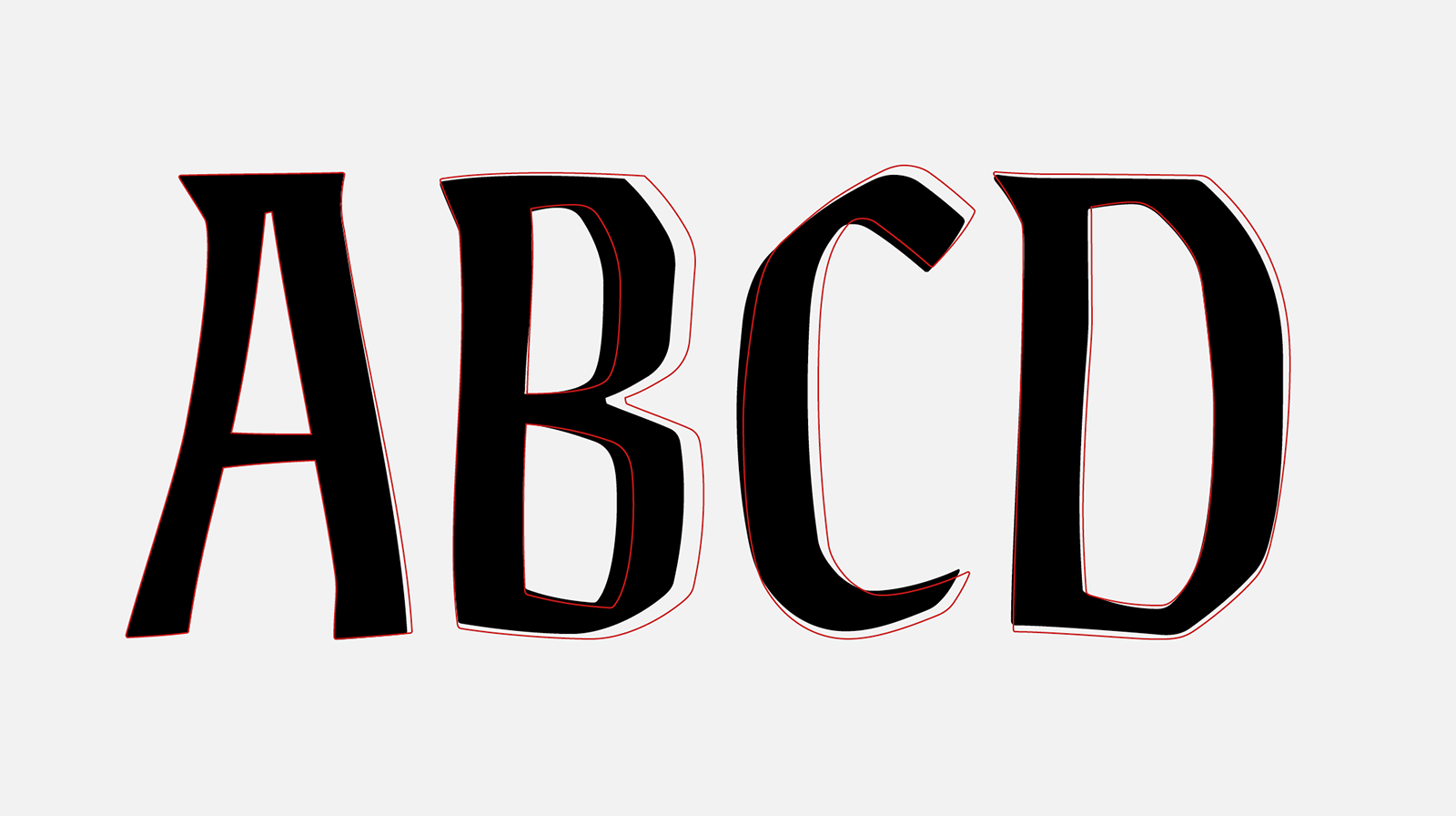
After creating the first ‘authentic’ version, we made our own corrections to the typeface: We changed the proportions of letters that were too narrow, such as B, E, F, and O, unified the width of the stems, and aligned the axes and rotation of characters such as C, J, and 3. We also unified the angles of the terminals of the curves, which did not correspond to the logic of the way of holding the writing tool when drawing the letterforms. We darkened all of the characters slightly to make them less subtle, and narrowed their metrics. For the new drawings of special symbols such as $, &, @, §, ¶, we tried to be as faithful as possible to Menhart’s original, especially with the ones the brackets and slashes so typical of him. We continued by drawing the basic punctuation, mathematical and accented characters, and completed the font into a complete pan-European character set.
![Our comparison of the differences between the pencil drawing of Vajgar and the proof of the produced typeface. Source: National Museum Library. [3] Our comparison of the differences between the pencil drawing of Vajgar and the proof of the produced typeface. Source: National Museum Library. [3]](https://oldrichmenhart.com/wp-content/uploads/2022/12/Vajgar_05.png)
Our comparison of the differences between the pencil drawing of Vajgar and the proof of the produced typeface. Source: National Museum Library. [3]
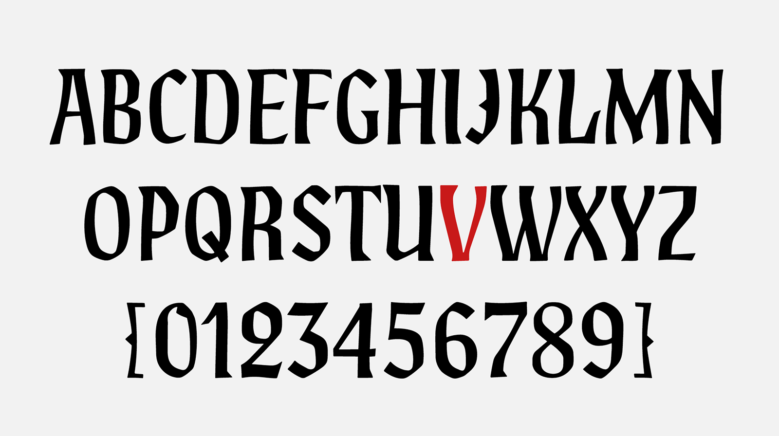
The first digital redrawing of the Vajgar font according to its original proof. We will call this version ‘authentic’, without any intervention from us.
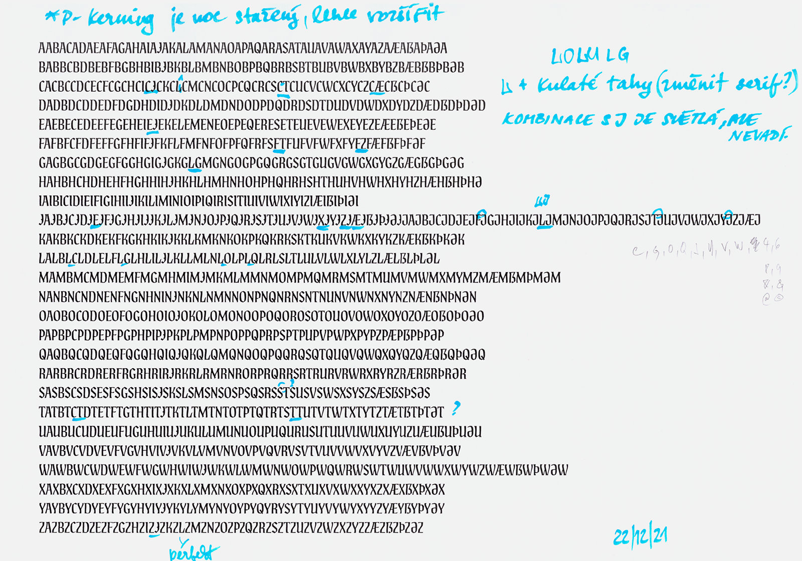
One of the many corrections applied to the ‘authentic version’ and a rough kerning proof.
After redrawing, Vajgar surprised us with its timelessness and relatively good readability in blocks of larger text. The vibrant letterform drawings are perfect for poster use, but work just as well at text point sizes—the individual characters fit together nicely. This led us to create several contextual alternatives that further supported this visual game.
1. Comparison of the characters in the authentic version (black) and the outlines of the final font.
2. New majuscule index glyphs.
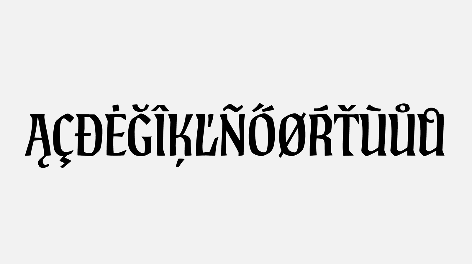
3. Modified and supplemented diacritics and accented characters for most European languages.
In addition, we slightly modified the accents (the rotation of the dotaccent for the umlaut, and the caron is now slanted for round character such as C and S), narrowed the space and added the letters A–Z in the form of an upper index that can be used when creating abbreviations. At Jan Solpera’s instigation, we created a new shape for the letter J, better integrated the character Z, and changed minor details in the numerals and other symbols. We considered the typeface finished in February 2022. But we shouldn’t have been working on Menhart’s other typefaces at the same time! This led us to the idea of supplementing the minuscule set, which we initially rejected. Vajgar was supposed to be a simple majuscule typeface without the need for additional weights and expansion for uses other than headlines. But working on Unciála convinced us that Menhart’s typefaces don’t have to always be worked on with reverence, so we added minuscule characters in June.
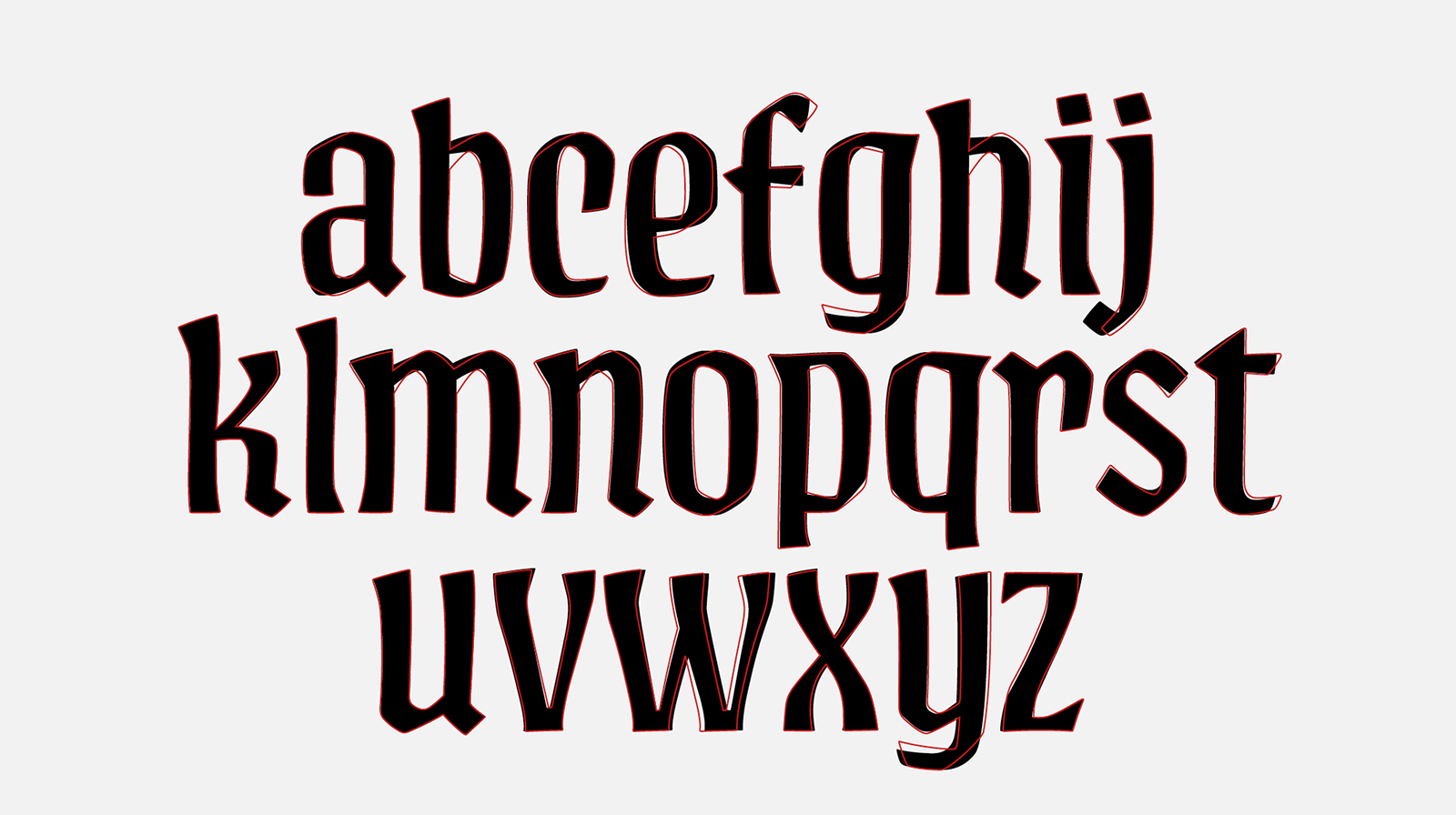
Our first design of the minuscule characters (black) compared to the outlines of the final font.
When creating the minuscules, we based it on Menhart’s various lettering, ex-libris and monograms, as well as our own creativity, while respecting the original morphology as much as possible. In order to keep the typeface blocks compact, the minuscules have a pronouncedly high x-height, and the characters contain almost no diagonals. The wedge heads of the stems are different. We have also completed new text figures, which were present in all of Menhart’s typefaces until Vajgar.
![One of the sources of inspiration for the creation of a minuscule for the Vajgar typeface was Menhart’s title inscription for the book Betlémská kaple [Bethlehem Chapel], SNKLHU Prague, 1953. One of the sources of inspiration for the creation of a minuscule for the Vajgar typeface was Menhart’s title inscription for the book Betlémská kaple [Bethlehem Chapel], SNKLHU Prague, 1953.](https://oldrichmenhart.com/wp-content/uploads/2022/12/Vajgar_10-571x800.png)
One of the sources of inspiration for the creation of a minuscule for the Vajgar typeface was Menhart’s title inscription for the book Betlémská kaple [Bethlehem Chapel], SNKLHU Prague, 1953.
![Another source of inspiration for creating the minuscules for the Vajgar typeface was the poster Bohu nejprve buď slouženo [Let God First Be Served], Benedictine Abbey in Břevnov, printed by Průmyslová tiskárna. Source: National Museum Library. [4] Another source of inspiration for creating the minuscules for the Vajgar typeface was the poster Bohu nejprve buď slouženo [Let God First Be Served], Benedictine Abbey in Břevnov, printed by Průmyslová tiskárna. Source: National Museum Library. [4]](https://oldrichmenhart.com/wp-content/uploads/2022/12/Vajgar_11.png)
Another source of inspiration for creating the minuscules for the Vajgar typeface was the poster Bohu nejprve buď slouženo [Let God First Be Served], Benedictine Abbey in Břevnov, printed by Průmyslová tiskárna. Source: National Museum Library. [4]
Vajgar was the last typeface Menhart saw produced. Toward the end of his life, diabetes severely impaired his eyesight and made it impossible to work, so a question exists about the extent to which his health influenced the character of this typeface. In any case, we tried to savor the digitization as much as possible, and our reward is a lively typeface that deserves its place in this collection.
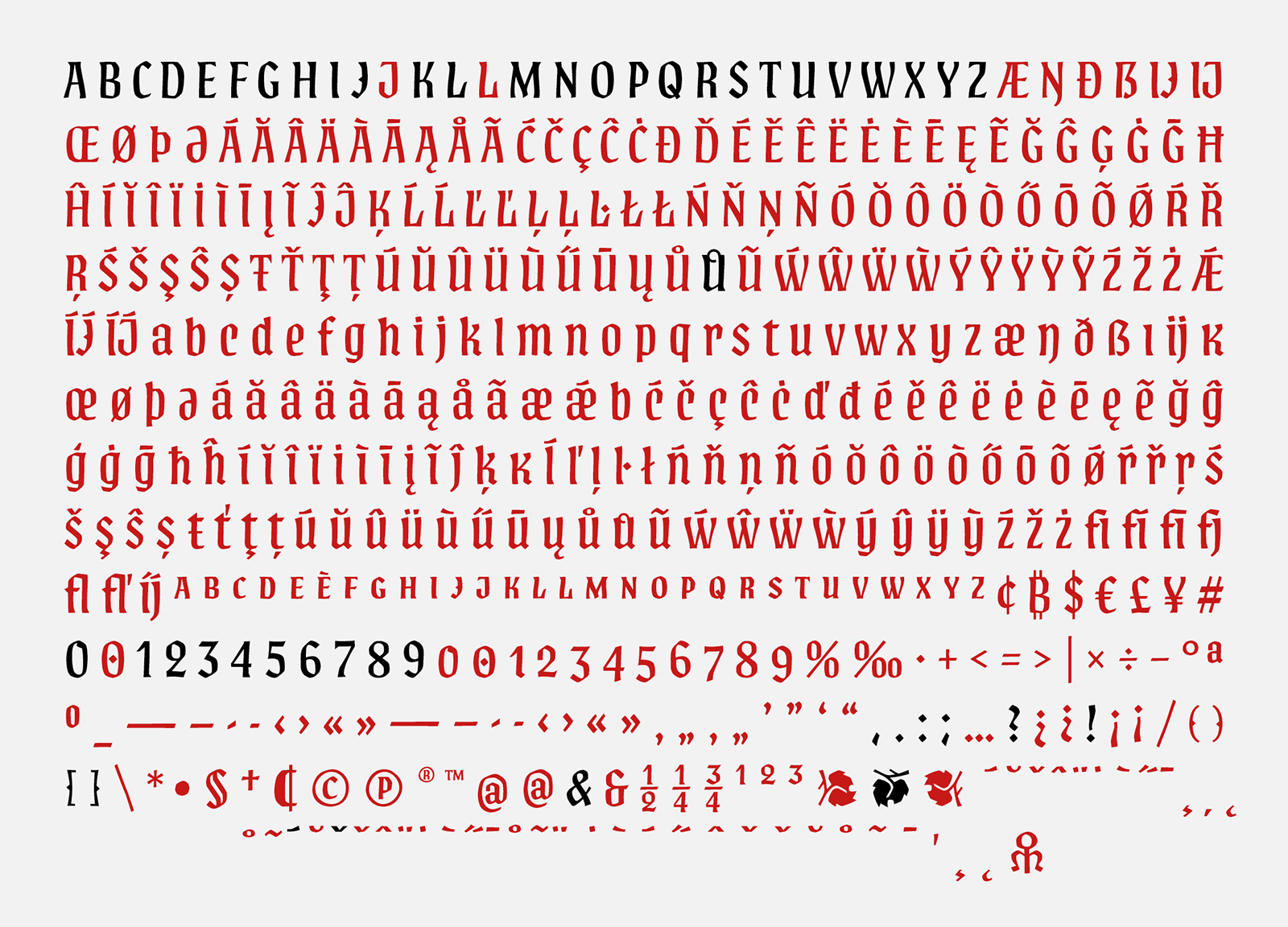
The BC Vajgar typeface’s complete character set. The ones marked in black are the original characters designed by Oldřich Menhart. The red characters are the ones that have been newly created.
1) SOLPERA, Jan. Vajgar není jen rybník [Vajgar is not just a pond]. In: Výběr. 2021, 58 (1), pp. 45-52. ISSN 1212-0596.
2) Somewhere in the middle of working on the typeface, we visited the district archive in Jindřichův Hradec, where we found things such as files with posters type setted from the Vajgar typeface in the Stráž printing house. On large format posters, the typeface is used in two sizes; its original size around 5 cm, and now at 10 cm.
[1] National Museum Library, book culture department, Typografika collection, inv. no. TYPO Menhart 129-1, typography: Vajgar, 1960s.
[2] National Museum Library, book culture department, Typografika collection, inv. no. TYPO Menhart 125-1_1; TYPO Menhart 125-2_1; TYPO Menhart 125-8_1; TYPO Menhart 127-23,24_1; TYPO Menhart 128-1,2_1; TYPO Menhart 128-15,16_1, typography: Vajgar, 1960.
[3] National Museum Library, book culture department, Typografika collection, inv. no. TYPO Menhart 129-6, typography: Vajgar, 1960s.
[4] National Museum Library, book culture department, Typografika collection, inv. no. TYPO Menhart n03, typography: Bohu nejprve buď slouženo [Let God First Be Served], undated.


